The author says:
Hell let her go…but not all the way. And each time Jo falls asleep, it drags her back to be consumed by creatures of the dark. [Sequel to Flames of Lethe & 2nd of planned trilogy]
Setting: earth & hell
Time: present day
Genre: dark fantasy-romance
Target audience: fantasy & paranormal romance readers
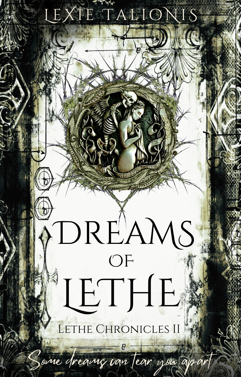
As before, I created this cover using Canva & stock images. Please rip it apart and tell me everything wrong with it! Thank you all!!
[original submission and comments here]
Nathan says:
Like the first submission, I think this is very good. However, it is no better than the original submission — just different. And it doesn’t look like any of the changes made were to address issues brought up by commenters the first time.
- There might be just a smidge more indication of the romance that you originally mentioned in the story description in the medallion, but I think you have to be looking for it; I would guess that most people, when seeing someone “embraced by death,” think of it as a common metaphor, rather than an indication of romance.
- The handwriting font at the bottom is still the same font — the words have changed, but the problem remains that the font both (a) clashes with the style of the rest of the cover and (b) is hard to read against a busy backdrop.
- The same grunge elements on either side of “Lethe” still make it hard to read, especially at thumbnail size.
By and large, I’d have to call this a lateral move rather than an improvement.
Other comments?
I, too, am not a fan of the handwritten tagline: it really seems out of place, let along almost impossible to read.
Other than that, my only qualms are the almost overwhelming busyness of the cover and the misuse of the main art. The small illustration above the title could have been put to much better use.
All of the fussy, decorative details really don’t add anything to the cover at all, and I think it might be much better off with a lot of less of that sort of thing. This might also allow for more space for the author’s name and the tagline.
To both Ron & Nathan:
If you read her last comments, on the first submission, she’s not going to move on that tagline. She’s bonded to it. She is not going to fix it or change it, so…we’re all barking up an empty tree on that.
I happen to strongly agree with both of you, but we’re wasting our time. In fact, she actually said something to the effect of “maybe people will click into the cover to read it,” and while I started to reply about that, honestly…I just gave up. I mean, if you’re so stuck on something that you’ll go to that point of rationalization…?
I very much thought the other cover was better, not “as” good. This only has contrast because she’s leached and leeched the color from it.
I think the medallion only adds a romance element if you know it’s a romance and you’re looking for it–in other words, if you’re the author. I still don’t see romance–I see something creepy, like death embracing a woman, at best–so…dunno. I love the sort of overall look and idea of the original cover and I’m gobsmacked that she could do that, with Canva, but as a book cover, it’s not working. It’s a great graphic, but great graphic ≠ great book cover.
Not sure what else to say here.
Please note: this is the *sequel.* It is not replacing book 1, which is still in shades of gold.
While the changes I made were subtle, I did reduce the text size, giving it more space between it and the ‘grunge’ edge, even considering that I made the edge thicker; and the image set for the center medallions (for the whole trilogy) is now some version of a skeleton and a woman.
It is *dark* fantasy romance after all, and it will be found in the romance category when anyone is shopping for a book. When I submitted it in here, I also posted it in a fantasy group and asked what they thought. It blew up with over 700 likes and hundreds of comments. So these covers reach their intended audience quite well.
Well, then, seriously and without snark, I would say that you seem to be reaching your readers and you don’t really need CC.com. If your demographic loves the books so much that you have 700 +people lined up to buy it when it comes out–hell, the cover almost doesn’t matter.
Right? Right. 🙂 Good luck with it. As I said, I am truly gobsmacked that you do these using Canva. I doubt I could. Your marketing efforts seem to go in other directions than simply needing the cover to draw in more readers, so…hell, stick with what’s working for you. I would.
Thank you. I didn’t know how well they would respond until after I’d submitted here. Now I have a better sense of what they like.
But the 756 people in the fantasy group who lined up were doing so strictly because of the cover, so I don’t know how many would translate to sales. I only know it did make them stop, look, like, read the scrawl, and then drop 175 comments as well, with many asking for where to buy.
I do appreciate the feedback in here, and I *did* listen to it and updated with many of the recommendations, resulting in the improved versions that had the above effect. So you all had some hand in the outcome. Thank you.
Well, seriously, as I said, if the leapt on it and bought, say, 175 copies, go with God. 🙂
As they used to say and no longer do–which is a shame, as it’s a perfectly good expression–the proof of the pudding is in the eating.
I haven’t seen the original version, so I’m going strictly by this version. Overall I like it, but it needs tweaks:
• The bottom script needs to NOT be script.
• On top, the name LEXIE needs kerning between the E and the X. Same with the T and the A on Talionis.
• The illustration in the middle, which is compelling, needs to be much larger.
• The title text might look better if it had some color, maybe pick up the dark gold color?