The author says:
It’s story of two era when two women rise up against the nemesis to protect the civilization
Nathan says:
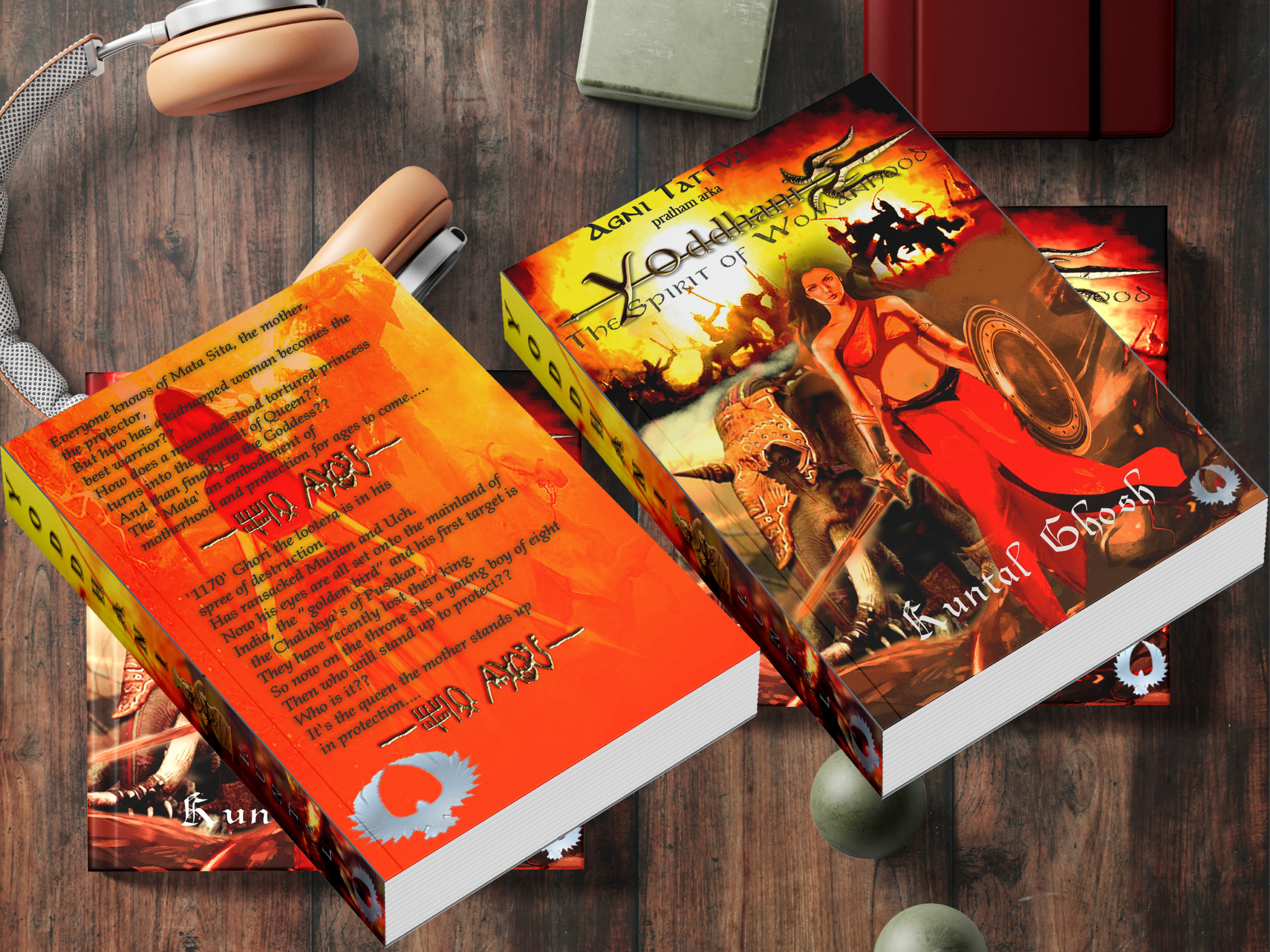
People, make it easy for us. Send us the cover so we can actually SEE it — I don’t need to see your desk and headphones. (You have editions bound on both the left and the right, or you just didn’t bother to composite it right when making your mockup?)
And send me a description that SAYS something; I can’t tell from the seventeen words above whether it’s some sort of fantasy of science fiction or historical; maybe it’s time travel? What I CAN tell is either the author didn’t bother to write with his brain engaged, or he’s an ESL writer; either way, I hope more care was paid to the English in the book than in the description.
Sorry, I’m not in a mood that suffers fools gladly. Merry Christmas.