The author says:
BLOODLINES is a new adult, upmarket fantasy novel (part one of a duology). It follows two protagonists in the same city: Rorri, a refugee, drug addict, and hopeless romantic who falls in love with his magic tutor (which is where most of the cat-related things come from); and Pak, an outcast orphan boy with a tragic past, a cursed weapon that makes him do terrible things, a love for animals, and a crush on his only friend. Both are haunted by the distant antagonists in an ongoing war (people called the Duen) and both are subject to racial/class prejudice. Rorri has a secret (he screwed up bad), and Pak is searching for answers relating to the weapon, which ultimately ties to Rorri. Also they’re elves but like, lowkey elves, not Tolkien elves. Elevator pitches are hard 🙁
Target audience is 20-30 year old queer and neurodivergent fantasy readers (I plan to do targeted marketing via Facebook), people who like the Magicians Trilogy by Lev Grossman. It is both plot heavy and character motivated which is why I’m saying it’s upmarket.
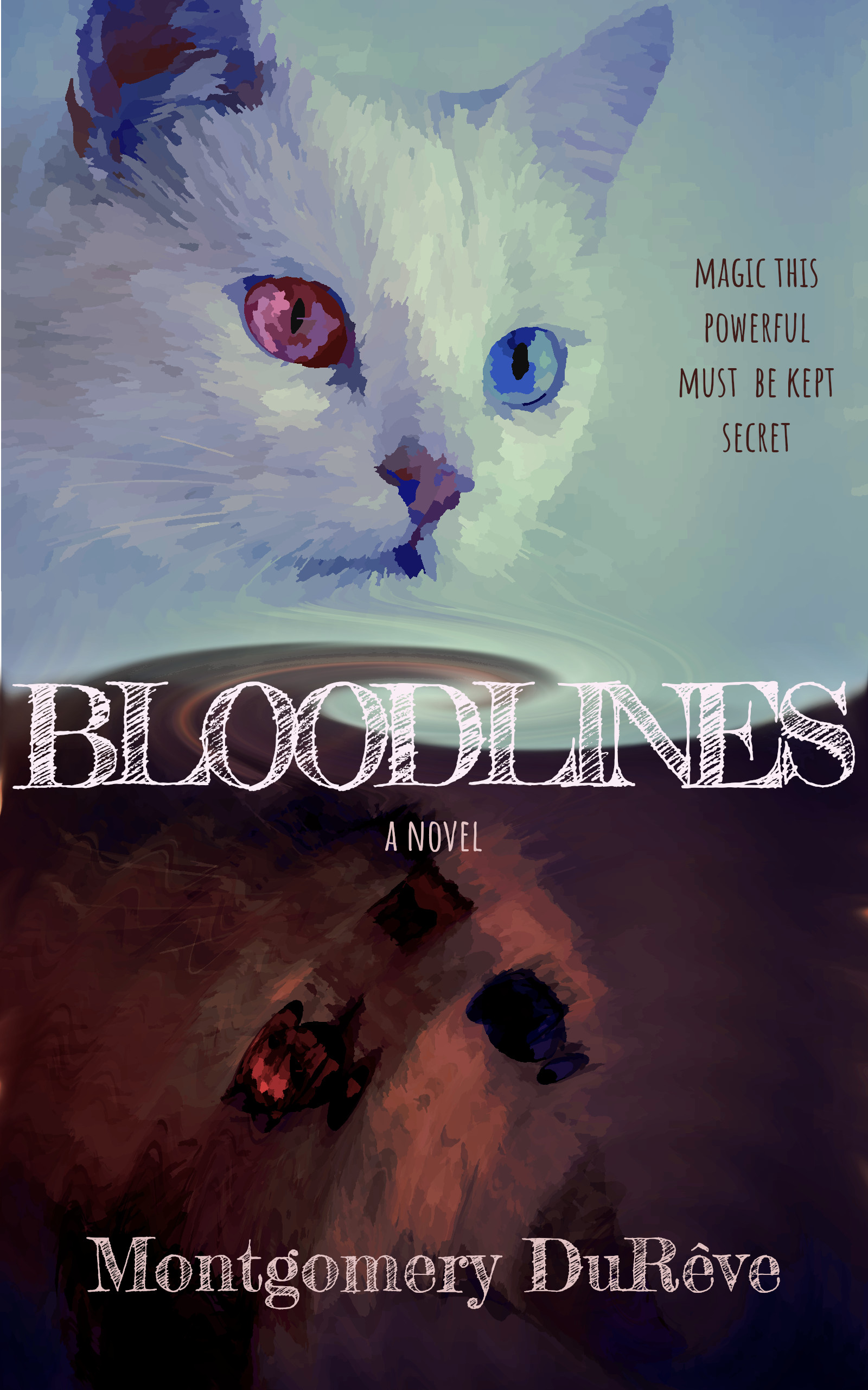
I made the cover, my biggest concern is that the cats will throw people off. They’re mostly symbolic in the book, not necessarily a hard plot point.
Nathan says:
The problem isn’t the inclusion of the cats (although it took me forever to realize that the bottom cat was the reflection of the top one), it’s that nothing says “fantasy.” Cats can certainly be magical, and there’s nothing wrong with using them as your central image, but just including a cat doesn’t tell the reader that it’s a fantasy novel, and the typeface you chose has nothing fantastic about it either. Remember that, at the very least, your cover needs to immediately signal its genre.
This is something you could easily solve with (a) a different typeface, and (b) maybe a border.
But while you’re at it, please lose the posterizing filter — it adds nothing, only detracts.
Other comments?