The author says:
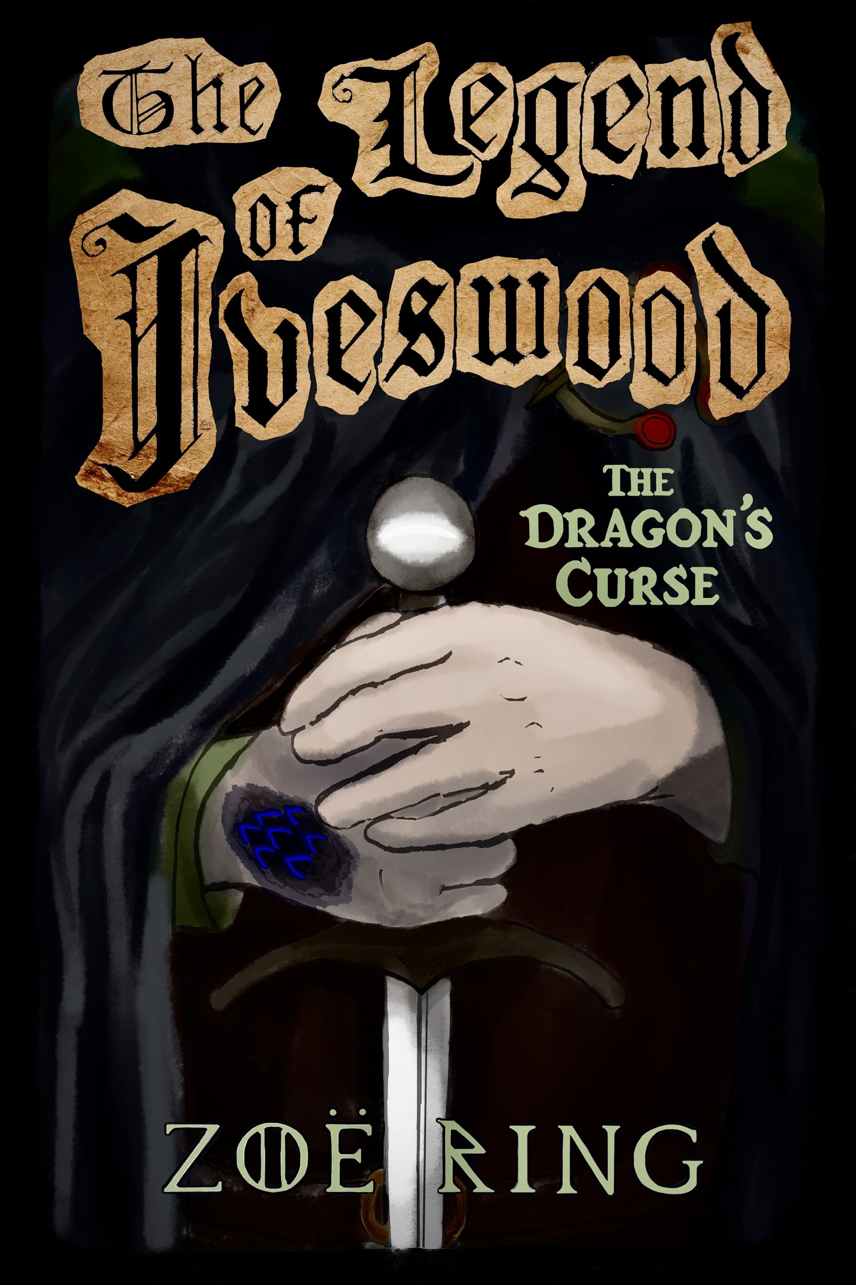
‘The Dragon’s Curse’ is the first installment in ‘The Legend of Iveswood,’ an epic YA fantasy series woven with illustrations. A young thief struggling for years under the weight of a curse—to uncontrollably shape-shift into a vicious dragon—learns that the kingdom of Skylia is under threat of a primordial figure of reckoning, and realizes he may redeem himself in the eyes of the people if he can save them. Inadvertently befriending a range of characters with their own hopes and dreams along the way, he and this ragtag group must unravel a mystery centuries-old in the making, all while potentially playing with fire… (The illustration is a mockup I plan to redo in a traditional medium once the palette and placement are established).
Nathan says:
Glad to hear it’s a mock-up.
Here’s what I would do:
- Place the hand with the sigils/scars/whatever on top where it can be seen.
- Lose the “torn parchment” effect around the letters; it doesn’t contribute anything, and makes the title harder to read in thumbnail especially. (Calligraphy can be hard enough to read without any help.)
- Tighten the focus be losing the outer inch of the illustration. The black robes don’t contribute anything but negative space.
Other comments?
Maybe change the pieces of parchment to one solid ripped piece.
or try that title in gold with no parchment at all.
https://imgur.com/ZNS50kL
I’d use the same font that you’re using for dragon curse for the legend bit or the author font (which is super cool)
I used Cardinal font for Iveswood because it was a bit more readable but yours in gold might be more readable
I think the title font is pretty unreadable, no matter what’s done with it. I would strongly consider using the byline font for both, title and byline. 3 fonts is at least one font too many for this cover.
For clarity–I mean the title font on the original cover is unreadable–yours is much better, Shelley.
The parchment fragments add nothing at all…and, worse, look too much like cut and pasted letters. Everyone else’s comments about the typography I second.
The main problem I have is with the illustration: it is awfully generic. Aside from there being 10,000 fantasy book covers with hands holding a sword like this, it really conveys nothing specific about this particular book. It’s just a picture of hands holding a sword–and that’s all. For instance, the dragon-shape-shifting theme is something that might set your book apart, make it seem different…but there isn’t a hint of that idea on the cover. I think the illustration needs to be rethought from scratch: it needs to not only suggest that the book is a fantasy adventure it needs to convey something about what makes this book special, what sets it apart.
I agree with Ron and in fact, that devil stole my comments. 🙂 I was going to say, the problem I have with the cover–even assuming that the final illustration is significantly better–is that it tells me absolutely nothing. “Medieval Fantasy,” MAYBE. “Medieval adventure,” maybe, and more likely, due to the sword, blackletter and the monks’ hood/robe. Absolutely nothing fantastic about it (Fantasy, I mean); surely nothing about shifting to a dragon, which I think would be very cool, curse or not.
Surely, if this book is heavily illustrated, presumably with similarly-crafted illustrations, there’s something, somewhere, about him shifting into a dragon? THAT would be far more interesting than this extremely static, passive “person in monks’ robes (?) holding sword” thing, with “big blue dot on hand.” If you did the Miller test (yes, yes, named after Ron) and changed the title into something you didn’t know, in Cyrillic, what would you think the book was ABOUT?
You wouldn’t know, right? Well, so too is the case of your prospective buyer. No way of knowing if this is a YA fantasy right up his or her alley. I realize that trying to convey a young thief shape-shifting into a dragon might be too much, but…there’s gotta be something you can do to set this book apart from all the rest. And surely, all the rest in that (forgive me) boring “hands on sword” bit.
And as I said, I really don’t like the blackletter font. First, it screams Medieval, which may not be your intent, and does not scream fantasy. And thirdly and actually most importantly, it’s impossible to read in thumbnail size and not much better when zoomed.
Sorry.
Thanks for the great feedback, I’ll fix the font straightaway. I’d like to telegraph the book leans more literary than the average fantasy, but I’m not sure on the best way to do that… I’ll try a new mockup focused on the dragon-duality instead.
Well, that’s trying to reconcile two very different–and effectively opposite–goals. Genre covers are genre covers, designed to attract a reader that is specifically seeking a book in that genre. The best way to do that is to follow current trends in that genre–fonts, colors and the like–and make the cover art, etc. unique to your story.
LitFic, on the other hand–Literary Fiction–specializes in covers that appear to be mostly about nothing. No real hints as to the story. You can, of course, go that route–but that will…not alienate will be is the majority of your would-be reader base, at least up until you find a LitFic following.
(n.b.: Sure, LitFic can be fantasy, but the decks are heavily stacked against it, as LitFic is pretty much all about the inner feelings, emotions and turmoil of the character[s], whereas genre fiction is about the ‘outer’ lives of the characters, more than inner.)
I suspect that if you really want to go the LitFic route–or hinting to your would-be readers that your novel is “more” LitFic than Genre, you’ll need to address that by significantly revising your title (a la “The Time Traveler’s Wife”) and then changing the cover up to, again, be pretty much about nothing, or vague. 🙂
Good luck with it.
Though I agree that the torn-parchment thing isn’t working (assuming that was intended as an aspect of the final design) and the gothic lettering style is a bit outdated, I think there are ways you’ve already shown some really good instincts with the ‘The Legend of Iveswood’ treatment:
You’ve got a nice shape/layout to ‘The Legend of Iveswood’. It’s occupying space on the cover nicely. I don’t often see non-designers doing so well in that department.
Re. the illustration I’d like to second what Ron says. It’s awfully generic.
It’s hard to think of a more general-use image in fantasy than hands holding a blade. It doesn’t really hint at any of the specifics you mention in your summary.
You’ve included the point of the skin turning to scale but that feels like a detail against a wider set of choices that aren’t working very hard.
You also mention that this is a heavily illustrated book/series but this doesn’t feel like a subject ideally chosen to showcase that strength.
You mention that this is more the literary kind of fantasy but it’s really easy to aim for ‘classy’ or grown-up’ and end up with ‘dull’ or ‘generic’ and I think the hand with the blade is veering that way. There’s just nothing very interesting about that as an image: it doesn’t suggest any specific angle, raise any particular question etc.
It’s also not an illustration that’s working great for the space. The title of the book is getting a bit bunched up beside it, and there’s no space to include the entire blade which further undermines any impact the image might have. It’s getting in the way of the byline too.
What you do have is an atmosphere there which is a good start.
I’m also eyeing a couple of letters in the byline. That ‘o’ in Zoe is a bit potentially copyright-infringy re. Game of Thrones. I don’t think you’ve used a knock-off font, this looks more hand-lettered? The ‘R’ meanwhile looks a bit out of place, with none of the other letters going for that runic vibe.
Well spotted for making out that the hand marking represents “skin turning to scales”!
I thought it was a magic sigil (fantasy cliche, especially in blue). At thumbnail size it looks like a bruise.
Going more heavily into that idea might work as part of an illustration. Even the generic hands-and-sword image would be improved if one of the hands was a full-blown dragon’s talon.
Funny, the disturbing feeling of the ‘O’ looking vaguely familiar didn’t hit me until later on. Now I know why.
Yeah, title and name are both hand-lettered, I’m still researching what software to go with for the cover (and possibly font) creation, been just using Clip Studio Paint to jot ideas down. I love the suggestion of gold lettering, still searching through fonts for the right one. For that classy look, I think I might go symbolic and put the dragon as a shadow in the background, maybe like this:
https://i.imgur.com/OPV9dUl.jpg
Well, I like the idea of the dragon-self foreshadowing the character/plot, so that might work. It’s very hard to know what’s going to work unless/until we see it. But it’s a big improvement, conceptually, over the generic hand-on-sword concept.
How you’ll convey the transition/shifting, that, I don’t know. I fear a blob of color or scales, on a small body part, isn’t going to say it. It’ll be one of those cover items that require that the reader has bought and read and finished the book, to “get” it. That’s never a good thing. Do you have any illos inside the book that have him caught in mid-change? Perhaps with a single wing sprung from his back, or…?
I do have one like that, all the illos are in the early stages at present. Still waiting till editing on the first book is done to decide which to include. I may use the art to raise awareness for the book before it’s published. The dragon-shifting is hinted at from pg.1 but not explicitly shown until Chapter 3, so I thought I might get away with making the dragon-element look more mysterious on the cover.
I don’t really mind the old English Lettering I think it’s cool. Maybe not on parchment because it’s hard to read but maybe in gold. I do agree it’s a bit sterotypical. Maybe make your subject smaller with a robe and magical eyes, with one arm changing to scales. Just a thought. Sort of like the shape shifter theme too.