The author says:
In Curb Children, a subcultural literary fiction novel, an adult millennial in 2022 recalls his punk rock raver teen years and the loss of a trainhopper friend to suicide in 2008. The target audience is people between 18-42, and anyone who enjoys strong narratives with diverse countercultural characters. For fans of S. E. Hinton, Bret Easton Ellis, Charles Romalotti.
Nathan says:
My standard quip is that “literary” novels go out of their way to look like nothing in particular — sensationalism is gauche, you know. But even then, there’s an element of marketing necessary to those covers.
In this case, nothing — AT ALL — is discernable in thumbnail. Not only is the title unreadable and the byline invisible, the map which takes up the whole cover isn’t recognizable as such. It’s the opposite of any eye-catching cover; it won’t even be a speedbump as potential readers browse the selection in the online store which comprise most of an indie-published book’s potential sales.
You mention three authors you’d expect to appeal to readers of your novel.
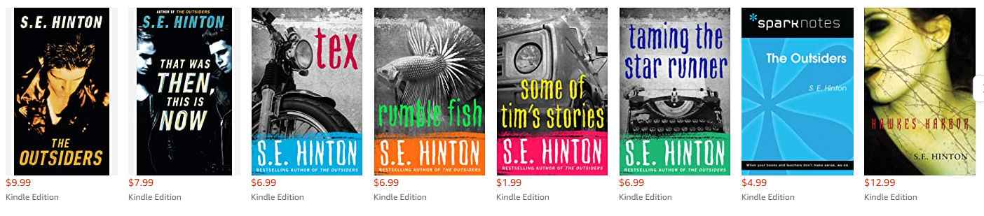
S.E. Hinton:
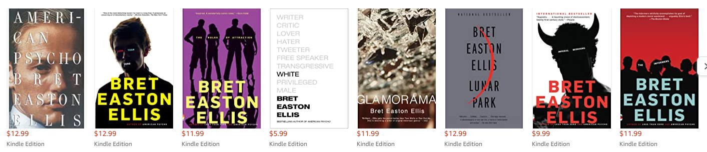
Bret Easton Ellis:
Charles Romalotti:
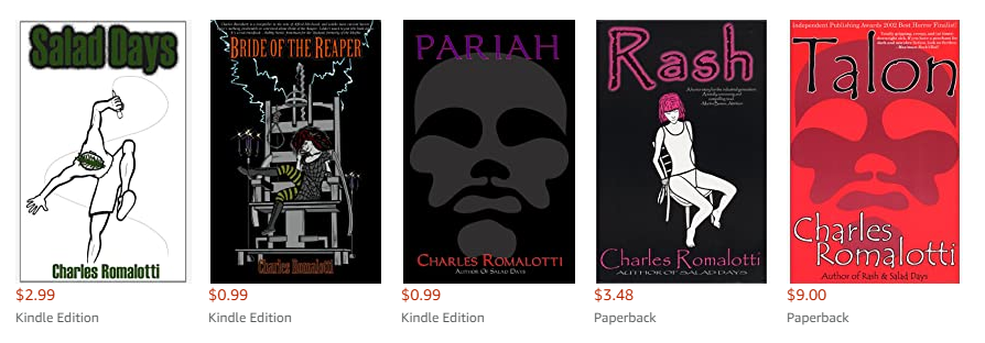
No particular commonalities except some universal good design: Simple images, clear colors and contrasts, readable titles.
Go and do thou likewise.
What this cover needs is train tracks and part of person on them. I don’t mean a severed limb but like a leg or arm flung across the track with the rest of the body off screen. Or maybe a shattered guitar. it should be dark colors, not cream tones, with maybe the faintest hint of washed out for that bit of despair but a distressed font would probably convey despair well enough.
(and great, now I see this in my head so want to make it…lol)
I was thinking about this and maybe this should be sepia tones, not dark. I think I got up in the suicide but that isn’t really the focal of the book.I still think you need train tracks though…lol
https://imgur.com/kgvtK10
maybe something like this?
There is just absolutely nothing about this cover that could attract a potential reader. I am afraid that you have probably fallen in the subjectivity trap that snags many authors: you know the significance of the cover, it is meaningful to you…but the potential reader doesn’t have that inside information. The map is essentially meaningless, the handling of the title typography and the graphic elements seem superfluous, neither suggesting nor adding anything. This really needs to be scrapped and started over again from scratch.
Yeah, I’m forced to agree with Ron here. And Nathan. There’s simply nothing here. Nothing that would even lure the most dedicated Subcultural LitFic reader to click on it, because I doubt that they’d recognize it. The map is particularly bad, but so too are the fonts and the treatments, and the stripes. It’s just…I’m sorry, it’s simply bad.
I concur with Ron that this needs a complete redo. I don’t even feel that the concept will work with revision–a map of that size won’t be viewable, recognizable or readable, as Nathan shows, above. It needs a total rethink, a new concept. Thus, I won’t put in time on fonts, layout elements, etc. because this simply should not be used.
Unlike my colleagues and our esteemed host, I did recognize those jagged lines as a map in thumbnail when seeing this in the feed over at our companion site at Lousy Book Covers. Nevertheless, I have to agree with them that seeing a map on your cover’s thumbnail neither tells me squat about the book’s contents nor snags the slightest bit of my interest. In fact, when I first saw it in the feed, it seemed to me like the image might be attached to one of Mr. Shumate’s articles on one of his other sites; maybe something to do with his near-rectangular home state of Utah.
Of the three authors you mentioned, the one whose book covers’ style I think you ought to mimic most closely should be S.E. Hinton’s. Her books were mostly tales (loosely based on her own real life experiences) of the protagonist(s) getting caught up in various notable incidents while experiencing a rough upbringing among street gangs. This sounds rather similar to your protagonist’s story, the only major difference being the time in which it’s set (which probably won’t actually make that much difference to basic infrastructure of your story).
Note how the images on her covers are generally either of gangland toughs or their motorcycles or other vehicles; these street gangs and their equipment were generally the main elements of each of her stories. Your cover should likewise focus on just one readily recognizable symbol of one of the three notable elements in your story: either something to do with trains (if the trainhopper friend’s death is especially memorable and particularly influential to the entire story) or something to do with being a punk rock raver such as that shattered guitar Savoy suggested or maybe a shot of some guy’s Mohawk haircut (still something commonly spotted among punk rockers and their fans to this day, or so I’ve heard).
Basically, think of what part of the story you expect your readers to remember most vividly and focus on that.
Hmmm…maybe just the back of a punk’s mohawk-ridden head? With a train or ? in the background, with the punk is looking at it? Just a thought. Simple, but somewhat Hinton-ish.