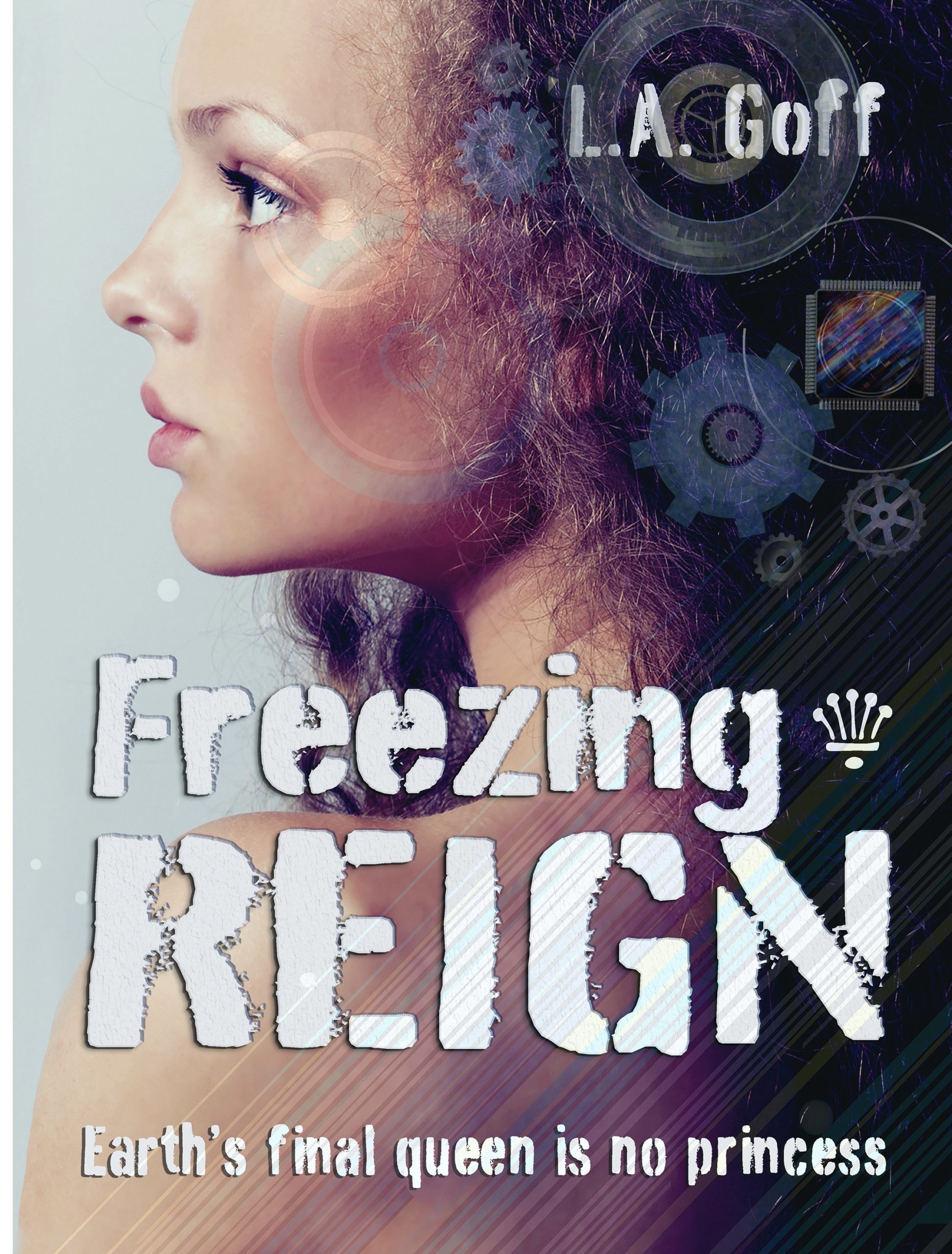
The Survival Strategy

The author says:

It’s a dystopian thriller set in the near future. It’s action-packed, and fast-paced. It’s similar to books like The Hunger Games, The Maze Runner, Gone, Uglies, Divergent..etc. The title, “The Survival Strategy” is a working title. I’m not positive I will keep it. I’m also considering Fight or Flight as a title, because it seems fitting to the story, and the cover. All thoughts are welcome!

Nathan says:

It’s a well made cover, but my first guess was that it was a spy thriller.  (Something about silhouettes of men wearing trenchcoats…) I don’t know what kind of dystopia we’re talking about — cyberpunk urban, post-apocalyptic, etc. — but a hint of that would go a long way.  Even just adding some pure green glows will give it more of a futuristic vibe. And have you tried a distressed typeface?

Other comments?

First Kyss

The author says:

First Kyss is a paranormal romance featuring wolf shifters, magic, and Norse mythology.It is set in modern day Missoula, Montana with trips across the Rainbow Bridge to Asgard. My target audience are readers who love paranormal romance, particularly wolf shifter romance. It would appeal to readers of Nalini Singh’s Psy-Changeling series and Maria Vale’s The Legend Of All Wolves series.

Nathan says:

Well, it certainly hits all the bases for the genre — a quarter-second is all it takes to identify it as paranormal romance involving werewolves.

Two technical things stand out to me:

  1. The glow on the medallion is very artificial-looking. It might be beyond the skills of your designer to add reflected highlights on the pecs beneath, but even breaking up the regularity of the glowing beams would help a lot.
  2. It seems oddly muted, as if you purposely pulled back on the contrast. I would say, go the other direction. Punch it!

Other comments?

Cooties

The author says:

OK, so this is a pretty standard plot for a romantic comedy: schoolboy meets schoolgirl, schoolgirl likes schoolboy, schoolboy likes her back. Romance ensues, but they face some major hurdles to their getting together, as not everybody around them at their school and at home approves of their relationship. Will their love be able to overcome these obstacles, or was it never meant to be?

Twist: uh, did I mention these schoolkids are ELEMENTARY schoolkids, or that they’re, like, ten? (“But going on eleven!” they’ll tell anyone who looks askance at them and asks just how old they are when they say they’re dating.)

Target audience: anyone who likes “puppy love” romantic comedies like Melody (1971) or Little Manhattan (2005) or Moonrise Kingdom (2012).

Title: I’m tentatively going with “Cooties” for now, though I’m open to suggestions. You may notice I haven’t put this title or my byline on the cover yet, and the art’s a bit rough.

Explanation: this being a first draft, I haven’t actually spent any money on higher-resolution copies of the stock images I used here yet. As for the title and byline, I’m not quite sure what kind of lettering to use: see, I’m pitching this sort of like I would if it were a Y.A. romance, but the story’s a bit more mature (as in, it would probably get a PG-13 rating if it were a movie) and a lot longer (as in, slightly upward of 100,000 words) and more in-depth than any Y.A. novel typically would be. In short, this is only a rough draft, and I need some advice on how to refine and caption it.

Nathan says:

Showing people in an embrace — especially headless people, which takes away most age identifiers — is definitely going to hit the WRONG audience for this.  I didn’t catch the age of the cover models until I read your description and then went back, looking for cues, which is the wrong way for a cover to function.

You’re definitely going to have trouble finding the right image for this book, because it’s got to portray preteen protagonists without giving the impression that it’s for a preteen audience.  And “preteen romance” isn’t exactly something that stock photo banks specialize in.  My first idea was of a preteen boy and girl sitting at a lunchroom table, with their heads facing straight ahead, but with sidelong glances and subtle smiles…

(I R ARTIST!)

…but that may still give too much of a middle-grade-audience vibe.

My related second idea is, I think, a little less obvious, and thus a little less likely to seem aimed at a middle-grade audience.  Two lunch trays (with apples, drinking boxes, whatever conveys a grade-school cafeteria) and between them a boy’s hand and a girl’s hand, with their pinkies reaching out to each other:

But again, these are off-the-cuff ideas. I think your best bet is to sit down with someone who understands cover design from a marketing perspective and figure out how to convey a grade-school romance without attracting a grade-school audience.

Other comments?

Indescribable Ordeal

The author says:

Non-fiction history of the German 65th Infantry Division. A standard divisional-level history, in English, of a World War II German formation that served in Netherlands, France and Belgium as coastal defence, and in combat in Italy throughout the Italian Campaign. The division is not well known, definitely *not* one of the elite formations of the war, and suffered heavy losses throughout its combat career at the Sangro, Anzio, the Gothic Line, and the retreat over the Po where it was finally destroyed. Nicknamed the “hand grenade division” after its distinctive vehicle insignia.

Nathan says:

I think you’ve got the makings of a workable cover here.  Here’s what I would do:

  • Crop out the unused border space.
  • Take out that scribbled-over texture on the photo; it only obscures and doesn’t add anything. In fact, I’d experiment with putting over the plain gray-green background instead.  And make the photo “pop” more with lighter highlights.
  • There’s no reason for the byline to be the smallest text on the cover. There’s also no reason to italicize it.
  • I don’t think that the “title flush left, subtitle flush right, byline centered” scheme works.  Just put the byline flush right under the subtitle, with just enough space between to separate them.

Other comments?

Flames of Lethe [resubmit]

The author says:

Hell let her go…but not all the way. And each time Jo falls asleep, it drags her back to be consumed by creatures of the dark. [Sequel to Flames of Lethe & 2nd of planned trilogy]

Setting: earth & hell

Time: present day

Genre: dark fantasy-romance

Target audience: fantasy & paranormal romance readers

As before, I created this cover using Canva & stock images. Please rip it apart and tell me everything wrong with it! Thank you all!!

[original submission and comments here]

Nathan says:

Like the first submission, I think this is very good.  However, it is no better than the original submission — just different. And it doesn’t look like any of the changes made were to address issues brought up by commenters the first time.

  • There might be just a smidge more indication of the romance that you originally mentioned in the story description in the medallion, but I think you have to be looking for it; I would guess that most people, when seeing someone “embraced by death,” think of it as a common metaphor, rather than an indication of romance.
  • The handwriting font at the bottom is still the same font — the words have changed, but the problem remains that the font both (a) clashes with the style of the rest of the cover and (b) is hard to read against a busy backdrop.
  • The same grunge elements on either side of “Lethe” still make it hard to read, especially at thumbnail size.

By and large, I’d have to call this a lateral move rather than an improvement.

Other comments?