The author says:
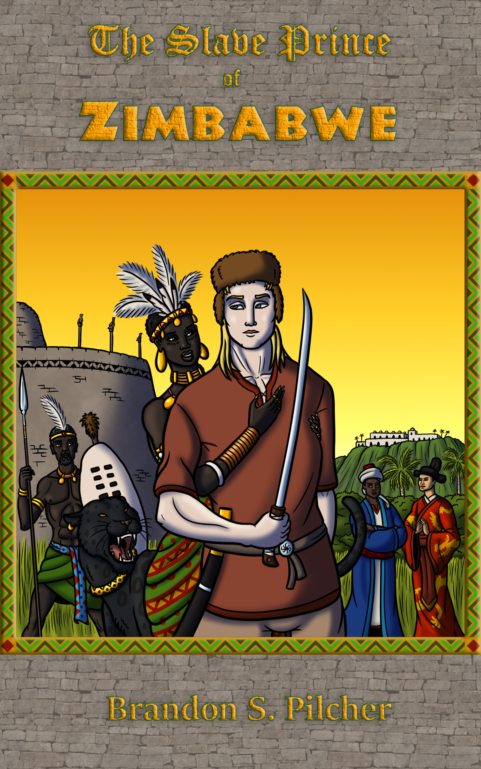
“The Slave Prince of Zimbabwe” is a historical-fiction novella set in the year 1200 AD. Our protagonist, Drazhan Khazanov of Ruthenia, has found himself forced into bondage and brought all the way from his homeland in eastern Europe to the Sultanate of Kilwa on the southeastern coast of Africa. His master the Sultan has offered him a chance at manumission if he can abduct the fierce and beautiful Mambokadzi of Zimbabwe. But when she foils Drazhan’s attempts to capture her and offers him an alternate path to the freedom he craves, they find themselves confronting the wrath of not only his former master but also the mightiest empire in the medieval world.
Will likely appeal to fans of action-packed adventure stories like those of Charles R. Saunders, Robert E. Howard, and Edgar Rice Burroughs.
Nathan says:
Action-packed adventure stories should look like action-packed adventure stories. Howard and Burroughs had something important in common: Their paperback covers were beautifully illustrated by Frank Frazetta, whose artwork was dynamic and active.
Obviously, we can’t all be Frank Frazetta (in fact, only one person could be), but ACTION is needed on the cover of an action-packed adventure story.
If you need more inspiration that will work well with your style of colored line art, look at the covers of the classic Conan the Barbarian comics:
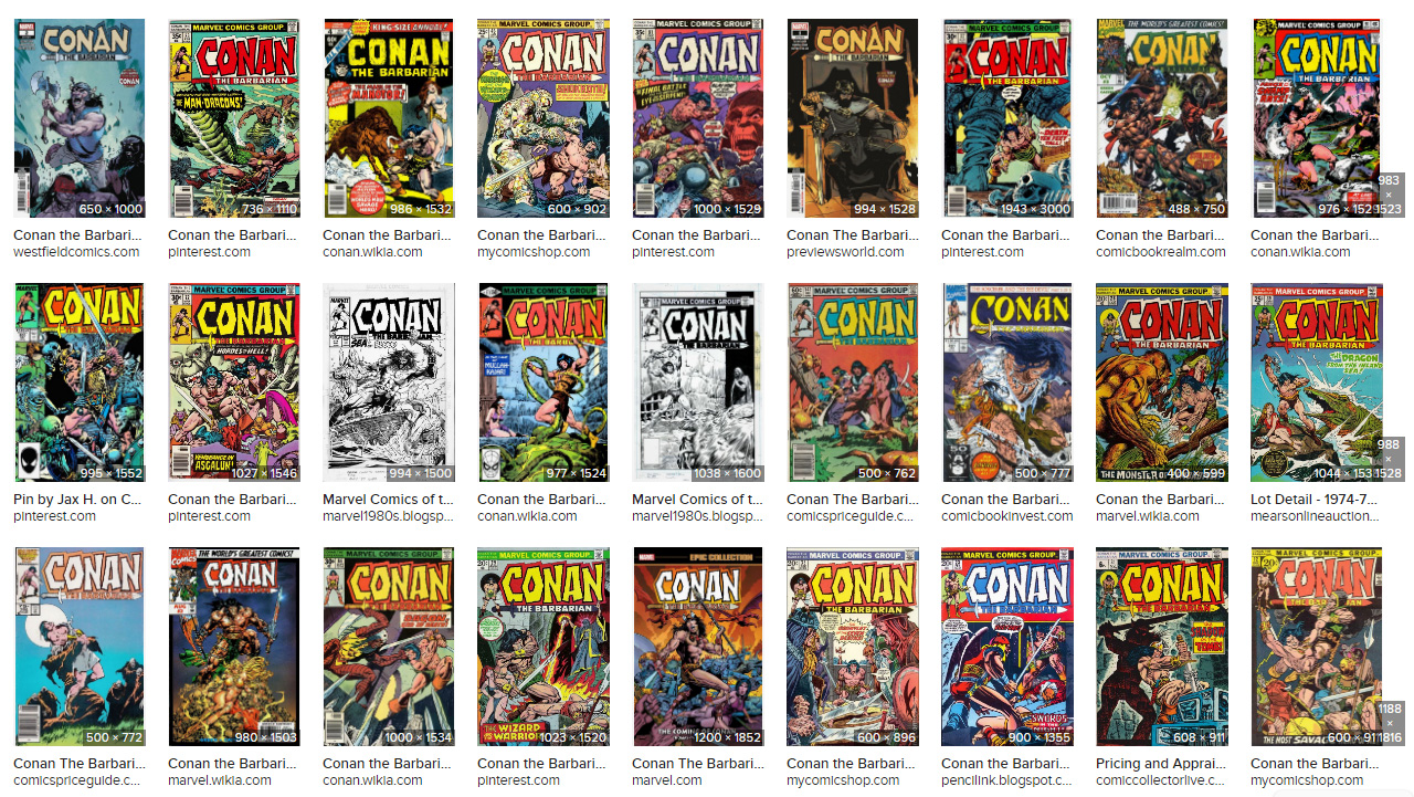 That’s art with adrenaline right there.
Go bold.
I am afraid that I have to agree with Nathan. There is nothing about the cover that suggests ” action-packed adventure.” The hero even looks vaguely bored. There are a lot of issues with the type, but I think the first thing to work on is the imagery: it really needs to be rethought entirely from scratch.
Just getting rid of the un needed texture and integrating the text would make it a 100% better
https://imgur.com/KvtRweb
If you could add in some spears coming at him where the birds are now that would add lots of cool drama. A better expression-something with angst would be better too- give him a glare or snarl and maybe beef up that sword.
Thanks for all your thoughts, everyone!
With the cover design I submitted, I wanted to show the diversity of the main cast as well as the architecture of Great Zimbabwe (which is a major part of the story’s setting). I understand what people mean about the tone of the illustration not showing enough action though?
Maybe having the leading man and lady (the two in the center of the composition) in fiercer-looking poses showing of their weapons would have been better?
Hi:
Well, there are still commenters here that haven’t chimed in yet and surely shall. Shelley’s revision is 80% better. All the dead design around that image is just…not helping it.
I agree that it needs more action. I get that you were attempting to homage the great Golden Age stuff, but the border, etc. has got to go.
Also, pay attention to Shel’s font treatment. A thousand percent better than what you did. It conveys, very handily, much of what you’re trying to do/say.
Diversity is nice–but it’s not really going to sell books. I’m sorry, but it’s not. Sure, someone who has already found your cover in a search, clicked through and all that and is NOW staring at the cover might think “Hey, diversity, mixed-race couple, cool,” but your cover’s job isn’t to sell all that and tell all that.
Its only job is to get a click. That’s it–clickbait, nothing more. I doubt that the concept of diversity alone is enough to garner clicks, when you are discussing what is clearly a men’s action-adventurer genre novel. (Sure, with the obligatory romance aspect tossed in for good measure.) That’s what you’re selling–classic, historically-based (loosely) men’s action-adventurer that tips its hat to the greats.
Your cover should reflect that.
Hitch
As they say, never put your agenda before your story.
Yeah, exactly that. As I say tediously often, book covers=clickbait. Nothing deeper or more important than that. Trying to manipulate anything beyond that click is a wasted effort.
I’ll put it this way: the only two characters I see on this cover who don’t look like they’re posing for their yearbook picture (and getting irritated wondering how much longer the photographer is going to make them stay in those poses) are the gal (Princess Mambokadzi, I presume?) and the black leopard. The big cat (her pet, perhaps?) appears to be laughing at something, and the way the gal has her arms and hands rather intimately wrapped around what is presumably Drazhan Khazonov has me thinking she’s definitely interested in him as more than just a friend. Other than that, everyone—and I do mean everyone, including Khazonov himself—is standing there posing and looking bored.
Concerning action, what your characters need is not a fiercer pose and not “showing off” their weapons; Khazonov’s pose already has him “showing off” his sword now—exactly like a guy holding a ceremonial sword during an ROTC ceremony for his yearbook photo. What it needs is action like on those Conan The Barbarian covers: having the gal fawning over the hero with her hands all over him—something the gals on those covers often did if they didn’t happen to be warrior women themselves like Red Sonja—is fine, but like Conan himself, your hero needs to be shown not just holding a sword but actually using it. Show him either slashing his way through somebody or something, or standing there with his bloodied blade leveled at somebody or something after he’s already slashed his way through the fray.
As for “diversity” and other such buzzwords, I should point out that the only people who care about such political abstractions are “sensitivity readers” and other such rent-seeking virtue-signaling spongers, not the prospective readers who might actually want to buy your book. When marketing your book—which is the sole purpose of cover design—always remember you’re trying to sell it to readers, not critics. These days, a fawning review and a dollar might buy you a cup of coffee from a vending machine; whereas an angry review and a million book sales can buy you a mansion.
As long as we’re making comparisons to Conan The Barbarian here, I should probably point out all of that franchise’s pulp novels (and comics, and—later—movie adaptations) were pretty much adolescent male power trip fantasies. When not focused on the savage hero’s bulging muscles, the artwork in the comic books regularly featured exactly two kinds of women: scantily-clad damsels in distress, and scantily-clad warrior women; not exactly the kind of stuff that gets you a friendly review in any “woke” publication these days, to make a mild understatement. Yet they sold, and they sold well: back before the very first Terminator movie made him a major celebrity, if you asked people about Arnold Schwarzenegger, anybody who wasn’t drawing a complete blank would probably say “Oh yeah, he’s the guy in those Conan movies, right?”
Now I’m not saying you need to throw out all the progress people have made in promoting racial and sexual harmony in the last half-century and try to pander exclusively to a monochrome adolescent male audience, because not even the Conan franchise’s original target audience was like that; as early as 1984, the movie Conan the Destroyer featured Grace Jones as the tough-and-taciturn black gal Zula who holds her own when fighting alongside Conan on this adventure, and the (mostly adolescent male, though not at all monochrome) target audience was fine with that. What I’m saying is you should focus on selling the story, not on trying to check all the boxes on some critic’s checklist. You’ve already got a guy from an obscure eastern European kingdom (how many people even know Ruthenia is a real name of a nation that actually existed between Poland and Lithuania back in medieval times?) going on an adventure with a feisty African princess all the way down in Zimbabwe (where he’s likely the first and last white guy the locals will ever see in their entire lifetimes) on the orders of the Sultan of a joint African-Arabian-and-Persian island city state; how much more “diverse” and exotic does any of this need to be?
In short, focus primarily on showing the protagonist and his love interest’s adventuring in the foreground on your cover, and let all those exotic background details of the characters and their setting (i.e. his and her ethnic and racial origins) speak for themselves.
SNORT, this is slaying me, lol!!!
I love that you’re privileged enough for diversity to not matter to you (you’re always the hero, after all), but you aren’t the only reader. And you’re taking it for granted that everyone should only want to see you in everything, everywhere.
The cheek of suggesting that having diversity on the cover of a book about Africa is “virtue signaling” …just wow.
I approved your comments for only one reason: So that I could then publicly declare that I’m banishing you for simplistically accusing others you don’t know of “privilege” instead of making an actual case. Begone, foul libtard.
this might be super nit-picky, but…the hero is holding his sword in his right hand, but the scabbard is also on his right side. It’s impossible for him to pull the sword out of the scabbard with that grip…
Apart from that, just make the hero a bit less bored looking and utilize Shelley’s layout tip
Good catch.
I kind of disagree with some of the other comments, diversity is starting to be important. I mean, if you are selling your book in the North America, your readers are going to be pretty diverse. Your protagonist is still the white guy, but you know.
Notwithstanding, I agree that not much is happening in the image, the frame around the image doesn’t look good, and the typeface doesn’t integrate with the rest of the design. Architecture and diversity and all that is good, but it’s like a storyline, they need to be doing something, not just posing. Even in romance novels, that always have some cheesy photo of a guy or girl posing, they’re usually at least making out.
It does matter, especially in a story about Africa. Look, I know some people are used to seeing themselves represented everywhere to where they don’t get the big deal, but minorities DO read books also (and some of us, in fact, write them).
Frankly, the cover could use a lot of fixes to where someone wouldn’t see it and roll their eyes, passing on what they might interpret as (yet another) “non-natives do it better” story. The title, especially with the composition isn’t helping them avoid this.
The “snorting” and politicized talk are implications that such opinions should be avoided if you’re actually wanting to create a diverse cover. The diversity isn’t the problem (and why would it be), nor is it wrong to want to have it. Your story is literally diverse — what would make people interested in such a story not pick it up is if the cover DIDN’T reflect that.