Totem (Book 1: Scars)

The author says:

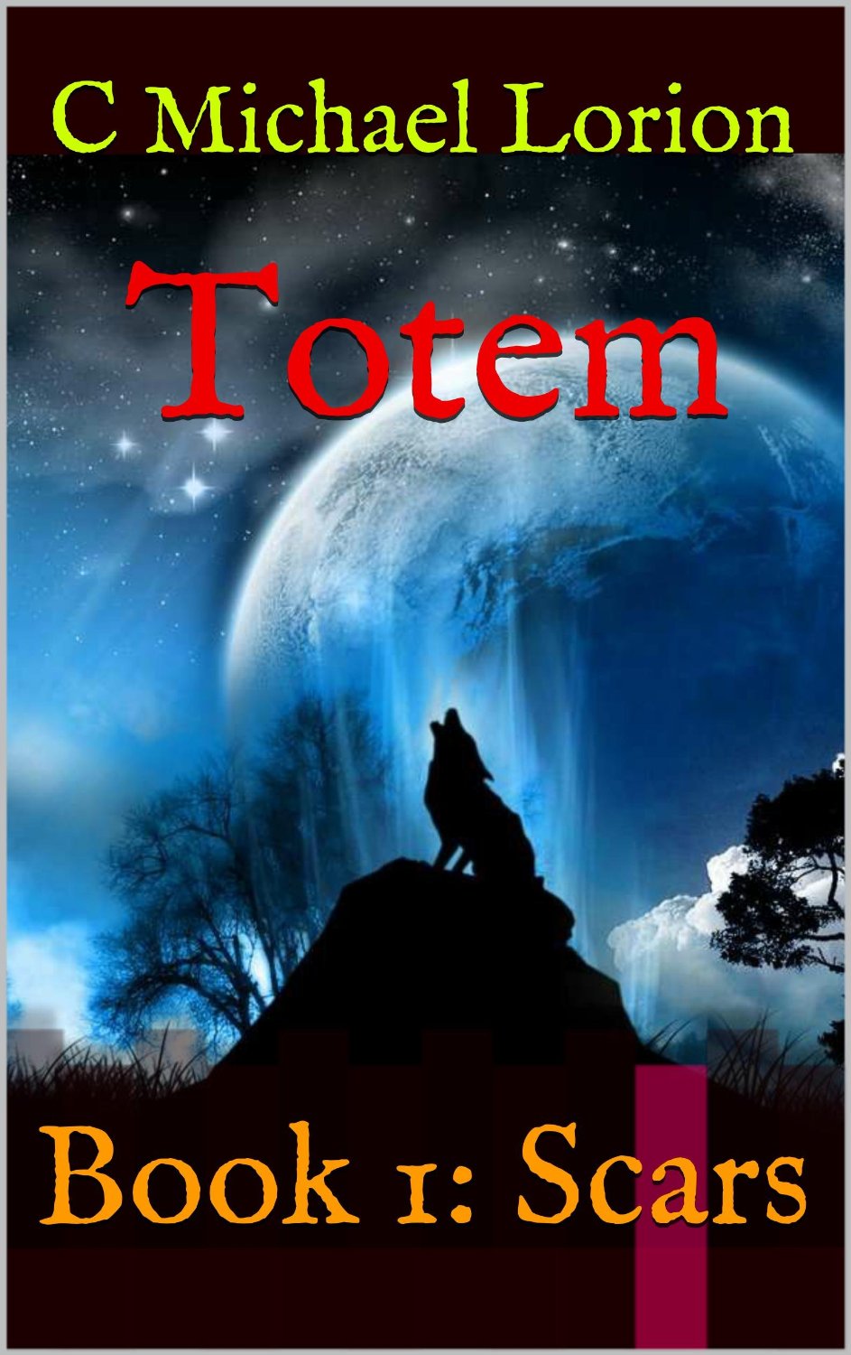
Totem (Book 1: Scars) is set in 1978 in a small Massachusetts city at the beginning of a blizzard. A Passage has been opened on Wachusett Mountain that connects an ancient Native American tribe with those now living in 1978. A brother and sister come through the Passage, one seeking revenge for a past massacre, the other trying to stop the impending carnage. Mystical powers are used by each, including skinwalking and manipulating nature. The genre is urban/dark fantasy and its audience would be readers of Stephen King, Dean Koontz, Robert McCammon, Terry Brooks.

81G0W2v5zTL._SL1500_

81G0W2v5zTL._SL1500_


Nathan says:

First up, you’re probably going to get some grief from this crowd, most of whom also comment over at LousyBookCovers.com, because of the inclusion of that wolf; so many paranormal and historical romances feature a wolf on the cover that it’s become a cliche. I don’t see any specific mention of wolves in your description (it probably falls under skinwalking); if it isn’t essential, you might consider removing that element of the cover.  (The oversized planet-thing is also something you’d expect to see on a paranormal romance cover — don’t ask me why.)

On the other hand, the wolf is the only part that even obliquely references the Native American angle, and nothing in this cover anchors it to the modern day (or 1978, which is close enough). Is there anything you could add — maybe in the fonts, or as a border around other graphics — that lends a Native American flavor to it? I assume that we’re talking about a New England tribe here, so you wouldn’t want Navajo blankets or Pacific Northwest totem poles, but…

From a strict design standpoint, I like the color scheme and layout. I’d suggest you change the font for “Totem” (leave it as is for the byline and volume title) just for a little more variety — possibly something sans-serif to contrast with the serif font. Also, as you can see in the thumbnail, the title text intersects with the edge of the moon; it’s a bit distracting. If you keep the moon element, you might want to either move things around or make the title text stronger so it doesn’t get “beat up” in the thumbnail.

In summary: Pretty good design, but I’m not sure it advertises your book accurately.

Other thoughts?

The Magician’s Horses [resubmit]

The author says:

The Magician’s Horses is a Sci-fi novel built heavily on mystery and suspense. My intention is to extend beyond the usual Sci-fi audience to reach any young adult reader, while also appealing to the older, more sophisticated Sci-fi fan. I am still working on the wording for the back cover, but envision it reading as follows: “Follow Dave as he is drawn out of his solitary life by a mysterious couple who introduce him to a world of adventure far beyond his television remote. Science and thought combine to form a magic act that breaks the boundaries of time and changes Dave’s world forever…”

tmh

tmh

Nathan says:

This is definitely a much stronger cover than the original. Strictly from a design standpoint: I think there’s too much dead space. Make the amulet bigger, and strengthen the grid/sine wave pattern in the background so it can be seen in the thumbnail. (It’s the only SFish element on the cover, and while I understand you don’t want to pigeonhole the book as sci-fi, I think the hint needs to be stronger.) Also, I’d toy with the font so it’s a little less common; Impact has been so overused (especially with LOLcats and such) that it’s lost a lot of its effectiveness. Here’s a five-minute redo to illustrate what I mean: tmh-redo

You could experiment further. Maybe make the background pattern bigger; there’s no reason the text can’t overlap it. I kept my font choice to the same general feel as yours, but maybe a more ornate font will fit the bill better.  Make a couple of different versions; look at them big, look at them small, look at them side by side with books that you think they’d be shelved with. Other ideas?

Something Taken [resubmit]

The author says:

In constant conflict with her family, Terry leaves home to prove she can make it on her own. Arriving in Denver, her plans unravel quickly and her drinking lands her in trouble. Then all her plans collapse when she is stopped by the police and the officer intimidates her into submitting to his pleasure. The cop isn’t content with one encounter and pursues her relentlessly. The only one Terry can depend on is her pup, Sprout. But the escalating pursuit is about to reach a deadly climax. SOMETHING TAKEN is a urban crime drama set in the 70′s. It’s graphic realism is directed to an adult audience.

something take cover A2 dark

something take cover A2 dark

Nathan says:

Definitely better at advertising the genre here. I can instantly tell “cops and a non-cop woman,” which is what I need to know.

From a design standpoint, the bottom half of the cover looks very plain compared to the top half, with too much of the unbroken red background.  I would scrunch the title, the silhouette and the byline further toward the bottom so there’s not as much empty red space to draw the eye.

Anyone else?

Something Taken

The author says:

In constant conflict with her family, Terry leaves home to prove she can make it on her own. Arriving in Denver, her plans unravel quickly and her drinking lands her in trouble. Then all her plans collapse when she is stopped by the police and the officer intimidates her into submitting to his pleasure. The cop isn’t content with one encounter and pursues her relentlessly. The only one Terry can depend on is her pup, Sprout. But the escalating pursuit is about to reach a deadly climax. SOMETHING TAKEN is a urban crime drama set in the 70’s. It’s graphic realism is directed to an adult audience.

something taken city cov

something taken city cov


Nathan says:

I think this cover suffers from the same thing that the previously posted one does: it doesn’t convey the genre that the blurb describes.  Seeing a city from far away doesn’t say “urban crime drama” to me; there’s no indication that this is a story involving police, or non-consensual (semi-consensual?) sex, or the ’70s (that last might not be a bad thing, but…)  If I had to guess, I’d assume that the cover shown here is about a woman taking a self-discovery road trip away from the city with her dog.

If you want your audience to think “urban crime drama,” show me city streets at night. Show me police lights. Show me a face with heavy chiaroscuro shadows. Show me a bold, blocky typeface.

What does everyone else think?

Kali’s Eye

The author says:

This is young adult Adventure/Mystery: For two children, who have spent their entire lives in a tea garden, traveling from India to England is an adventure in any sense of the word. Reality supersedes imagination when they meet three impetuous cousins, an imperious Scottish viscount, and discover that England is not nearly as jolly as they expected. As they blunder through caverns, sail the high seas, and ramble through grand houses, it becomes increasingly clear that the events that are unfolding around them are bound by a mysterious yellow diamond, known as Kali’s Eye…Yet, even Kali’s Eye has no power over the looming thunder of War.

Kali's Eye Cover Olivia Graham resized

Kali's Eye Cover Olivia Graham resized


Nathan says:

I think the biggest problem here is that this doesn’t look like a young adult mystery/adventure (and if, as the description says, your protagonists are two children, then what you might have here is a middle-grade mystery/adventure, and it looks even less like that).  Take a look at the books with which this one would share shelf space: Colorful cover schemes, bold type, characters in active poses, etc.  Compared to that, this book cover looks like an introspective women’s drama.

There are other design problems here — the biggest being a title font which obscures what it says, even at full size — but I think that’s all rearranging deck chairs on the Titanic compared to the biggest problem of genre and audience mis-match.

Anyone else think differently?