The author says:
This is young adult Adventure/Mystery: For two children, who have spent their entire lives in a tea garden, traveling from India to England is an adventure in any sense of the word. Reality supersedes imagination when they meet three impetuous cousins, an imperious Scottish viscount, and discover that England is not nearly as jolly as they expected. As they blunder through caverns, sail the high seas, and ramble through grand houses, it becomes increasingly clear that the events that are unfolding around them are bound by a mysterious yellow diamond, known as Kali’s Eye…Yet, even Kali’s Eye has no power over the looming thunder of War.
Nathan says:
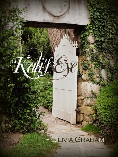
I think the biggest problem here is that this doesn’t look like a young adult mystery/adventure (and if, as the description says, your protagonists are two children, then what you might have here is a middle-grade mystery/adventure, and it looks even less like that). Take a look at the books with which this one would share shelf space: Colorful cover schemes, bold type, characters in active poses, etc. Compared to that, this book cover looks like an introspective women’s drama.
There are other design problems here — the biggest being a title font which obscures what it says, even at full size — but I think that’s all rearranging deck chairs on the Titanic compared to the biggest problem of genre and audience mis-match.
Anyone else think differently?


I agree the title font is a bit too swirly and hard to read.
As for the picture – perhaps if there was a child coming in/going out of the gate.
It’s the font that strikes me as the worst mistake. It looks like a parody of a swirly, script-y font, with its twirls and loop-de-loops run amuck. But you’re right that the photo, while very nice to look at, doesn’t speak to the YA/middle-grade genre at all. I guess I’d recommend studying Nancy Drew and Hardy Boys covers; as near as i can tell that’s the sort of vibe this book is aiming for.
The cover gives no hint as to the time period that this takes place in. It looks like a spiritual book, not a mystery/adventure. The title font, besides being hard to read, seems more appropriate to a romance.
I’m sorry but there’s nothing about the cover that seems to have any connection to the blurb. It is a lovely photo though. Perhaps if there were children on the cover…
The title font makes me think romance – as does the cover itself. It’s a nice cover, and if the author had written a contemporary romance, this could work.
If this is about two children, it’s not YA. Depending on the ages, it’s probably middle grade, so look through Amazon for middle grade adventure book covers. For instance, here’s one book cover for what looks like a middle grade mystery: [url=http://www.amazon.com/dp/B00C4Y442K/?tag=kb1-20]Shirley Link & The Treasure Chest (Mystery Series for Middle Grade Readers)[/url]. Just type in “middle grade books,” and you’ll see what I mean.
I think you need a cover that focuses on the kids, and the fonts need to follow suit.
The title is all but illegible even to sophisticated adults. Children will find it completely illegible — especially since it includes the name Kali, which they’re unlikely to be familiar with.
The picture simply will not appeal to children at all. To an adult it looks restful, and maybe the open gate will convey a faint idea of invitation. To a child it’s just a boring picture of a garden.
I agree with the idea of browsing a bookshop and examining the covers of the top titles for the age group and genre. I’d suggest a lively illustration of a particularly exciting, action-packed scene, combined with clear, bold text.
Adventure/mystery is a competitive market. The cover doesn’t suggest adventure at all to me. It seems neither exciting nor intriguing: These should be strong elements in the story, so the cover should have them, too.
What immediately bothered me about the typeface was the colors! It looks really awkward to switch between colors just because you need starker contrast with your background picture. I remember doing that for PowerPoints in middle school when I had really cool background pictures… and that’s not the association you want. I agree with everyone else above who suggested putting one or both of the main characters into the scene. I actually like the picture–very Secret Garden, I think–but I do agree that it might appeal more to your readers’ moms than your readers.
How about a flash of light in the corner of the open gateway?
The font is unclear, I actually strained my eyes trying to read it….make it less swirtly and use a constant color. switching colors makes the reader’s eyes have to adjust for each word and it quickly wears them out.
A quick suggestion is to use a less swirly font with a light color, then have it inside a blurred out dark outline to make it stand out.