Frames, Book 1: Nica of Los Angeles

The author says:

Setting: Los Angeles and other dimensions. Genre: speculative fantasy with detective and dystopian elements. Audience: adults who are comfortable crossing genres, able to enjoy Chandler *and* Tolkien, Douglas Adams *and* Dashiell Hammett. Thumbnail: When rookie private eye Nica takes on a mysterious case, she enters a world of multiple dimensions called Frames, where buildings and lawn chairs can be sentient, where a stray cat has great powers, where books can be killers, and clouds can be spies. At home, Nica tackles missing persons cases, while in the larger reality of the Frames she is swept into an escalating battle between good and evil.

nola

nola

Nathan says:

There are two groups of problems here which we can loosely group under “what the cover says,” and “how the cover says it.”

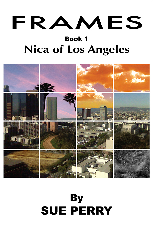
The biggest by far are under “what the cover says.” I get Los Angeles from what I see, but I get nothing that hints that this book contains either detective or fantasy elements — there’s no Chandler or Tolkien in evidence.  If you’re committed to the grid outline (which has its own drawbacks — see the next paragraph), couldn’t you use some of the squares for something other than skyline and aerial shots? How about evocative back streets at night? Noir silhouettes with glowing eyes? Something other than postcard imagery?

Under “how the cover says it,” the biggest problem is the grid itself. I’m guessing that you went with that because of the “Frames” idea, but the grid prevents the cover from having any single noteworthy image as its center of attention.  As you can see from the thumbnail version above, the postcard images in the grid are rendered even more generic.

Another problem under “how the cover says it” are the fonts. There are at least three (I’m guessing that “Book 1” and your byline are the same font), they don’t work well with each other, and — again — not a one of them evokes either detective or fantasy fiction.

And a third problem is the white space on the cover. White space can be very effective when it looks like part of the intentional design (usually, though not always, in nonfiction books). Here, it just looks like you didn’t know what to do with it.

If the covers posted here are salvageable, I like to suggest ways in which that can be accomplished. In this case, however, I think that starting over with a new visual concept is the way to go.

Anyone think differently?


Black Book

The author says:

A Sci-Fi Fantasy Horror Western. Initially set in the old west, the story follows time travelling special forces commando Jack as he hunts down the Black Book. An ancient ledger that can save humanity’s future. Dark forces conspire to put an end to Jack’s mission even before it begins and Jack’s personal demons are dangerously close by.

image

image


Nathan says:

From a design standpoint, there are no egregious errors here. But I think we can fine-tune it to better attract the eyes of the right people.

First, I don’t know that the cover scheme is right for a SF/horror/western — it seems too soothing for me. Especially for westerns, I think one expects “dry” or “dusty” colors on the orange-through-scarlet spectrum. I think that would work for the horror part, too.

Second, the leaf silhouettes look like something more commonly seen in a romantic drama. Maybe it’s just the fact that they’re maple leaves (not really associated with the West).

Third, the way the silhouette of the Indian on the left overlaps the cowboy silhouette is visually confusing.  I know you didn’t want to hide the horse entirely, but I think you might want to sacrifice it for visual cohesion.

Fourth, while the illustration captures the “western” part of the story, there’s not much indication of the SF/fantasy/horror parts (the existing color scheme may be an attempt to indicate SF instead of pure western, but I think all it really does is detract from the western appeal). Maybe a riveted border? Maybe a texture of ominous ancient writing over the lower shadowed parts? Obviously one doesn’t want it to get too busy, but I think this cover would be missing out by only emphasizing the western elements.

Finally, for the description under your name, rather than “previously released as,” you might try “collecting parts 1-5” or “parts 1-5 complete.”

Anyone else?

Among the Red Stars

The author says:

This is a historical novel about the Night Witches, an all-female night bomber regiment that served in the Soviet Union during World War II, flying obsolete wood and canvas biplanes.

Cover

Cover


Nathan says:

So, if I’m understanding your description right, this is a fictionalized account of a true story. Yes?

I like the idea behind it, but I see whole bunches of things I’d tweak.  Most of it becomes apparent in the thumbnail: The cover is dominated by something I just can’t make out.  In the larger version I can see that it’s a plane, but I can also see that it looks oddly comic-bookish.  That may be what you’re going for — it’s a story which lends itself to a knowing pulp flavor of derring-do — but in that case, the comic illustration should look older.

Here’s what I’d do:

  • Make the title larger.  And give it a little more character, like the grungy paint texture one would see with stencils.
  • Remove the “by” from the byline. If readers see a title and a name on a cover, they’re smart enough to understand that the name belongs to the author.
  • Add a simple tagline that gives more context. “Soviet Bomber Babes vs. Nazis!” (Again, I don’t know the full vibe of the novel, so my tagline may be completely inappropriate for this book. But you want as many of those essential elements as you can fit into one line: Soviet, female, bombers, WWII.)
  • Lighten the artwork so you can at least get a glimpse of it in the thumbnail. I know they’re night bombers, but you can still get that across if you leave the background dark and lighten the plane itself.
  • If you were going for a knowing comic-book feel with the artwork, I’d play that up by adding “Ben-Day” printing dots and maybe some paper fold marks.

Other ideas?


Totem (Book 1: Scars) [resubmit]

The author says:

Totem (Book 1: Scars) is set in 1978 in a small Massachusetts city at the beginning of a blizzard. A Passage has been opened on Wachusett Mountain that connects an ancient Native American tribe with those now living in 1978. A brother and sister come through the Passage, one seeking revenge for a past massacre, the other trying to stop the impending carnage. Mystical powers are used by each, including skinwalking and manipulating nature. The genre is urban/dark fantasy and its audience would be readers of Stephen King, Dean Koontz, Robert McCammon, Terry Brooks.

Totem-72dpi-1500x2000(3)

Totem-72dpi-1500x2000(3)

Nathan says:

Definitely a great improvement over the previous cover. It’s a compelling image, and I can definitely see both the Native American and New England story elements.

Here are some ideas for fine-tuning, most of which are “try this and see how it works” suggestions:

  • The black cloud around the title might be a bit much. I’d experiment with thinning it down, or adding a warm tone to it that mimics that of the clouds, or pulling it lower so that it’s more like a drop shadow than an aura.
  • Everything on the cover is centrally aligned, with the exception of the steeple in the skyline silhouette. I don’t think you should move the steeple to the center, because having something be completely aligned can be visually boring, but having that one element out of step with the others makes it look inadvertent.  I’d experiment with moving one or more of the other cover elements off of the center line: the eagle, the moon, maybe even some of the type.
  • I’d make the ReadersFavorite.com pull-quote smaller, possibly putting the quote and attribution on a single line. (You could eliminate “Totem is” from the quote and not sacrifice anything.)

Anyone else? Other ideas?

07/02/14 Update:

Chad sent in his final cover, based on the advice he’s gotten.

Totem-72dpi-1500x2000(5)

Thanks to everyone who contributed their thoughts. This is definitely a much stronger cover all around than the original.

Protecting Emma

The author says:

This is a short in a series that I hope to compile as a novel. I’d like to see if these covers work or not. Set in modern day. A standard “serial killer with a mission” thriller. This would likely (I hope) appeal to anyone who liked “Silence of the Lambs” or John Sandford’s Prey series.

protectingemmasample

protectingemmasample


Nathan says:

There’s nothing here that I’d classify as “wrong.” It seems competent, but unremarkable. If this were my design, I’d now start experiments to crank it up a notch, and here’s what I’d try:

  • pulling the image lower so that I could increase the size of the title (I’d either reduce the space between the letters of “PROTECTING” without squeezing the letters themselves, or I’d increase the font size just of “EMMA,” or possibly both)
  • adding a tint and/or a filter to add some character to the stock photo; take a look at how, for instance, horror DVD covers often add a scratched-up texture on top of everything

You said that this is part of a series, so I looked on Amazon for the rest of them. You’ve been very consistent in the design and layout of the covers, which I was going to recommend. So any changes you make here, remember that you’re going to need to be sure they work across all covers.

Other ideas?