The author says:
Pink Strawberry blossoms is a harem / coming of age story about a guy, Julius, who finds himself as the only guy in an all girls boarding house for the duration of his college course in animation. Being a playboy, Julius finds himself having to manage multiple simultaneous relationships while facing the uncertainties of his future…
Nathan says:
Now, part of the assumption behind critiques on this site is that the covers are for books to be marketed through mainstream platforms: Amazon, Barnes & Noble, etc. Thus, a cover designed to appeal to a small niche market might hit all the bases for them, but still garner plenty of criticism on this site.
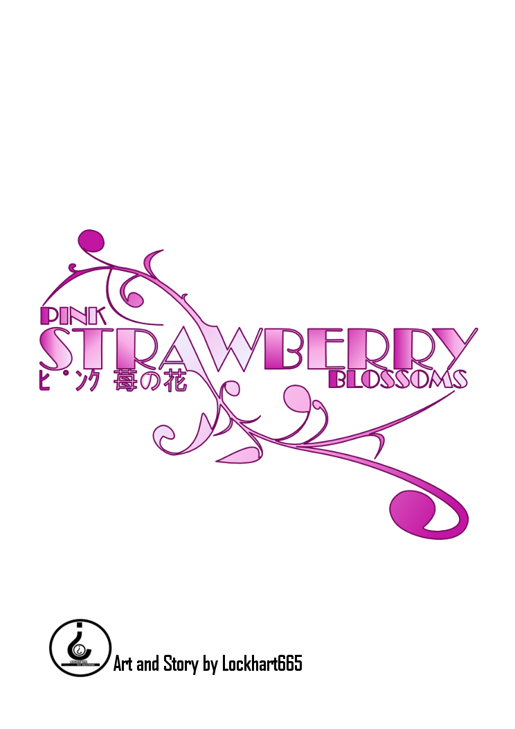
With that said, it’s strong typography. The type does become pretty unreadable at thumbnail size, though; you should consider a stronger outline around “strawberry” at least, so that something is readable at that size. Also, as most ebook sites have a plain white background to their pages, the edges of your cover are going to be invisible on those pages just like they are here; you should include a border of some kind simply for demarcation.
More substantively, I’d say that for a book with an “Art and Story by” byline, the cover should feature some of that art. If you want the type to still be the most prominent thing on the cover, you can reduce the contrast of the image you add, fading it to the background. (I’m assuming, with the anime influence shown here, that any such image would be line art, which fare much better being used that way than photography or full illustration.)
Regarding the author’s name as given: I think that using a screenname for a byline would be a definite turnoff to potential buyers on the mainstream sites; it screams “fanfic” or “messageboard fiction collected into an ebook.” This is another of those areas where the expectations of a niche market and the expectations of the larger potential market are in conflict.
(And by the way, the huge space between the katakana hi and the maru is really odd.)
Other comments?