The author says:
Totem (Book 1: Scars) is set in 1978 in a small Massachusetts city at the beginning of a blizzard. A Passage has been opened on Wachusett Mountain that connects an ancient Native American tribe with those now living in 1978. A brother and sister come through the Passage, one seeking revenge for a past massacre, the other trying to stop the impending carnage. Mystical powers are used by each, including skinwalking and manipulating nature. The genre is urban/dark fantasy and its audience would be readers of Stephen King, Dean Koontz, Robert McCammon, Terry Brooks.
Nathan says:
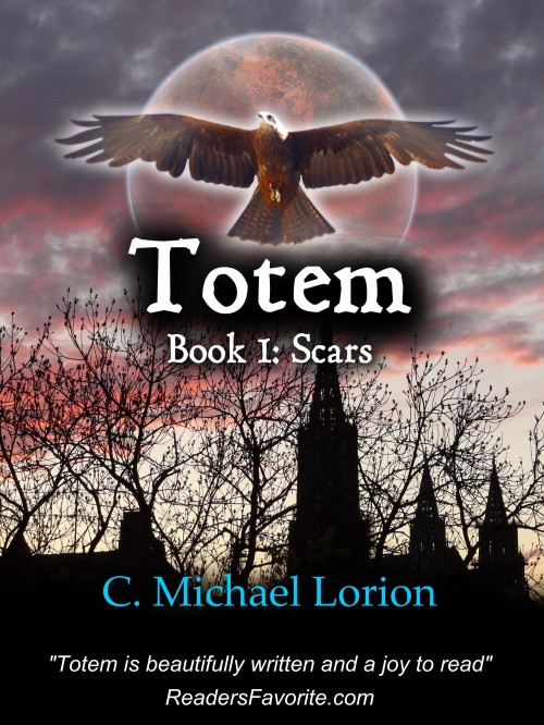
Definitely a great improvement over the previous cover. It’s a compelling image, and I can definitely see both the Native American and New England story elements.
Here are some ideas for fine-tuning, most of which are “try this and see how it works” suggestions:
- The black cloud around the title might be a bit much. I’d experiment with thinning it down, or adding a warm tone to it that mimics that of the clouds, or pulling it lower so that it’s more like a drop shadow than an aura.
- Everything on the cover is centrally aligned, with the exception of the steeple in the skyline silhouette. I don’t think you should move the steeple to the center, because having something be completely aligned can be visually boring, but having that one element out of step with the others makes it look inadvertent. I’d experiment with moving one or more of the other cover elements off of the center line: the eagle, the moon, maybe even some of the type.
- I’d make the ReadersFavorite.com pull-quote smaller, possibly putting the quote and attribution on a single line. (You could eliminate “Totem is” from the quote and not sacrifice anything.)
Anyone else? Other ideas?
07/02/14 Update:
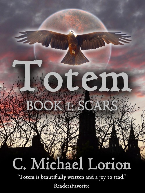
Chad sent in his final cover, based on the advice he’s gotten.
Thanks to everyone who contributed their thoughts. This is definitely a much stronger cover all around than the original.


FWIW, since I’m not a designer, I agree with everything that Nathan has suggested. And this is a definite improvement on the prior cover. Good job! 🙂
Wow, Chad! Nice. I think Nathan’s suggestions are spot on. The first thing I noticed (and that irritated me) was that it’s so symmetrical with moon, bird, text centered. If you can make adjustments there that will add a note of discord, which in the end, I think, will serve you well since the story hinges on time and culture clashing. You could put the ReadersFabvorite quote above your name (about where your name is now) and then more your name down and right so it’s in the lower right corner.
Jayzus, typos much…
It looks to me like the moon is in front of the clouds, which just isn’t possible. I feel like those clouds are too dark for the moon to show through them so much, if that’s the desired effect.
The font chosen for the quote feels amateurish to me. Maybe try something with serifs?
I agree with Nathan about the black shape behind the title being a bit too much. Also, PLEASE fix the tracking between the T and the o in the title. Aslo the blurb should be bolder, and not so wimpy. Also you should add a period after the sentence and a long dash before:
—ReadersFavorite.com
BTW, I love the silo trees and buildings.
I’m going to contradict Don here. 😉
I love the top part of the cover and hate the bottom part. The title needs just a bit of tweaking to look better.
The bottom part could go away if I had any say in this. I don’t like any of the fonts, nor the heavy black part. I would move everything down, to let the top part be the focus of attention, and use the same font as the title and subtitle in a contrasting colour.
You know what this means: Cage match!!!
Bring it on!!
I think you should lose the bird. It clutters up an otherwise good cover. I also think the shadow behind the title should be toned down as Nathan suggested. I might also try out a few different title fonts as I am rather ambivalent about the current one. It is a great improvement though. Nice job.
Pretty much agree with Nathan, as usual.
The asymmetrical placement of the steeple is indeed jarring. If the image can’t be moved to the left, perhaps you could simply add an additional tower…about where the central tree is now. That would shift the visual weight enough. The symmetry doesn’t have to be perfect, just more than you have now.
I also agree about the line spacing, which looks particularly odd with your name and the blurb. I would lower the former and raise the latter. The shadow behind “Totem” definitely needs to be diluted.
The moon looks more like Mars. And I would use an image of the actual moon. I’m not sure what it is at the moment.
————————-
(By the way, the spacing between the T and the O is not “tracking,” it’s “kerning.” And it does need to be fixed.)
I agree with Nathan on all the points, while it is still a nice cover . Sorry, I know ‘nice’ is not what people want to hear, usually. What strikes my eye, besides what was mentioned by N. is the glowing: N. already mentioned the black glow (or is it anti-glow? Let’s say halo-effect) on the title, I also think having the halo on the bird, on the moon AND the title is a bit much.
Thank you, everyone. I just now saw all these comments. Wasn’t notified by email as I was on the first cover, not sure why. Oh well. I made more changes since I uploaded this version and before I read all your comments (which were all very helpful, even if I may not agree with all of them). So glad I found this site. I will upload the final version for you all to see, and you can even make more comments/suggestions if you’d like!
I see the final version earned a positive comment on Joel Friedlander’s e-Book Cover Design Awards for July 2014, so kudos for that, Chad! Joel doesn’t give out his praise lightly.
I saw this, too. Congratulations, Chad!
It also underscores the useful feedback that this site provides.