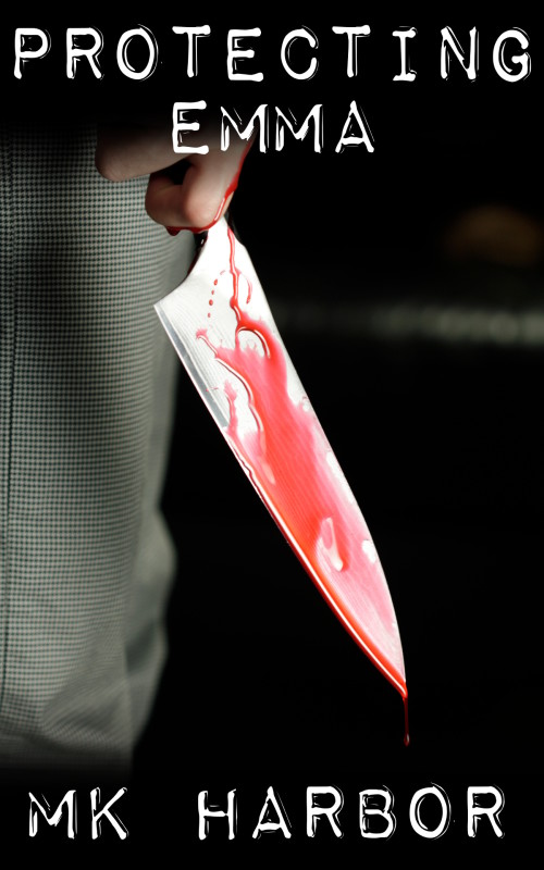
The author says:
This is a short in a series that I hope to compile as a novel. I’d like to see if these covers work or not. Set in modern day. A standard “serial killer with a mission” thriller. This would likely (I hope) appeal to anyone who liked “Silence of the Lambs” or John Sandford’s Prey series.
Nathan says:
There’s nothing here that I’d classify as “wrong.” It seems competent, but unremarkable. If this were my design, I’d now start experiments to crank it up a notch, and here’s what I’d try:
- pulling the image lower so that I could increase the size of the title (I’d either reduce the space between the letters of “PROTECTING” without squeezing the letters themselves, or I’d increase the font size just of “EMMA,” or possibly both)
- adding a tint and/or a filter to add some character to the stock photo; take a look at how, for instance, horror DVD covers often add a scratched-up texture on top of everything
You said that this is part of a series, so I looked on Amazon for the rest of them. You’ve been very consistent in the design and layout of the covers, which I was going to recommend. So any changes you make here, remember that you’re going to need to be sure they work across all covers.
Other ideas?


I would just say either make the ‘blood’ look more like blood or take it off altogether.
I think this can work, but needs a little work. There seems to be a disconnect with the font, to me. I’m not sure what I’m looking at on the left or why it’s there. The knife could stand out better, the blood could look better. I like the color scheme. If the knife/blood really stand out and grab attention, there is nothing to distract in the background, and the font matches better, this may have good potential.
I mostly ditto Nathan’s take on this one, but I too wonder about that dark vertical streak on the left (what is it? Is it needed?).
It is a seam from the pants, is it not?
Blurring the pants would help. This would also put the focus more on the blade. Maybe add a reflection on the blade?
I agree with all that was said here: it’s not a bad cover, it’s just not really interesting. For a short story, it’s ok though. But for the complete book I would rethink the concept, make it stand out more, make it less generic. Another font and layout choice could do the trick. Darkening or desaturating the image could make us forget the blood doesn’t look real.
I haven’t seen the other covers in this series though, so that might set this one apart and we don’t want that. Eventually you might want to redo them all, to fit the complete collection when you have a design for it.
I think it would be more interesting if you saw more of the hand, if it is available. The knife is good image, but the hand holding the knife implies so much more.
Also, that isn’t blood as mentioned before, it does look like someone has just cut up a watermelon. You will have to play with the colour of it.
As Nathan says, nothing fatally wrong…but it could be better.
This looks like one of those instances where the author is so enamored with the cover image they are reluctant to cover any of it up…with the result that the title and author’s name are crowded into the top and bottom of the cover. Not only does this make the type look like an afterthought, it leaves far too much black space, which is almost overwhelming.
I would suggest some retouching of the image: there is absolutely no reason to include the pants leg (nor whatever that blurred horizontal line is on the right). I would also make sure that the image is oriented so that drool of blood from the tip of the blade is vertical.
Cropping the image this way will enable to place it better on the cover—lowering it, mainly. This in turn will allow you to place the type a little more creatively and effectively. I would suggest experimenting with placing the type within the image rather than using the type to frame it.
Like Nathan, I looked at your Amazon author page. Your consistent designs are compelling, and the red circle (missing here) adds to the atmosphere and identifies the series for readers, along with alerting them it’s a short story so they won’t feel misled. I would suggest tweaks of all four shorts to make the red circle legible in thumbnail – heavier, sharper font? Make the circle a tad larger while reducing 3 of the images so the circle doesn’t cover so much?
Then for this compilation, I’d change the title to “The Guardian: Complete Set” (or similar), use the Emma cover image as you have but smaller, and repeat the red circle, this time listing the four titles included.
$2.99 – such a deal for readers, 70% for you! Great start. Lee
I think the blood looks watery and I’m wondering if it might be more intriguing without it. Less obvious. I’d like the knife to be a little off center and the hand clearer.