Paladin’s Odyssey

The author says:

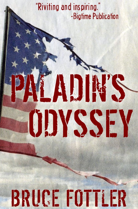
 A dystopian thriller. Joesph Paladin is a national hero everyone thought they knew: A former major in the United States Army, retired colonel in the Maine Republic Militia, and one of the key founders of the New American Confederation. His exploits to reunify a fractured nation in the grim aftermath of a global catastrophe are legendary. But only a handful of people knew his real story. History books will be rewritten as his long awaited memoir discloses a jaw-dropping secret that he’s harbored for decades, along with other untold stories of his past. (PS: No, I don’t really have an endorsement from a big-time publication. I was just curious to see how it would look on this cover. Maybe, someday…)

PaladinsOdyssey

PaladinsOdyssey

Nathan says:

It’s a well-designed cover in terms of aesthetics. I don’t know if it conveys the near-future, semi-post-apocalyptic setting of the novel; if I were to guess from the cover alone, I might expect a WWII or Vietnam-era battle epic or memoir.

For some reason, orange-red or brick-red seems to convey a near-future political dystopia well; you might experiment with adding that color to the background and tinting the ripped flag with it. (And if that makes the colors to uniform, try switching the type to white to stand out).

Other ideas?

Pride’s Children

The author says:

Obsession is commonplace; what you do with it can be exceptional. Pride’s Children is a story of betrayal and love in a modern retelling of the Book of Job that answers the question, Who is allowed to want? The reincarnation of Job is fragile writer, Karenna Ashe, who has lost almost everything—and put herself back together. Acceding to a request for a unique interview exposes her to powerful Irish actor Andrew O’Connell—and the specter of public ridicule, when she falls for a man she never expects to see again. Her competition, Hollywood actress Bianca Doyle, is young, beautiful—and infinitely more suitable.

PC 2nd gen cover

PC 2nd gen cover


Nathan says:

The biggest problem is that the byline font is almost unreadable. Even if it were spaced correctly (a cursive font like that shouldn’t have jarring breaks between each character), it’s still a hard font to read, and the fact that your last name is a less common variant doesn’t help.

I don’t think the title font is the best, but it’s not as distinctly inappropriate. At worst, it doesn’t help convey the genre or mood of the novel.

And really, that’s the underlying problem here: The novel sounds like a romantic modern-day recasting of the Book of Job, but the cover doesn’t relate to that at all; it’s simply generic.  Even if you only indicated the romance without the Job part, that’d be something.  Look at some romance novels (especially those without cover art dominated by people groping each other’s loosely draped bodies) and see how the fonts used indicate the genre.

(I’m not crazy about how the image, the type, and the black bars at top and bottom interact, but I think that’s of secondary concern.)

Other opinions?


Spawn of Evil

The author says:

THIS NOVEL IS AN ADULT FICTION THRILLER The book melds WWII history, murder, graphic sex and extreme serial killer violence into a thrilling novel. It is not suitable for children. While with their parents, who were serving as SS Nazi guards at Auschwitz, six boys with psychological behavior patterns, were selected for a special educational class. Their teacher, who is a Nazi officer, instructs them in the new beliefs of Adolf Hitler and the Third Reich. The young teenage boys are indocumented into Nazism. Through books and teachings, the Nazis prove that the Gypsies and Jews are a threat to Germany, and must be exterminated. The boy’s witness this first hand, while at the concentration camp and are encouraged to participate, in the raping and murdering, of the prisoners. After World War II ends, some of the boy’s parents, as war criminals, are caught and hung. Now, while their being raised by other German families, their psychopath and sociopath behavior festers and becomes heightened, as they approach their late teens. Soon they began to rape and murder Jews and Gypsies.

Spawn Front CoverSm

Spawn Front CoverSm

Nathan says:

If I were to see this in the bookstore, I’d assume it to be either a historical account from WWII, or a wartime novel. What I don’t get — and should — is the “graphic rape and murder” part.  Fortunately, you’ve got all of that red space that would otherwise go to waste; if you overlay it with a bloodspatter pattern in a deeper blood red, I think that could close a lot of the gap between the cover and the subject matter. I’d also be tempted to try adding grungy scratchmarks (the kind you often see on “torture-porn” DVD cases) either around the title text or in the border area, but only once I’d already added the bloodspatters to make sure I don’t over-texture it.

Other ideas?


Tesla’s Signal

The author says:

Visionary inventor Nikola Tesla and his assistant Clara must use their extraordinary talents and devices to save Earth from alien invaders. This is a SF novel set in the early 1900s, with the themes of advanced ‘weird’ science, alien invasion, mind control, interdimensional travel and telepathic beings. The target audience is readers of classic SF, and any fan of Tesla, who is a cult favorite of nerds and New Agers alike.

TESLA SIGNAL cover

TESLA SIGNAL cover


Nathan says:

The historical back-and-white photos look like they’d be more at home on a nonfiction book (especially the assissant Clara, since the poor quality of the photo makes it look like “this is the only documentation we have of her”).  I’d say lose both photos, as they really don’t fit with the rest of the full-color cover.  If you’re worried that that leaves the bottom half empty-looking, then move the Tesla tower further down the page, put your byline at the bottom (and make it bigger), put your blurb closer to the top, and increase the size of the title (which would also help correct the almost-but-not-quite-centered look).  You might also want to experiment with making the dark blue even darker, and perhaps adding a subtle texture to it.  (You could also play with adding a subtle texture to the main part of the Tesla tower; at full size, the computer-generated image looks a bit plain, and a slight texture could help set the tower off from the lightning emanating from it.)

Other ideas?

Scar Jewelry

The author says:

Where and when: southern California, now and in the early days of punk Genre: literary fiction Target audience: readers of literary fiction. Thumbnail: What do we really know about our parents or the ways they shape us? For twins Deirdre and Langston, 20, the answer is: not enough. With their father long dead, and their mother now in a coma, they realize they don’t even know whom to notify. In fact, they understand almost nothing about their mother. They delve into her life and uncover secrets that revise the past and transform the future.

scarjewelry

scarjewelry

Nathan says:

A much better cover than your last one in terms of design. What I’m not seeing here is much, aside from the barbed wire, that relates to the punk genre. Yes, there is the overlapping type, but it’s in far too “gentle” a font to convey much punkishness. Where’s the ripped paper? The hand-drawn type? The in-your-face imagery?

Also: Centering is a bit wonky in the text below the title, and “by” is unnecessary.

Other opinons?