The author says:
Obsession is commonplace; what you do with it can be exceptional. Pride’s Children is a story of betrayal and love in a modern retelling of the Book of Job that answers the question, Who is allowed to want? The reincarnation of Job is fragile writer, Karenna Ashe, who has lost almost everything—and put herself back together. Acceding to a request for a unique interview exposes her to powerful Irish actor Andrew O’Connell—and the specter of public ridicule, when she falls for a man she never expects to see again. Her competition, Hollywood actress Bianca Doyle, is young, beautiful—and infinitely more suitable.
Nathan says:
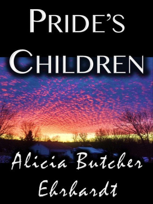
The biggest problem is that the byline font is almost unreadable. Even if it were spaced correctly (a cursive font like that shouldn’t have jarring breaks between each character), it’s still a hard font to read, and the fact that your last name is a less common variant doesn’t help.
I don’t think the title font is the best, but it’s not as distinctly inappropriate. At worst, it doesn’t help convey the genre or mood of the novel.
And really, that’s the underlying problem here: The novel sounds like a romantic modern-day recasting of the Book of Job, but the cover doesn’t relate to that at all; it’s simply generic. Even if you only indicated the romance without the Job part, that’d be something. Look at some romance novels (especially those without cover art dominated by people groping each other’s loosely draped bodies) and see how the fonts used indicate the genre.
(I’m not crazy about how the image, the type, and the black bars at top and bottom interact, but I think that’s of secondary concern.)
Other opinions?


This may be another example of where an author is simply too close to their book to be really objective when choosing a cover image. I am sure the photo depicts something meaningful…but probably only to someone who has already read the book. As it is, there is absolutely no way anyone would be able to discern what sort of book this is or what it might be about from the cover alone.
Once this problem has been resolved you can try to do something about the typography. But this may change anyway with the new image.
By the way, I might add just for the general edification of CoverCritics readers that fonts such as those used for the author’s name here are meant to emulate script or handwriting. To this end the letters need to join, just as if you were writing cursive with a pen. In this example, the spaces between the letters (called “kerning”) need to be closed up until the lettering is continuous.
Heavenly sunsets are typical of religious books. That’s what first came to my mind when I saw the thumbnail. Thus, I think it may grab the religious audience. But I never would have guessed romance. For me, the question is how much you want to convey the religious aspect versus attract the romance audience (which is huge)? Well, the best answer is, attract both.
I do like the contrast. It caught my eye immediately. But, again, if romance readers are browsing thumbnails, this will look far less like a romance than any other thumbnail on the screen.
I like the placement of the C in Children.
Absolutely, the author font needs a facelift. The uniqueness, or trying to set a brand of sorts, doesn’t offset that it looks too wrong. And the last name is unreadable like this, especially since it’s not Smith, Jones, or something that could be read in a hard-to-read font. While the title font is quite plain, it is very clear. The best is to be clear and signify the genre, but if you have to err, err on the side of being clear.
I would start again from scratch, I have to say. The layout of black bars is not quite professional looking, it would be better to have a picture that is big enough to cover the cover, the fonts are not very good – one is unreadable, one is too plain, and not a bit romantic; the picture is bad. Sorry but it is. The light effect on the clouds is beautiful, but it does in general look like something you would post in facebook “look what beautiful sky” for your friends to admire, not a good, professional photo. Also the plain suburban buildings look very unromantic. I am sure many romantic people live in very ordinary houses, but such are the conventions of the genre. Though most romance has people on the cover, I don’t necessarily think leaving them out creates a good kind of uniqueness – people are naturally interested more in other people than in landscapes, they just draw the eye and create curiosity (which at least may result is sales). Even a small figure in a landscape would be more eyecatching.
Thank you all – Nathan, Ron, gp, and Tuula, for your time and your comments.
I agree with the comments about the name font – worse than the spacing is the fact that my name is odd and hard to spell, and the lower case ‘h’ looks like a ‘b’ in the name. So that font is out. Any suggestions?
The buildings will go – you gave me a good idea: a specific building (a mountain retreat) with the possible addition of a woman – both in silhouette (as long as it’s clear in thumbnail) MAY work.
This is NOT a romance – so I can’t let it veer to close to the romance covers (‘loosely draped bodies’ ) or fonts. It is mainstream with a love story. The HEA doesn’t come until Books 2 and 3 – I don’t want to promise what is not in Book 1 and have unhappy readers.
Mainstream is all over the place for covers – which is why I was looking for critique: each one is so different there is no ‘style’ which telegraphs ‘this is a mainstream love story.’
I have scanned literally thousands of covers without seeing one I would like PC’s cover to look like, on many design websites. Genre covers, and even literary covers, send a clue to the readers. I won’t go to a designer without some clear ideas, so I’m still chewing on this.
Again, thanks for your time and your input.
Alicia