The author says:
Where and when: southern California, now and in the early days of punk Genre: literary fiction Target audience: readers of literary fiction. Thumbnail: What do we really know about our parents or the ways they shape us? For twins Deirdre and Langston, 20, the answer is: not enough. With their father long dead, and their mother now in a coma, they realize they don’t even know whom to notify. In fact, they understand almost nothing about their mother. They delve into her life and uncover secrets that revise the past and transform the future.
Nathan says:
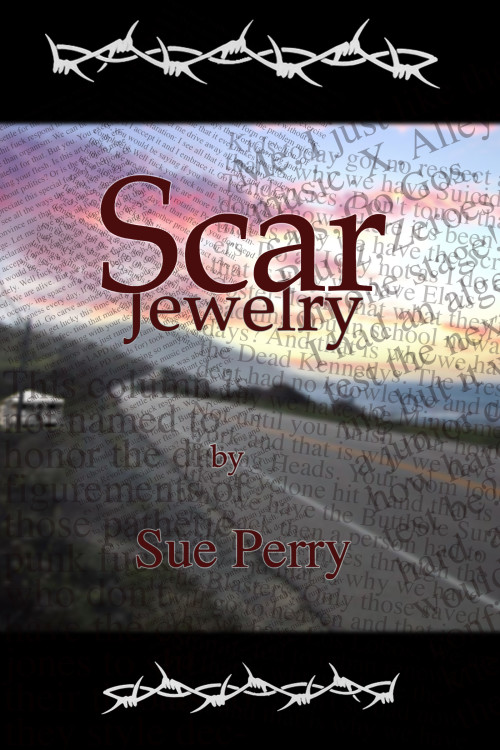
A much better cover than your last one in terms of design. What I’m not seeing here is much, aside from the barbed wire, that relates to the punk genre. Yes, there is the overlapping type, but it’s in far too “gentle” a font to convey much punkishness. Where’s the ripped paper? The hand-drawn type? The in-your-face imagery?
Also: Centering is a bit wonky in the text below the title, and “by” is unnecessary.
Other opinons?


I’m not a fan of the way the barbed wire looks, and I would ditch the transparency. I agree, it may be much more effective if it conveys the genre much better.
Since it’s punk, shouldn’t there be an urban or suburban landscape in the photo? An empty swimming pool used by skaters (if it’s appropriate to your story). Flyers posted outside a club or on a telephone pole? If it were NYC, I’d say a picture of CBGB’s. I don’t know what the L.A. equivalent was.
Found “Get in the Van” on Amazon. I believe that venue on the cover is the Avalon. It isn’t the best picture, but it gives one the sense of the moment, and as it’s Rollins, it has an air of authenticity. YMMV.
Hi. It seems to me that the barbed wire at the top and bottom should bleed off both edges. Most importantly, it would look better. But also, what good is barbed wire that stops in midair? It won’t keep anything in or out. Even barbed wire tattoos go all the way around the arm and join up.
I’m really sorry to have to say this, author, but you should really think about hiring a graphic designer. I don’t think you have the right tools or skills to design this cover by yourself. And I’m really saying this with all respect and without snark: you’re trying very hard and you’re asking for help and I honor that.
There are too many things going on on this cover and no focal point for the eyes. One strong illustration and font well laid out on a plain backgroung would do a much better job IMHO.
Something like those: http://www.pinterest.com/pin/62698619787308516/
http://www.pinterest.com/pin/62698619786846761/
http://www.pinterest.com/pin/62698619787208681/
http://www.pinterest.com/pin/62698619787232809/
http://www.pinterest.com/pin/62698619786065080/
Hey, all, Scar Jewelry author here. I appreciate your taking the time to comment thoughtfully on this cover. Makes me realize just how little I know about what makes a book cover right, including what it does/doesn’t convey about the contents, and when iconic images are appropriate. Also makes me think I should reconsider my thumbnail, because the word “punk” clearly set off a chain of expectations here that are unrelated to this book. Going away to ponder, now.
This is coming close to what I call the “kitchen sink” school of cover design: the tendency to want to put too many visual elements from the book onto the cover.
Mies van der Rohe was talking about architecture when he said that “less is more,” but this applies to book covers as well. Try to find one–or at the most, two–images that convey what your book is about, or what kind of book it is. Remember that, unlike yourself, the reader has never read your book, so try to make sure the imagery doesn’t require any special knowledge of the contents…that is, it shouldn’t require reading the book to make sense. (For example, I recall an author of a Tolkeinesque fantasy adventure novel who put a pretty photo of a rural stone bridge on the cover of his book. When asked what that had to do with fantasy, he said, “That’s the bridge the troll lives under.”)
So sit back and think about what image might best represent what your book is about or is trying to say. This can be something directly from the book or it can be something that simply symbolizes the theme.