The author says:
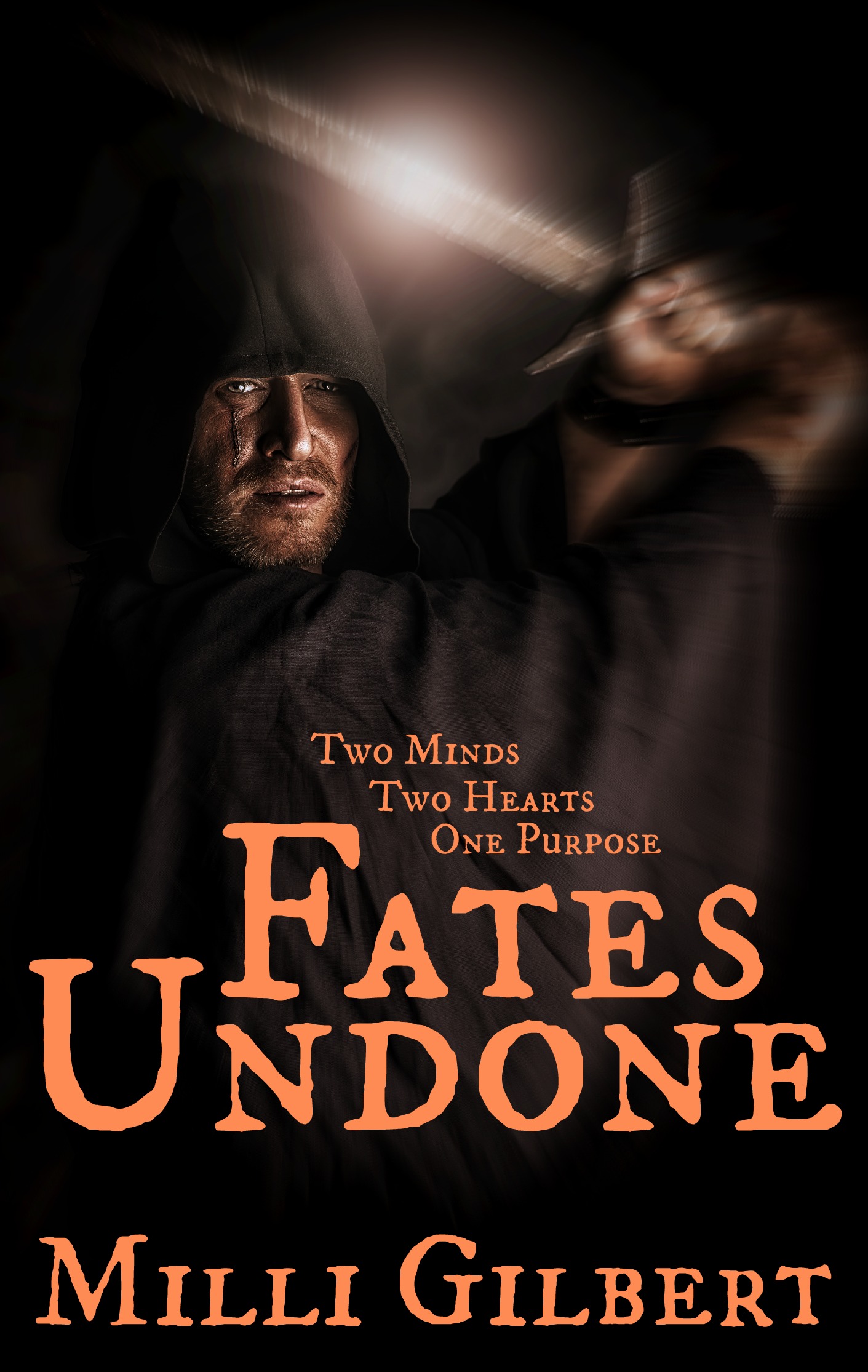
A fantasy set in medieval times, Nara sets out on her spirit quest so she can take her mother’s place as Duchess of Tinn, along with her companion, Barris, and his dragon, Bramble. Along the way, a 1,000 year old spell is broken, releasing a murdered man’s heart and soul from the bodies of Barris and Bramble, turning him back into his true form of Prince Brogan. The new duo complete the task, but along the way, find that Nara’s home city lay in ruins, her father is dead, and her surviving family and friends are in hiding. The queen, banished 1,000 years ago, has taken over the territory with plans to take control of the kingdom. But the son she murdered will stop at nothing to keep that from happening.
Nathan says:
So, my assumption from the description and the current cover is that this is in the “grim fantasy” subgenre a la Joe Abercrombie. Yes? I hope so, because my comments are going to be informed by that assumption.
The best covers for grim fantasy novels have a muted color scheme, as yours does, but I think the most successful of them also have a “gritty” feel to them, which yours does not. I attribute that largely to your type treatment: the color is a continuation of the main hues of your cover image, and the semi-medieval font doesn’t add and information or excitement to what the image tells us.
I think one of the best examples of a cover for the subgenre is this one:
![519kPrCXRKL._BO2,204,203,200_PIsitb-sticker-v3-big,TopRight,0,-55_SX278_SY278_PIkin4,BottomRight,1,22_AA300_SH20_OU01_[1]](https://covercritics.com/wp-content/uploads/2015/01/519kPrCXRKL._BO2204203200_PIsitb-sticker-v3-bigTopRight0-55_SX278_SY278_PIkin4BottomRight122_AA300_SH20_OU01_1.jpg)
The artwork shows visual elements readily identified as “fantasy” (or at least “pre-modern”), while the type treatment wouldn’t be out of place on a police procedural or gritty “FBI vs. serial killer” suspense thriller.
So my advice is to play mostly with the type. Try something that’s not usually a fantasy font, something heavy and sans-serif. I’d probably put it in white, as here, and add a slight grunge texture to it (slight enough that it doesn’t interfere with readability).
And if you don’t intend for this to be a grim fantasy, well, come back for an entirely different set of advice.
(One non-font comment: I’m not sure that the blur in the image really helps. Yes, it lets us know that the face is more important than the hands, but simply playing with the contrast could do that as well.)
Anyone else?