The author says:
An orphan is adopted by pirates and goes on a search for her birth parents through 17th century London.
Nathan says:
You didn’t say, but I’m assuming you’re going for a middle-grade audience. Yes?
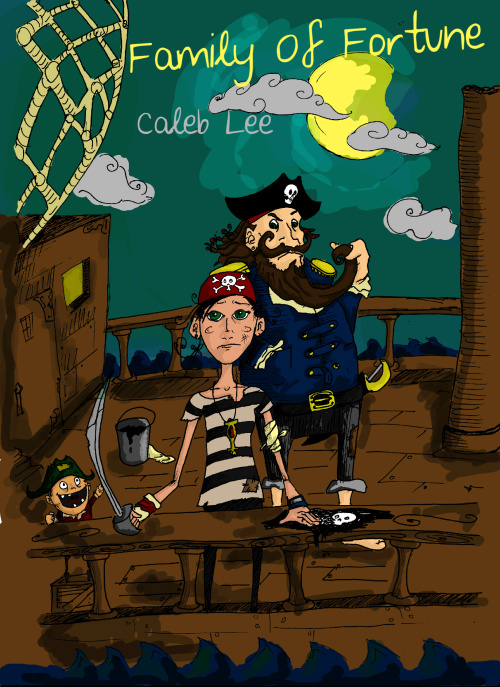
I think the sketchy line art can work, but the color work is just a little too blunt and rushed-looking for me. (Is there any way we could add some clue of gender to the pirate-girl?)
There’s no reason that the title can’t stretch to the left, over the netting. Make it larger and more visible!
Anyone else?


Given the book’s description, I am confused by this cover. To me it indicates a humorous, even goofy storyline. I get absolutely nothing of 17th century London at all, but rather a children’s book about pirates.
In my humble opinion it doesn’t work at all and I suggest a complete redesign with fog and mystery, a London skyline? I am not sure, but this design is not going to sell the book you’ve written I don’t think.
True, if this isn’t a middle-grade ‘Pirates are really fun to hang out with on my light-hearted adventure’ book, this is a complete miss.
The sketchy cover art works. I can tell it is a girl, but a subtle bit more waist tapering could help this gender issue out quite easily.
I noticed a hint of white in the brown right near the left edge near the little pirate, colour that in! 🙂
Some things need to be worked on to make this a better cover.
1. The shading. It would almost look better without it at this point. It needs to be smoothed out with a feathered brush. It is far too ‘Photoshoped in with a hard brush’ looking. The ship and the moon being prime examples. Smoothing would help this. Use a really light opacity brush with full feathering and just smooth it all up.
2. The characters don’t stand out as much as they could. The brown ship is the problem here, and the sky. They can be lightened up quite a bit. Honey oak and twilight!
3. The Title. It shouldn’t be in the moon. I think an extra inch on the top of blank space could do this wonders. Take it from the bottom and remove the waves (as they are far too high up for a boat anyways). I also am not a fan of the font. It looks sketchy, like the art, but it isn’t nearly as charming. This would benefit with a strong confident font.
4. More little pirate. I mean, just look at him. He is the best!
Why is her lower body missing?
Can see the captain’s foot through the balistrade’s and the ocean through the ships opposite side, but her lower body isn’t viewable.
She is wearing black skinny jeans, but they are there.
Which is why lighter wood could help!
I don’t like the girl’s expression and posture. It’s amazing how a seemingly subtle thing like this can affect shopping impulses.
Sketchy art is fine, but there’s a line between art that looks like it was drawn sketchy intentionally and art that looks like it was drawn sketchy unintentionally, and you’re on the wrong side of it. Some (not all) of the things that contribute to this impression:
-The aliased lines. Aliased lines always look unprofessional.
-The girl’s eyes are too high on her face (also too large and too close together). This is a common beginner mistake.
-You don’t have to meticulously color within the lines because you’re trying to look hurried, but you don’t want tiny bits of the wrong color sparkle outside the lines. That’s unsightly. (I even see some background white on the left!) Color with big, smooth motions.
-The problem Char noticed: We can see that the deck doesn’t extend below the balustrade, so her legs apparently end at knee level and she she has no feet.
-The perspective and angles of the stairs and door on the left are way off, again, in the way a beginner would draw.
-The two main figures have wooden, expressionless faces that give me no sense of what they’re feeling or how I should react. The art is not communicating.
I’m not crazy about the illustration, but the cover can be improved immensely if you really make the title pop, make it fun and exciting. As it is now, you can’t read it, especially as a thumbnail.
http://www.amazon.com/Skink–No-Surrender-Carl-Hiaasen-ebook/dp/B00JCS2GTY
http://www.amazon.com/Dork-Diaries-Tales-Not-So-Happily-After-ebook/dp/B00IBHS7DG
I quite like the figures, even if the girls arms and legs look weirdly spindly. The title should be larger as already mentioned, and the sky could be improved.
For me the nr 1 problem is all the brown! Makes it look sort of depressing. I thought maybe showing less of the ship – but then you might not see it is a ship. Solution: Paint your ship? Ships then used to painted, so there is no reason why everything needs to be brown.
…why is the mast broken?
Have a look at other illustrators who use this style of ‘deliberately bad’ illustration — the most prominent one I can think of is Quentin Blake
https://www.google.co.uk/search?q=quentin+blake&safe=off&rlz=1C1CHFX_en-GBGB535GB535&espv=2&source=lnms&tbm=isch&sa=X&ei=VRmWVInXMtfVaqSDgrgF&ved=0CAYQ_AUoAQ&biw=1190&bih=719#safe=off&tbm=isch&q=quentin+blake+book+cover
See how the covers use borders and other devices to contain the chaotic nature of the drawings? Also see how the drawing is fitted around the title, and the title is legible and a focal point. The colours and the way the shading is slapped on doesn’t help. I think the colouring needs to look less bog-standard coloured-on-a-computer effects. See if you can use watercolour effects to match the hand-drawn style.
I agree that this cover is for a light read aimed at middle-grade children. If it is supposed to be anything else, this illustration style is not appropriate for it.
“There’s no reason that the title can’t stretch to the left, over the netting. Make it larger and more visible!”
Actually, there is one reason: the first part of the title might not be legible with the net behind it. Maybe a new font, different coloring, or just bigger lettering would help make it stand out more.
As for the rest of the drawing, I can tell that the main character is a girl, but you really don’t see those legs of hers in those skinny black jeans unless you’re looking for them. The same goes for the little pirate tyke. Something to add a little contrast there would be good; maybe have both kids barefoot, or those jeans riding up just a little bit on her to reveal the flesh of her shins? The cheap “slops” pirates and other mariners wore back in the 17th century before the quality of ready-made clothing dramatically improved tended to do that a lot, you know. The wood on the deck of the ship could use some lightening too; at least some hint of the moonlight reflecting from it would make it look a lot better.
One last thing: other than the tyke, nobody seems very happy in this shot. Unless you’re trying to give the impression the girl has the petulant attitude of a 12-year-old being dragged along on a family vacation against her will, I’d change the expression on her face to be either happier as if she’s thrilled to be on this adventure, or more defiant as though she’s a fiery pirate wench in training looking to use that cutlass. (A haughty and sarcastic expression might work too; she reminds me a lot of Elaine Marley from the Monkey Island games, to be honest.)
A little more synopsis would help decide her attitude; how does our protagonist really feel about her situation, and is she looking for her birth parents in hopes of learning her history and improving her lot, or to avenge their deaths?