The author says:
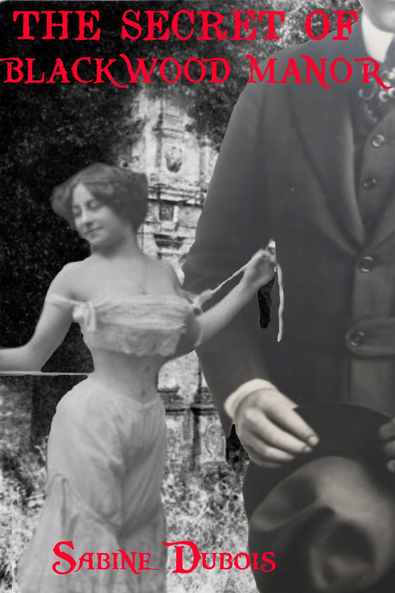
When Mavis Grace inherits her aunt’s manor in the country, she thinks she’s received a chance to clear her family’s reputation. But her luck takes a turn for the worse when she discovers that the manor is haunted. Together with Alois Muscio, the mysterious village curate, Mavis must figure out how to banish the ghosts that walk the halls of Blackwood Manor. Between exorcism, dealing with her husband’s antics, and her budding interest in Reverend Muscio, Mavis’ life has never been stranger- and, when the light of the full moon strikes the Manor’s tower, things get much, much worse. The Secret of Blackwood Manor is a Gothic paranormal romance, aimed at, say, fans of Crimson Peak or Edgar Allen Poe. It’s set in an English manor and the countryside around it in the late 1800s.
Nathan says:
It’s a good thing I have a reputation for being brutally honest, or people might think I’m being particularly hard on this cover.
The brutally honest assessment of this cover is that it’s not very good; it’s got many more problems than good points. Hopefully by pointing out the problems specifically, you’ll see better how to get your intent on the cover.
Problem #1: Type color. Red on shades of gray is hard to read and hard to see. Even in the larger version above, you can see how “Blackwood Manor” blurs into the images behind it; even though the colors are distinct, the contrast (the brightness/darkness) is too close. Now imagine looking at it if you had only moderate color blindness, or if you’re browsing on a monochrome Kindle. The problems are exacerbated in the thumbnail; not only is the print hard to read (which is not in itself a deal-killer), but the lack of contrast practically demands that your eye ignore it.
Problem #2: Type placement. Wedging both the title and the byline “out of the way” is a bad decision even in the best of cases — and by “best of cases,” I mean that the designer doesn’t want to cover up or interfere with the art. That’s really not a consideration here (see below); there’s nothing that demands not to be obscured by type. Instead the type seems like an afterthought instead of an integral part of the design. (And the off-center placement of the byline seems pointless.)
Problem #3: The image. I look at your description, and I see historical-paranormal-suspense-romance. All that I can see of that from the cover is historical (because the images are old) and maybe romance, or maybe just pin-ups. But there’s nothing there to entice me to read. The straight grays — not even sepia tone — is dull and off-putting. The images seem to have no relation to each other; no one component or image is central, either spatially or in terms of visual interest. Technically, the hard edges to image parts (like the headless man’s suit) and the inconsistent contrast in the various image parts make this, very distinctly, several images instead of one image. And none of it seems to relate to the story: Is Mavis Grace a wasp-waisted dancing girl? Is it so darned important to show a man in suit with a hat that he needs to intrude on the cover? (If this were over on LBC, it would have earned the “photobombing” tag from the way that the headless man just seems to stumble into our field of vision.)
If I were you, here are the either/or options I would follow:
a) Start over, deciding on a color scheme and type layout first. Find a pattern — maybe Victorian wallpaper or wood paneling — and play with the contrast and color so that it conveys both age (yellowing works well for that) and suspense (high contrast, with shadows at the edge, is what I’d start with). Let the type take up enough room that it has space to breathe — I’d probably let the title take up at least the top third. Use drop shadows and/or subtle beveling to make the type “pop” from the background. Then decide on a single central image to place on the background, in between the title and byline. If it’s going to be that woman (or not — that particular picture might be appropriate if your heroine is a charming seductress, but not so much otherwise), then color her in such a way that she seems to be part of the cover, then do something distinctive to her. I don’t know your story in depth, but find something either from the story events or the general theme that you can add. Maybe a blindfold. Maybe a big chain instead of those drawstrings. Maybe a birdcage over her head. Whatever it is, remember that a cover’s first job is to entice the kind of reader who would enjoy the book, not to depict any single setting or event from the story. Play with it all, until it looks good at first glance both at full size and in thumbnail.
or
b) Turn it over to a professional designer. If your writing is good, it deserves to be represented by good design, and if your design skills aren’t up to snuff, you need to do what’s best for the book.
Other comments?

![Cux7rxs[1]](https://covercritics.com/wp-content/uploads/2015/06/Cux7rxs1.png)