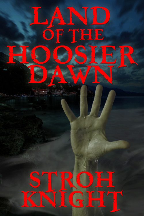
The designer says:
This is the description I received from the author:
“An unforgiving fog from the nation’s most polluted river rolls over a small Indiana town one Friday night in October of 1993. For those who were caught in its path, a new day has dawned onto who, or what they have become. Their bodies have changed and their diet has become “inconclusive,” until dead bodies surfaced at their docks on the inland river channel. For police chief Linton Derr, living in Fogstow, Indiana was a real dream. There was little to no crime. Everybody knew everyone else’s name. It made his job just a little bit easier and helped make the community one of the most desired places to live in the small riverside county that was once desolated by coal mines. But all it took was one big tragedy to put things into perspective. To bring all the skeletons out of the closet and force him to see that even in small towns, evil can walk amongst them. It could hide its deeds in the shadows and when the time was right . . .”
The author received some feedback saying the text was too bright and that the red needed to be toned down, but I think that makes it too murky and impossible to read at thumbnail size. I’ve also tried using white text, but that makes the cover look bland and colorless. It was also suggested that the hand be centered, but that didn’t look good at all. I was pretty confident with the cover until the feedback from other writers started coming in. But they’re not designers, and I put more stock into what you guys say.
Nathan says:
Thanks for making my job easy! This is 90% of a good cover, and it’s a lot easier to pile on that last 10% when the majority of the heavy living has been done.
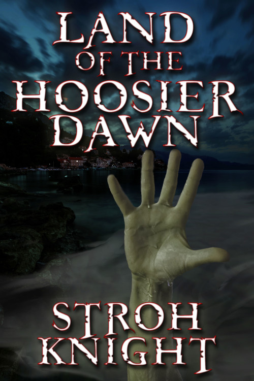
First, regarding the type color: Remember that you’re not limited to all-or-nothing on either red or white. I pulled your picture into Photoshop to try something, and:
I’d play with the width of the red border (which I made darker so it wouldn’t be so garish), and with using an off-white instead of pure white for the centers. I also added a bit of a drop shadow, which is always a quick fix if you’re worried the type still isn’t distinct enough.
Second: The hand. I think an easy fix there would be to tip the hand on the diagonal — say, maybe 20 or 25 degrees counterclockwise. You could thus center its main visual mass while avoiding the “wine glass” appearance of having every cover element centered on the same axis.
Third: You didn’t ask, but I have some issues with the font (Freebooter, yes?). It looks fine for the title — the matching over-extending descenders of “OF THE” is a bonus — but it looks awkward in the byline, where the Ts just seem out of place. Maybe using upper-and-lowercase instead of all caps would solve that problem.
Anybody else?


Honestly, I like the cover with the red.
I find the author’s name much more distracting than the font because I have never seen it before. (Just an observation, nothing more.) I also found it odd that the byline was the same size and font as the title.
Generally this looks great, but I have a few nitpicks.
First, obviously you want the title to stand out, but the red really does look way too saturated against the uniformly dark, unsaturated image. I’d either increase the contrast/brightness on the hand a bit more to make it the focal point or mute the text a bit. (But not too much.)
Second, the background image has a lovely pin-sharp focus, but the hand doesn’t. On the full-sized image, it looks like this is mainly an artifact of how you trimmed the hand, but the fingertips in particular are a little blurry. The hand ought to be as crisply focused as humanly possible, or else it looks like the image’s plane of focus is the village in the back.
This is one of those rare instances where the red font doesn’t irradiate my eyeballs. The title comes across better than the byline. Maybe Nathan’s right, and it’s the all-cap nature of it. Either way, I’d say that Nathan’s white font with red trim treatment is interesting. Maybe the red could be a little darker.
I agree that the Ts in the byline look awkward. Would the author object to his name not being in all caps?
I will admit, I like the white better. Possibly as I have an aversion to red type.
If you don’t like stark white there is always 5% gray. Otherwise there are other colours out there. I just was in photoshop, have a lark, and orange looked pretty nice against that blue. Yes, red is blood, but orange is… fog? Maybe? Well, it looked nice anyways. or a Yellow.
I agree though, pop that hand’s brightness up to increase the contrast!
The description talks about “dead bodies” and “all the skeletons,” so I get the feeling that there might be lots of hands sticking up out of the river instead of just one.
The red type color works for me, but I agree that the byline is a bit awkward. The letters in the byline could be modified a little: the foot of the top ‘T’ flattened and made a more normal length; the foot of the ‘R’ straightened so it stands on the ‘I’, and the “claw” reshaped to echo the curve of the ‘G’; the last ‘T’ is fine.
The shorelines are very dark and might become solid black if this is going to be a print cover.
That shade of red just doesn’t look right to me. Full-size, it doesn’t look like it belongs on the cover. This shade of red may contrast better and be more readable than other (darker) shades, but to me it doesn’t feel like this color fits. In the thumbnail, I find this color hard to read. The white is easier on my eyes and doesn’t send that out-of-place vibe (though the cover looks quite nice like that, it does lack attention-getting color).
Thanks for all your help, guys! I’ve made some tweaks as you suggested and now I believe we have a winner.
http://willoverby.com/wp-content/uploads/2015/06/Land-of-the-Hoosier-Dawn13.jpg
Congrats. It looks GREAT. 😀 Best of luck on the book! (If you’re the author. If not, best of luck in your cover career.)
Very nice. 🙂
Looks terrific. If I were to make one change, I would nudge the hand just a little to the left, so that the light spot on the ball of the thumb would be right on the center line.
Looks great. I agree with the nudge.
Fantastic job! This is a cover that would make me stop and look the book over.