The author says:
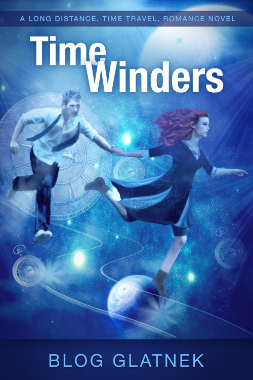
A time travel adventure novel about a top Temporal-agent (female) forced to drag a hapless man through time. Much danger ensues. Written by her boss, the head of the Temporal Agency, Blog Glatnek.
[original submission and comments here]
Nathan says:
Definite improvement! You managed to be a lot more confident in your font use, while still maintaining the feel of the original (as opposed to my more “novelty”-style fonts in my mock-up). Here are a couple of things I would still look at:
1) I think there’s still a lot of wasted space at the bottom — I mean, it’s not like you need to make sure that the reader has an unobstructed view of her left sock, right? I would tighten it up by cropping it a bit, making the top of that solid area behind the byline the bottom edge of the cover, and in compensation cropping a little from the left side.
2) While it’s good artwork, it tends to blur into a blue murk in thumbnail, or when glanced at (and remember, every book cover is first glanced at — it’s only after that first glance that a browser comes back for a second, longer look.) How can you make it “pop” more? I’d place with the contrast and/or the saturation — it doesn’t need to be garish, but a more dynamic contrast of light/dark or blue/red would make it more arresting. Remember, your book cover’s first function is to work like a highway billboard, grabbing the attention of someone who could just as easily concentrate on something else. (Like the car in front of him. Maybe you shouldn’t follow this comparison too far.)
3) The byline. As you said in comments to the original submission,
I (Tanya Park, female) am the author. Blog (male) is the futuristic narrator of the book.
So where’s your name? Because as it stands, there’s no reason for anyone to think anything except that Blog Glatnek is the honest-to-Elvis author. This book will get filed under “G.” If you’re trying to establish a pen name, that’s one thing; but if you’re instead trying to establish the identity of the narrator on the cover, I’d suggest something like:
From the Official Reports of
BLOG GLATNEK
Director General of the Temporal Agency
as told to
TANYA PARK
4) Commas. I’d take as many as possible out of your tagline (i.e., all of them). “A Long-Distance Time Travel Romance Novel.” If you feel really naked without some more punctuation, you could hyphenate “time-travel.”
Anybody else?


Much better! You could, however, crop the image further so that it at least fills the frame and eliminates the need for the bar across the bottom.
I do not understand the tag line at all. I think that you need to get rid of the commas.
Definitely a lot better.
Couldn’t agree more about Nathan’s third point up above. This tactic strikes me as an attempt to be cute or clever, which I find irritating (and I suspect that I’m not alone). It’s your work. Own it.
It looks professional enough that if I had met the author personally, I’d be willing to check it out.
But if I were shopping on Amazon, I’d probably ignore the thumbnail because the artwork doesn’t jump out at me. (In fact, I must strain to make it out.) (Not a fan of the text overlap either.)
The art looked fine in the thumbnail, but the bigger the cover, the dodgier it gets. The composition is fine, but the execution looks more and more like a photomontage the bigger it gets, and the blur doesn’t suggest motion so much as it looks like it was applied to fudge out the cut and paste artifacts. The boots, the sleeves and hem of the dress, and the edges of the guy’s legs are particularly noticeable.
The background elements are mostly fine, but the pair of wavy lines underneath them is too low-res and there’s a noticeable gap between it and the edge of the image.
Could we do something with the bar containing the byline, to make it jump out more? Right now, although I don’t object to the composition, and I’m not as negatively affected by the close-up blur/haze as is Katz, it’s too monochromatic for me. It has no *contrast,* and to me, that’s the Kiss o’Death, unless it’s done extraordinarily well.
I’d consider perhaps using the bars behind the byline and tagline to do something to make the thumbnail leap out at you. If you can’t de-blue the artwork–and I’m not sure how that could be done, having not seen the original artwork–I’d look at that. Not sure, as I’m not an artist (where’s whats-er-name when we need her) what color I’d use for those bars, but I’d certainly try a crapload of colors and shades to see if I could make that fly a bit more.
IF you can “de-blue” the artwork–if, in other words, the original artwork had the man and woman in sharper contrast, with less of a (filter?) used, to make them sort of blend into the background, I’d definitely consider using that instead. If you have the girl’s hair a screaming auburn (not crimson, auburn), better yet. This is me 2nd-ing Nathan’s point 2. You really need more contrast, somewhere. I don’t know what colors you could use on the bars to achieve that, so if you CAN get crisper artwork, I’m down with that idea. And amp up her hair, and the tunic/dress, if possible.
And yes: own that book. Nathan’s idea about the “from the files of…as told to… is good. See if you can get that in there, as you have so much space at the bottom. Maybe a pale yellow, strong, sans-serif font, removing the bar? That would get you some contrast.
Just some ideas. The monochrome feel is not going to help you, in my opinion. Nathan’s words about grabbing their attention early and fast is dead-on.
Hope something I said helps.
Late to the party, and my quibble is so minor you should all feel free to tell me to hush, but…for me, the positioning of the female character is distracting. She doesn’t look like she’s running-it’s more like she’s skipping or dancing. Overall the cover is rather nice; the colors are gorgeous and would catch my eye.