The author says:
Sundrop Sonata is a contemporary woman-and-child-on-the-run suspense novel featuring a heroine whose skills as a piano turner both trip the action and eventually resolve it…The widest target audience would be women readers who are looking for something different in mystery and suspense novels or who have a music background/interest.
Nathan says:
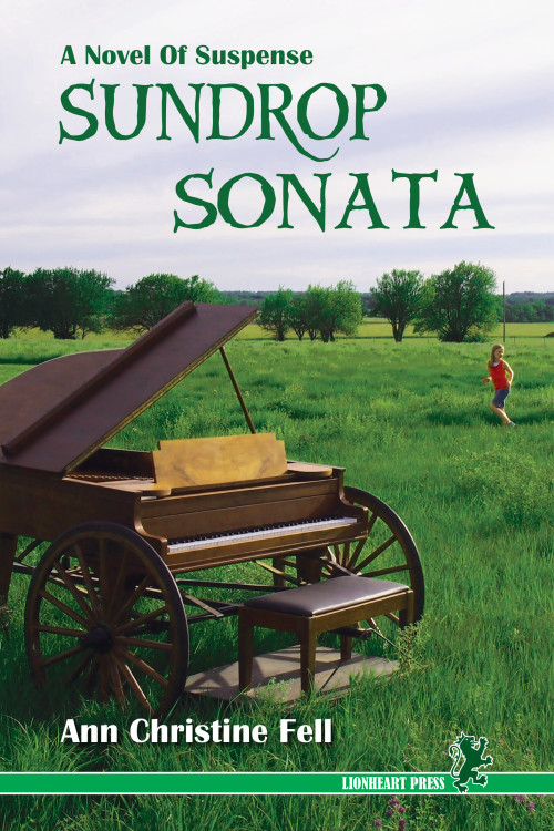
I think it’s a good cover, but not for the book you describe. (BTW, I assume “piano turner” is a typo, unless we’ve started rotating them like crops.) At best, it could be mistaken for a “cozy” mystery; at worst — and more likely — readers would assume that it’s a memoir, or litfic. The “A Novel of Suspense” sub/supertitle doesn’t make up for the fact that there’s no suspense in the cover.
And what does “suspense” look like? At its most basic, it looks like something is wrong with the world. Too many shadows, or too stark, or lighting that says that something is out of kilter. The photo for the cover of your book is the opposite — it looks like everything’s perfect.
Now, here’s what I did in five minutes, playing with exposure and saturation and a couple of filters. I’m not saying this is a good cover, but I think it shows that making things look a little less “perfect” and “right” is good.
Again: Not a good cover. But I hope it indicates the possibilities. If I were working with the original photo, I’d be playing with things like having the girl be the only red tone on the cover, adding some scratch marks, playing with a heavier, grittier font… I hope this gives you some ideas.
Anyone else?


I keep trying to think up something to say about this one, but Nathan already nailed it.
This is a very nice cover, but this isn’t a cover for this book.
Same here. I keep thinking how to add suspense, but I’m drawing a blank. The problem, imho, is that the girl, the only thing that suggests suspense, is like an afterthought. Small and at the edge. I like subtle, but this might be too subtle. So, instead of guessing, I took the liberty of testing it out and made the girl slightly more significant: https://dl.dropboxusercontent.com/u/1656290/Sundrop-Sonata-Cover.png (excuse the crappy copy/paste job). I don’t know if it’s enough to make it suspenseful enough, but personally, I think it’s a step in the right direction. I’ve also tweaked the colors a bit to make the red of the girl’s shirt pop more. The original colors are more correct, mine are a little on the greens side, but I think it makes the red pop more. I don’t even know if it’s a possibility for you to get a new image, so I don’t know how much is this suggestion even worth to you.
So far as I can see, the problem is that this cover would be more appropriate for a romance novel or an advertising poster for a musical than a suspense novel. The background appears to be a rather bucolic-looking rural field, and the piano on wheels in the foreground seems a bit bizarre, but not really out-of-place for a romance novel if it also happened to be a nostalgic period piece about an old-time traveling musician. About the only element that has me anticipating anything is the woman looking over her shoulder, and if not for your description, I would think she’s looking to her boyfriend to enter the frame any moment now for a romantic song-and-dance duet. In short, the mood your imagery sets is all wrong for the genre.
What a suspense novel cover needs is something edgy, as in something that sets the prospective reader’s mind on edge the moment she sees it. (You said this novel was mostly for women, right?) Nathan’s “grainy old over-exposed 16mm film” filter offers at least one possible way to make it look edgier, being somewhat reminiscent of certain unsettling scenes from the recent remake of War of the Worlds. Whether the kind of suspense that color scheme generates is right for your novel, though, I can’t say for sure without further description.
Here’s a thought: you said this was a “woman-and-child-on-the-run” story, right? You’ve got the woman in the frame, but what about the child? A shot prominently featuring a woman with a worried expression on her face hauling her child along by the hand might give your readers more the proper impression you want that something is wrong with the situation: from what are this mother and child fleeing? Read the book and find out!
In fact, having a mother hauling her offspring across such a bucolic setting as this might be even more effective than, say, hauling the kid across a barren wasteland or through a high-contrast grainy photo like Nathan’s that looks like it might come from an apocalyptic film. (Because then you have your readers thinking Oh, so that’s why they’re on the run: “Don’t look back at that mushroom cloud, honey! Keep up with me!”) With the contrast between the serene rural setting and the frantic activity of the mother-and-child, you’ll leave your reader asking more of the right kind of question: Why are they looking so scared in what appears to be such a pleasant place to be? Guess I’ll have to read the book to find out…
Any way you play it, though, you definitely need to bring the woman (and her child) into the foreground and move that piano out to the background. It’s her story (and possibly her child’s) that interests your prospective readers, not the piano. It’s fine to establish that there’s a musical undertone to the story by having a musical instrument somewhere on the cover, but your main subject(s) should always dominate the foreground. For best results, you might also want to have the mother and child fleeing toward us at an angle: as my art criticism professor taught me, diagonals give a picture a feeling of energy and dynamic motion; so make sure your duo-on-the-run is moving diagonally to maximize the frenetic feel of the whole situation.
Even if the mother and child actually spend most of the story hiding rather than running, it’s good to establish on the cover from the start that they’re being pursued. Plant the mystery of what they’re fleeing and why in your prospective readers’ minds, and then they’ll have sufficient motivation to buy your book and read it.