The author says:
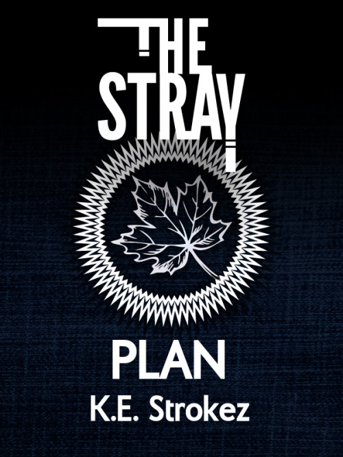
Re-release of “The Stray: To Plan”. Changed the title since people kept getting it wrong. It’s cyberpunk mystery, paranormal adventure, science fiction plus school life. The characters are teens, but the language and situations are more suited to adult readers: so it’s not New Adult cos the characters are too young, but it’s not specifically Young Adult because of the situations (and the profane language). As the first book in a (very long) series, the cover is meant to be simple and establish a pattern. The leaf symbol is integral to the story.
[original submission and comments here]
Nathan says:
I think this is a lot stronger in both original size and thumbnail size: the central image is an icon, and the rest of the cover doesn’t detract from it. (The primary consideration isn’t whether the leaf is an integral part of the story, but whether it’s a memorable graphic element. In this case, it is.)
I’m still a little confused by the title, since what I see on the cover is “The Stray: Plan,” or possibly even “The Stray Plan” (there are two different fonts in use, but both being strong san-serif fonts, I can see how they could blur together). You might be well served to add a colon after “Stray.”
Other than that, I think it’s a good job. Anyone else have comments?


I think it’s beautiful, but the genre isn’t very clear. Maybe you could substitute the spiky circle with a cog, to indicate steampunk? I know steampunk isn’t the only genre, but it’s the easiest one to put on the cover. I’m not sure how I feel about the title cutting into the circle, but that could just be my OCD.
Like Nathan said, it’s a bit hard to figure out which part is the title, but that doesn’t have to be an issue, especially since the title on Amazon can clear any doubts.
This isn’t very helpful, but while this cover is perfectly competent, it just doesn’t draw me in at all. Nothing in this design intrigues me or makes me want to learn more about the story.
I don’t like how the spiky circle is partly overlapped by “Stray” but not by “Plan”. I’d move it down slightly.
I’m not sure what the title of the book is supposed to be. I read it as “The Stray Plan,” but because of the different typefaces and the separation of the words, I can’t tell.
Nor is there anything in the cover that remotely suggests what sort of book it is, or what it might be about. There is certainly nothing at all “cyberpunk” about it.
If anything, at first glance I would assume that the book has something to do with Canada.
Well, there’s the byline; the “keystrokes” thing. Not that that itself blows “cyberpunk” for me.
I wish I knew what to say about this cover. I do. I have no desire to pile on, but it just doesn’t make me want to pick up the book. Something about it is off-putting to me, and I’m not sure exactly what that is. It’s not merely lack of excitement, although that’s certainly part of it.
Any chance, author-publisher, that you might consider tweaking the fonts a bit? Or…perhaps ONE of the elements could have a splash of color? It’s clean and it’s crisp, but my feedback would be that it lacks excitement and intrigue, which I think are crucial to a Book.
Sorry. Wish I had something more clarifying to add.
Hi there! I am new to this site, but I just thought I would comment – being a Canadian, I couldn’t help noticing that the symbol on this cover looks very much like a Canadian penny.
I am going to guess that is probably not your intention, but that is what Canadians will see first.
This screams Canada to me.
Does anything really *scream* Canada, though? Unless it’s at a hockey game?
Burning oneself with a Tim Horton’s coffee. That screams Canada.
I stand corrected.
[I was raised in Canada, so I’m allowed to make Canada jokes.]
I didn’t even notice!
Someone send the Hockey Squad over here to remove all of my maple syrup rations for a month! I failed at Canada!