The Reaper of Gaia

The author says:

A Civil War sharpshooter is tasked with helping hunt down an enormous mountain lion picking off immigrant workers building the transcontinental railroad in the foothills of the Sierra Nevadas in 1868. He finds himself caught in the middle of a battle between the immovable presence of nature and the unstoppable force of modernization. Hunter becomes the hunted as he toils with the idea of picking a side in this eternal conflict. Historical fiction novella addressing the themes of the cost of modernization and how those least responsible are often left to face the consequences of progress.

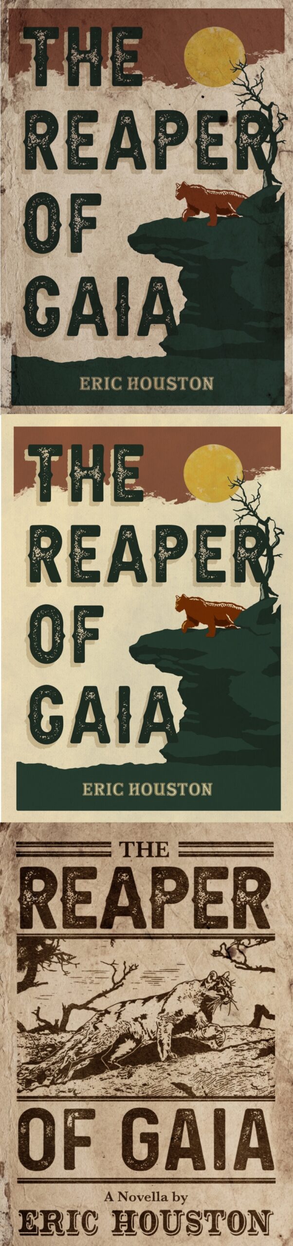
I’ve been toying with three cover ideas inspired by vintage travel posters and 19th century news headlines/posters.

Nathan says:

Of the three, I like the bones of the third one best; lighten the background, then use a halftone of the reddish hue for the mountain lion in the first two to make the lion pop in this one.

I question the wisdom of using “Gaia” in the title of a historical novel, though. While I know that it’s the name of an ancient Greek goddess, to a current readership it immediately brings up post-1970s environmentalism, and thus seems like an anachronism.

Thoughts?

An Army of Lies [resubmit]

[original submission and comments here]

Nathan says:

Definitely a much stronger execution of the concept than the original. Mostly what we’re into here is fine-tuning.

  • The knife still doesn’t pull its own weight; as you can see in the thumbnail, it ends up being semi-invisible in the thumbnail. Part of the problem is that the knife you’re using this time has a shorter blade compared to the handle, and the blade is the only part that’s visible as the “i” in “Lies.”
  • The drop shadow on the knife is a little weird, too; viewers can accept shadows on letters against unconnected backgrounds, but this instance means that a knife is casting a shadow on the sky.
  • Something about the color scheme makes me worry that people will see “slasher horror novel” rather than “police vs. serial killer novel.” I can’t support it rationally, but something makes me think that tweaking the city lights to be slightly more yellow; and making the lights at street level clearer — especially a couple of dots of blue-and-red police lights — would make a big difference.

Other comments?


Perlgate

The author says:

I am the author as well as the cover artist.

PERLGATE is a young adult sci-fi. The chief of security of a space federation is forced to discharge his best friend after he becomes commander under suspicious circumstances. Longer description on cover.

Issues I’m aware of: I know the earth’s curve doesn’t line up; the program I used to make this (Clip Studio) doesn’t allow multiple artboards to be used in the same file unlike Adobe Illustrator, so I had to eyeball it. I also know my art style makes this look like a graphic novel when it’s really a regular written novel.

Nathan says:

This is going to sound really savage. Please remember that I bear you no no personal malice; I’m just giving you the blunt truth.

If you know that your art style is wrong for this cover, why are you using it on the cover?  Your excuse about Clip Studio vs. Illustrator gives me a clue: You don’t think you can afford better. But here’s the point: READERS DON’T CARE. You won’t be able to stand next to every potential reader and comment, “Hey, I know the cover’s not right, but the novel’s really good anyway.” Your cover has to be able to stand on its own, with no excuses. If it can’t, you’re sabotaging your novel sales, and no number of excuses will make up for that.

The second part of the question is, why are you sending us the cover to critique if you know it’s wrong?  I think I can answer that: You want affirmation.  You want us to say that it’s okay.  I get that, I really do; we all want someone to tell us that our mistakes aren’t as important as we think. But that’s not what we do. We bear you no animosity, but we have no soft spot for you in our hearts either. We’re not your Aunt Gladys, who thinks everything you do is just wonderful.

I get being stretched thin and having to decide whether to put money into a cover or make rent. I really do. In this case, maybe you’ll have to settle for a cover that is less customized to your story in favor of it being professional-quality, if slightly generic.

Tough love. That’s what we specialize in around here.

Over Time

The author says:

This cover is for a speculative fiction novella for ages 18+. Setting is contemporary.

Avery Crenshaw’s life is interrupted by the End of the World. He quickly learns that Heaven requires overtime. With personal direction from a very special guide, Avery must navigate raw emotions, submerged memories, and unexpected revelations with the people he loved in life. Reunions with family, adolescent sweethearts, his “first-time” girl, and his ex-wife confront Avery with apocalyptic consequences. He starts asking himself if love had been worth the risk. These encounters lead him on a path through laughter and tears, losing and finding, joy and triumph – and shockingly, back again.

Nathan says:

I’m having a hard time drawing a bead on this novella from your description.  Is it sort of a post-Rapture drama, making-peace-with-your-life kind of thing?  If I’ve got that sorta right, then I think that the cover you have doesn’t work, right down to its initial concept — it simply has nothing visually that would attract the interest of the readers who would enjoy the book. So rather than spending time critiquing various parts of your design, I think we need to send you back to the drawing board, and ask yourself, “How should my cover look so that a reader wouldn’t be surprised by the contents?”

Maze Weaver

The author says:

YA fantasy (sequel, so I have to have the same models on this cover as on the first book, which you can see here: https://www.goodreads.com/book/show/62990067-dreamwalker )

Nathan says:

For everyone’s reference, here’s that first book’s cover:

Well, you’ve definitely got branding down…

I think the biggest problem with both covers is that the photo you have on top is just not impressive — between the lack of expression and either the poor original photography or the processing which washes out a lot of the contrast, it’s a lot less worthy of focus than the lower photograph. However, if you flipped it, the currently-on-top photo would be even less worthy of attention, and the readers who focused on it (secondarily, after the top image) would subconsciously feel that they had expended the brainpower to interpret an upside-down image with no real payoff.

My advice is to revise both covers, using the bottom image as your main image, and ditch the whole concept of the flipped upside-down images. I see from your book’s description on Goodreads that parallel/linked identities is a big part of the novel, but I think you can find a different way to indicate that visually.

Other comments?