The author says:
This cover is for a speculative fiction novella for ages 18+. Setting is contemporary.
Avery Crenshaw’s life is interrupted by the End of the World. He quickly learns that Heaven requires overtime. With personal direction from a very special guide, Avery must navigate raw emotions, submerged memories, and unexpected revelations with the people he loved in life. Reunions with family, adolescent sweethearts, his “first-time” girl, and his ex-wife confront Avery with apocalyptic consequences. He starts asking himself if love had been worth the risk. These encounters lead him on a path through laughter and tears, losing and finding, joy and triumph – and shockingly, back again.
Nathan says:
I’m having a hard time drawing a bead on this novella from your description. Is it sort of a post-Rapture drama, making-peace-with-your-life kind of thing? If I’ve got that sorta right, then I think that the cover you have doesn’t work, right down to its initial concept — it simply has nothing visually that would attract the interest of the readers who would enjoy the book. So rather than spending time critiquing various parts of your design, I think we need to send you back to the drawing board, and ask yourself, “How should my cover look so that a reader wouldn’t be surprised by the contents?”
I have to agree 100% with Nathan’s comments. I can’t tell from your description even what the setting is. So all I can say is, this is not a good cover, for any book. But I don’t have any solutions to offer, because I don’t know enough about your book–setting, themes, etc.
General tips: ~search out best selling books that currently appeal to your target market and study their covers.
~your title should take up much more of the cover real estate
~try not to cut your cover in half
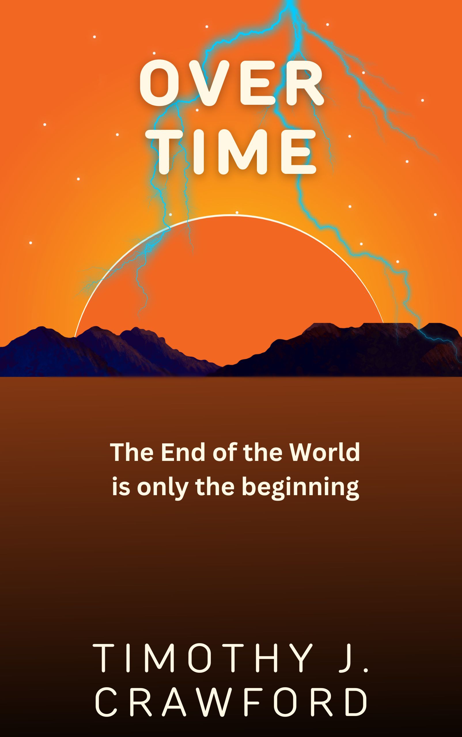
https://imgur.com/hHXjqA8
That’s a very hasty make-over of your existing image along book cover lines, but I remain uncertain that this artwork is the best sales pitch for your story?
I had an idea when I saw this and read your description. What if you make the sun a clock and have the lightning split the ground, leaving a chasm going from the clock to the bottom of the cover. I don’t mean use this art. You need new art. I’d look for a stone clock with a Moses Tablet vibe. I’d use simple trees for the mountain and grass for the plains. green, gray, blue, tones with white and yellow for contrast.
Yeah, I kinda like Shelley’s idea. This particular artwork really leaves me cold. I just…I don’t care for it for this book, and I am not sure what book it would suit.
It’s simply not adequately evocative. There’s no indication of genre–scifi? Fantasy? Litfic? Your basic drama? Can’t tell.
So…I would indeed start over. Sorry.
Minimalism is good but there still needs to be good design…it’s perhaps even more important the simpler a cover is. Better use of the space is needed: half the cover is a flat brown area.
The lighting would look a lot better, too, if it were not a blue that is almost the same value as the sky.
“Over Time”. I immediately found 4 novels on Amazon with that title. So, no, not that title.