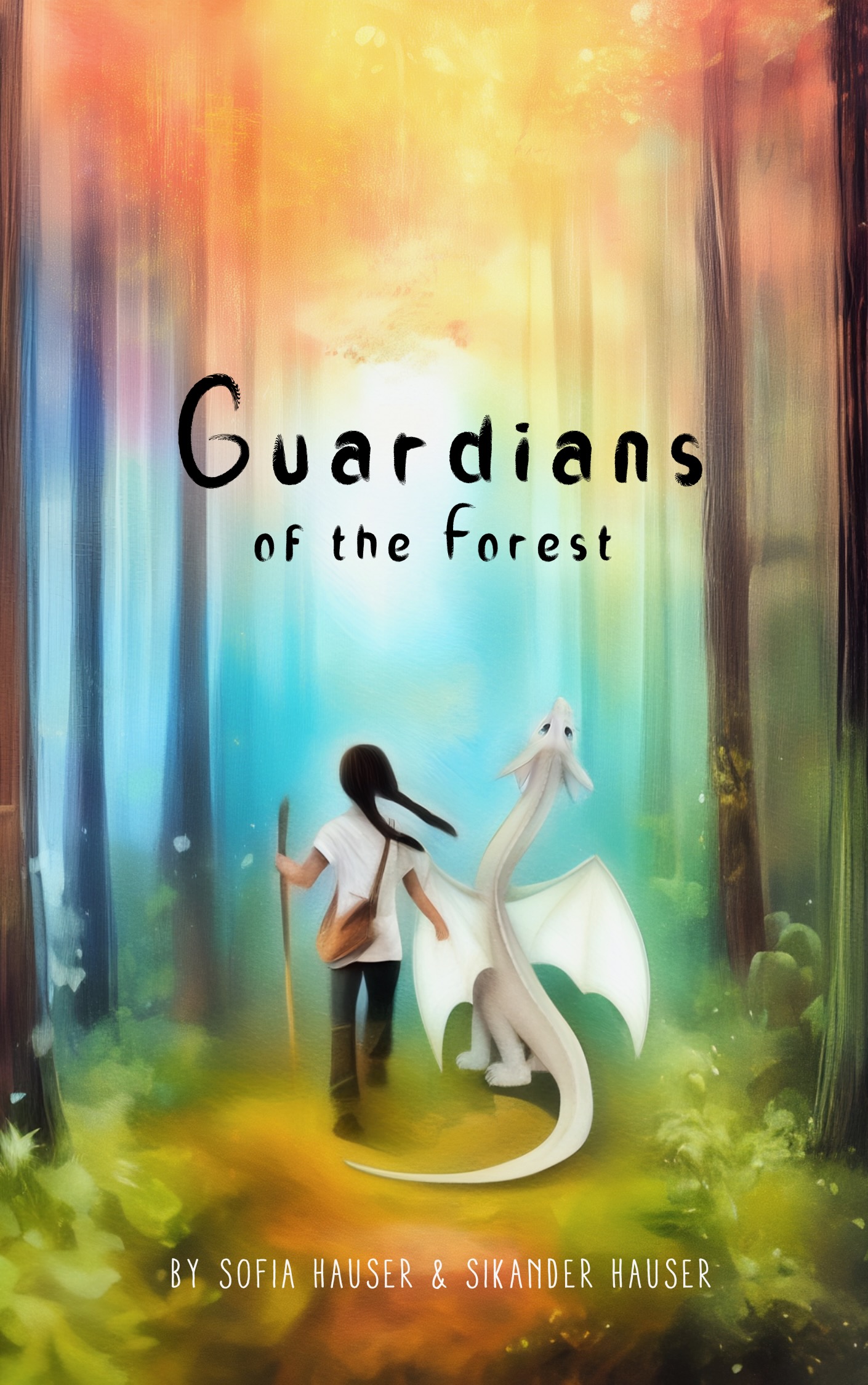
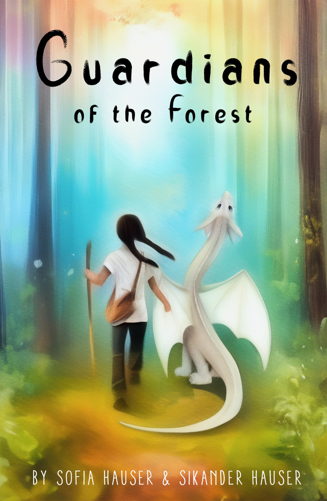
Guardians of the Forest

The author says:

Midgrade adventure story with a female hero, intentionally left timeless. The blurb references a girl meeting a dragon. They then end up on their adventure in the forest trying to topple a bullying wizard. Written for dragon nerds age 8-12 who value the adventure with dragons and are captivated by their personalities and companionship rather than the more popular awe of ‘might beast’ association. The main format is audio book and paperback in libraries.

Nathan says:

It’s good that you’re thinking ahead to whether audiences are going to see the cover first in ebook vs. paperback.  I think there are some modifications that can make the cover much more impressive in print.

First: There’s a lot of unused space which doesn’t contribute at all, especially at the top — worse, it makes the title harder to read and the main focus of the graphic harder to discern. (Imagine that someone is seeing a library book display from a dozen feet away.)

You could make the title larger to fill that space, but that still leaves the central figures too small. I’d say crop and enlarge the whole thing:

Beyond that, three more suggestions:

  1. Use a more impressive, “fantastic” title typeface.
  2. Make the byline bigger.
  3. Refine the artwork. The human and dragon are too smooth, almost blurry; add detail and texture so that the eye is rewarded for lingering on them.

Other suggestions?

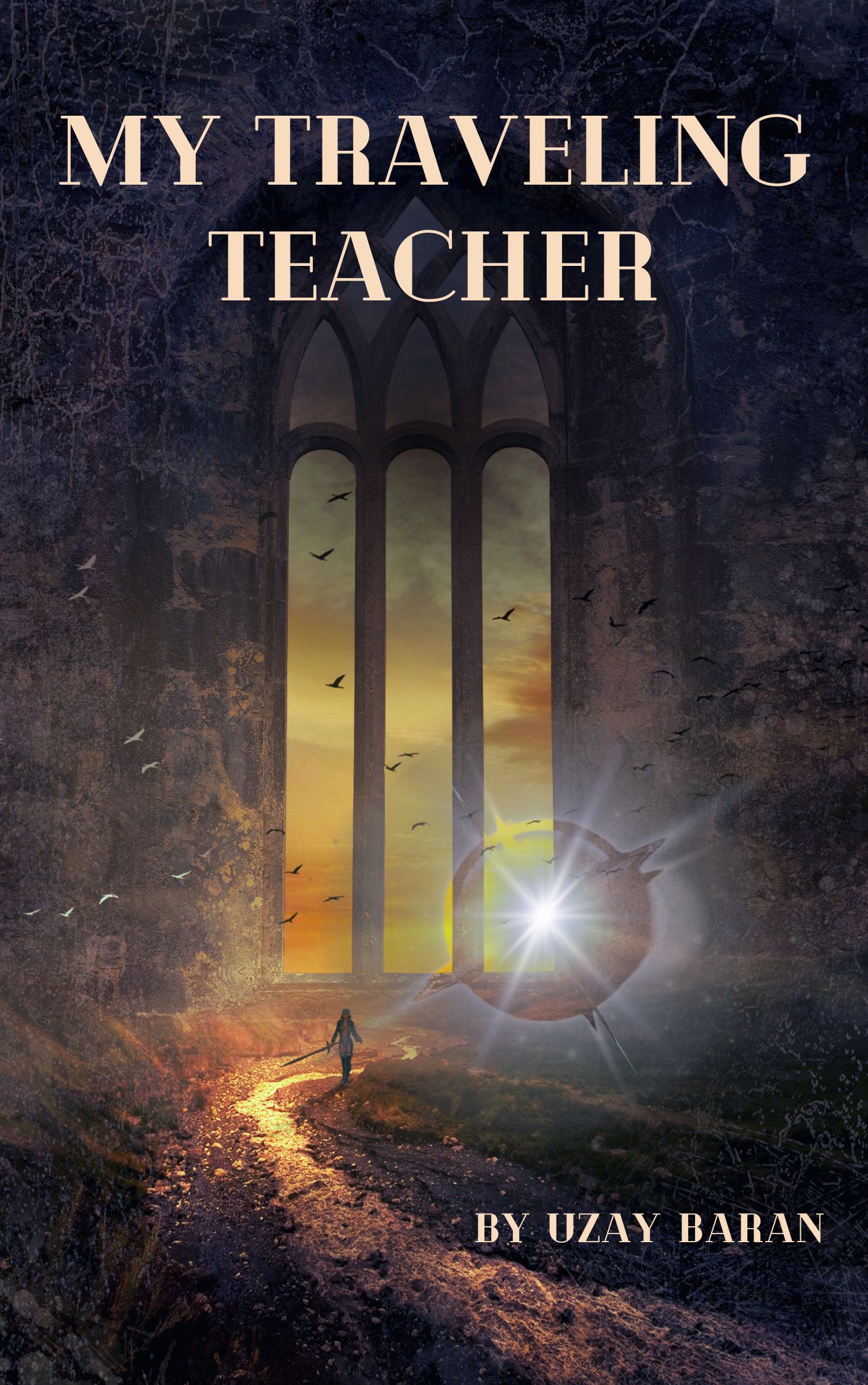
My Traveling Teacher

The author says:

A young woman leaves her home to live the life she wants, traveling between adventures to learn more about life. In one of those adventures, she encounters a mysterious man who will change everything she knows. Together, they start to travel between Realms (parallel universes created by different gods), and we will see how these travel change their lives.

Nathan says:

While there’s a general impression of fantasy here (both the armor and the anime influence to the artwork accomplish that), I think that as parallel universes are part of the likely draw, your cover should give a hint of that. Even something as simple as this…

…might be all you need.

Other comments?

Healing Plates: Anti-Inflammatory Recipes for Wellness

The author says:

Discover the power of food to heal and energize with “Healing Plates: Anti-Inflammatory Recipes for Wellness”. Packed with 100+ mouthwatering recipes, this cookbook is your ultimate guide to reducing inflammation, boosting vitality, and reclaiming your health—one delicious bite at a time.

Nathan says:

I really have no complaints about this, especially if the main focus is to sell physical books. (It might be a little cluttered to look good in a thumbnail for ebooks.) There’s no reason that the byline couldn’t be bigger, though. And “Edition 2025” is in an awkward position; it could probably replace either the cup of sauce to its left or the bowl of soup in the top center.

Other comments?

Snatched

The author says:

Hannah Tree, ex crim Private Investigator gets kidnapped three times while investigating a kidnap case she thinks is con. She’s right. But the kidnappers hire her to find a gangster’s daughter whose fake kidnapping they also arranged. The only real kidnapping is Hannah’s.

Nathan says:

I hope that you were typing that on a phone and that it’s not indicative of the quality of prose.

Any time we look at a book later in a series, we have to balance improvements directly to that cover with the branding for the series as a whole (sometimes the ideal solution is simply to redo all of the covers at once, but that’s obviously a bigger undertaking).  Here are the other covers in the Hannah Tree: Private Detective series:

There’s good consistent branding across the series, without being so tight that it’s constrictive.

This fifth entry tries to follow the same elements, but… Have you changed designers? Or have you decided to ditch the designer and just do it yourself? Because there are a few things that stand out as differing in this fifth cover from the previous four:

  • Byline is similar, but the font and (especially) size are different.
  • Series title now follows the style of the byline instead of the book title.
  • Book title isn’t as bold, nor is it rendered in shades of red.
  • The artwork is less central, less colorful, and honestly less professional.

I think in this case, the changes you could make to improve the cover and the changes you could make to better follow the series branding are, fortunately, the same.  Changes you make to help this cover look like the previous four are also changes which will improve the cover overall.

The biggest single problem I saw, even before I looked at the other covers in the series, is that the image used is too easy to ignore, especially in thumbnail. I understand that you were going for a feeling of stark loneliness; however, the image elements get lost in the sea of blackness, and it doesn’t make much of an impression on the casual browser on Amazon. Look at the ways that contrast and bold colors arrest the attention on the previous four covers; that’s what you need on the fifth.

Other comments?

Hexes & Hijinks

The author says:

Genre: cozy paranormal mystery Readership: anyone between ages 14 to 81 Trying to attract a cozy audience.

Premise: Danika Dreary has a secret: she can psychically tell when someone’s lying. When her grandma Elsie is accused of murder after a matchmaking gone wrong, Danika must use her unique gift to sift through the quirky residents of Mystique, California to find the real killer.

Nathan says:

It really seems to hit all the bases for the genre. I’ve got no suggestions for improvement. Anyone else?