 [original submission and comments here]
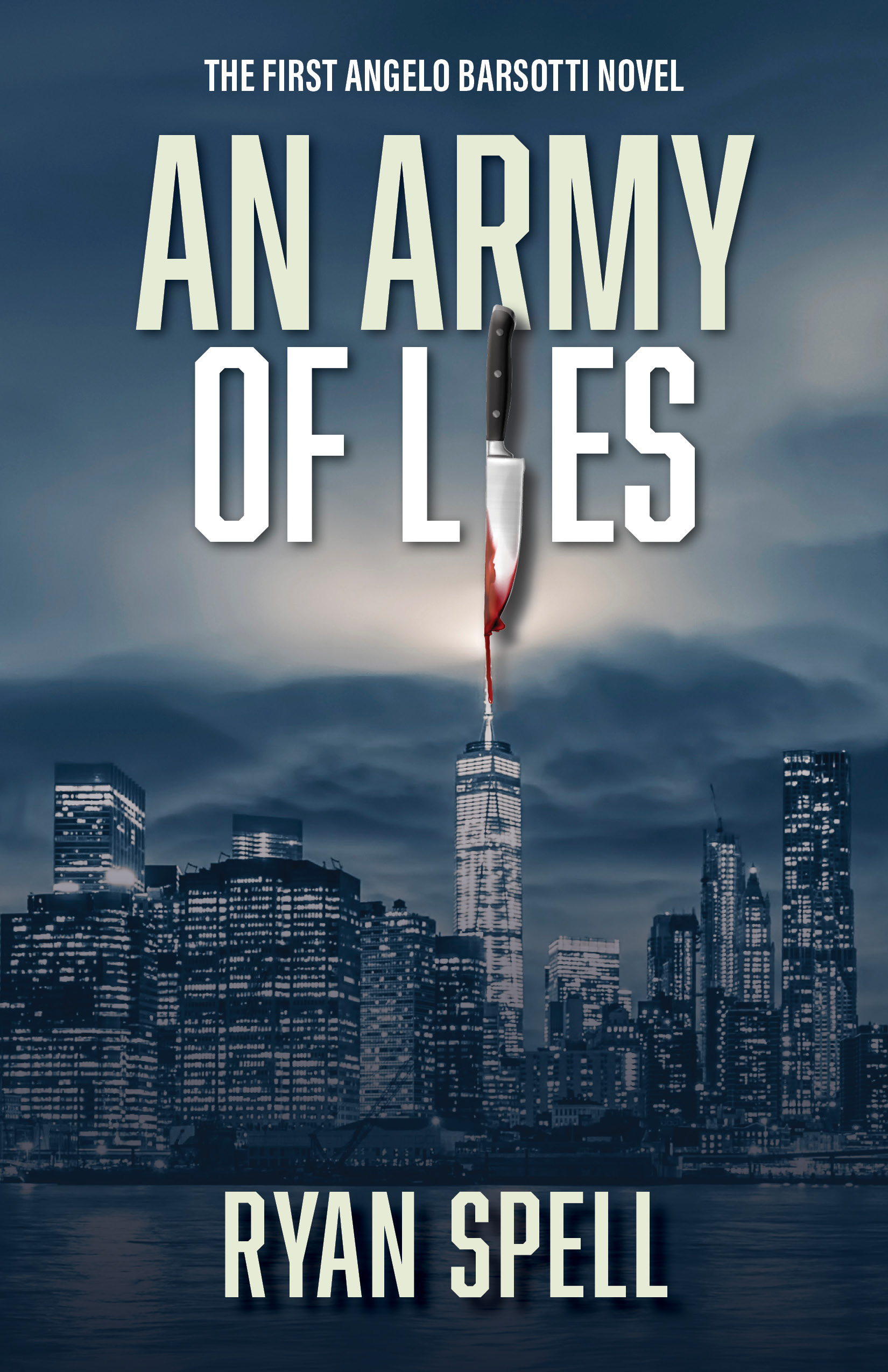
Nathan says:
Definitely a much stronger execution of the concept than the original. Mostly what we’re into here is fine-tuning.
- The knife still doesn’t pull its own weight; as you can see in the thumbnail, it ends up being semi-invisible in the thumbnail. Part of the problem is that the knife you’re using this time has a shorter blade compared to the handle, and the blade is the only part that’s visible as the “i” in “Lies.”
- The drop shadow on the knife is a little weird, too; viewers can accept shadows on letters against unconnected backgrounds, but this instance means that a knife is casting a shadow on the sky.
- Something about the color scheme makes me worry that people will see “slasher horror novel” rather than “police vs. serial killer novel.” I can’t support it rationally, but something makes me think that tweaking the city lights to be slightly more yellow; and making the lights at street level clearer — especially a couple of dots of blue-and-red police lights — would make a big difference.
Other comments?
I agree with most of what Nathan posted (though the drop shadow doesn’t bother me too much). I would like to have seen that dribble of blood a little more interactive, though…especially since it’s (nearly) aligned with the antenna on the tower.
What Nathan said.
Big improvement, love the blue monochrome!
Wow, big improvement! Good job. The knife still isn’t quite working for me. What if you flip it upside down and enlarge it? Make the blade as big as the L ES letters so it looks more like an I. And make the blood drip better.