The author says:
I am the author as well as the cover artist.
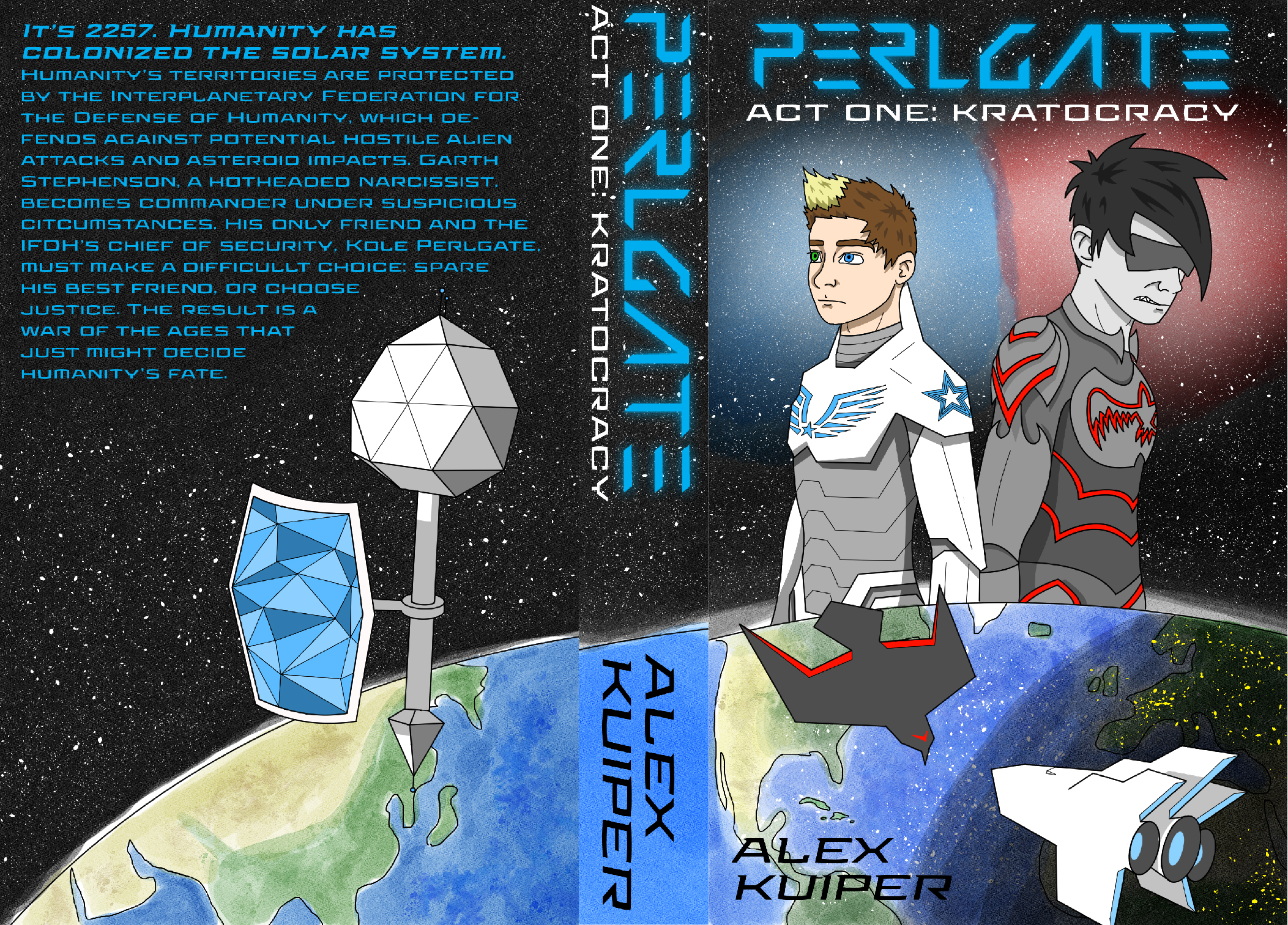
PERLGATE is a young adult sci-fi. The chief of security of a space federation is forced to discharge his best friend after he becomes commander under suspicious circumstances. Longer description on cover.
Issues I’m aware of: I know the earth’s curve doesn’t line up; the program I used to make this (Clip Studio) doesn’t allow multiple artboards to be used in the same file unlike Adobe Illustrator, so I had to eyeball it. I also know my art style makes this look like a graphic novel when it’s really a regular written novel.
Nathan says:
This is going to sound really savage. Please remember that I bear you no no personal malice; I’m just giving you the blunt truth.
If you know that your art style is wrong for this cover, why are you using it on the cover? Your excuse about Clip Studio vs. Illustrator gives me a clue: You don’t think you can afford better. But here’s the point: READERS DON’T CARE. You won’t be able to stand next to every potential reader and comment, “Hey, I know the cover’s not right, but the novel’s really good anyway.” Your cover has to be able to stand on its own, with no excuses. If it can’t, you’re sabotaging your novel sales, and no number of excuses will make up for that.
The second part of the question is, why are you sending us the cover to critique if you know it’s wrong? I think I can answer that: You want affirmation. You want us to say that it’s okay. I get that, I really do; we all want someone to tell us that our mistakes aren’t as important as we think. But that’s not what we do. We bear you no animosity, but we have no soft spot for you in our hearts either. We’re not your Aunt Gladys, who thinks everything you do is just wonderful.
I get being stretched thin and having to decide whether to put money into a cover or make rent. I really do. In this case, maybe you’ll have to settle for a cover that is less customized to your story in favor of it being professional-quality, if slightly generic.
Tough love. That’s what we specialize in around here.
I have to agree with Nathan on one important point he made: If you think the style of the art is wrong for the book, why use it?
And if the software you use is incapable of enabling you to create what you need, you should not be using it.
All that being said, there would be issues even if the art didn’t look like it had been created for a graphic novel. For one thing, you didn’t take into consideration the need to leave room for the title and other type when doing the art. The result was having to crowd the type into what little available space was left. Most professional cover artists will allow at least 1/3 of the cover for type. The imagery is kind of all over the place, with nothing really relating visually to anything else. There is no focus.
Hi, and yes, I have to agree with both Ron and Nathan. This art would never make me pick up this book–or any book. I don’t mean to be cruel, but it’s simply not up to par. And it’s unsuitable for this book. If you look at the covers of your competitors, it’s fairly clear what the market is expecting and what it wants, for a successful book.
There are thousands of fantastic images, at Pixabay, legitimately created and licensable. Especially for sci-fi and fantasy. Here are a few of the artists whose works I’ve used for various things:
https://pixabay.com/users/kellepics-4893063/
https://pixabay.com/users/0fjd125gk87-51581/
and, whoops, I guess another one of my faves has withdrawn from the site, probably tired of giving his art away.
So, I hope that helps.
Maybe you could use one of the spaceships if you did something like they did for Hunger Games or Divergent, which I believe would be your same audience. They use a symbol with lots of effects, fire and sparks for the energy and contrast. you’d need to give it a metalic/3D effect.
PS. I like the art it just isn’t right for the sort of book you have.
You cover doesn’t need to depict *exactly* what’s going on in the book, it just needs to convey a vibe. So free yourself from your list of characters and events, and what the ships, etc. look like. HItch gave you some great resources, and Shelley gave some great tips.
Is this better? Alternate cover
https://drive.google.com/file/d/11Bx6vSj9x3LKZOlj-ljeQYgZrj3V95ql/view
Does it scream fantasy rather than sci-fi?
Maybe not entirely fantasy as such, but without reading the back cover, I’d probably think a book with that cover was about some Indiana Jones-style adventures in archaeology; not a space opera. If your particular space opera story does happen to have some adventures in archaeology in it, then I’d suggest taking some pointers for your cover design specifically from the movie posters for Fifth Element.
I think this could be really close, maybe using a starfield as a background? Put the planet in the raven’s mouth, rather than claw?
quickie sample of what I’m talking abt:
https://imgur.com/FulSGh5
Eh, well, the layout is actually pretty much right for the genre: look at Star Trek or Star Wars or Babylon 5 paperbacks (and some of the hardcovers as well), and you’ll usually see some of the characters from the TV series or the movies prominently displayed on the top of the cover with the curve of a planet’s surface lurking somewhere around the bottom. The contrast between these particular two characters’ appearances pretty effectively implies a conflict between them on both a personal and a political level as well (though it seems to me it would be a fun twist to have that clean-cut guy in the blue and white turn out to be working for the evil empire while the anti-social-looking punk-ish guy in the black and red is actually the noble outlaw working with the heroic resistance). Also, while we do sometimes critique the book’s back cover and spine around here, it’s worth remembering that sales sites typically only display your front cover on the sales page; prospective readers wouldn’t even notice any inconsistency between covers until they’d already bought the book.
That said, yes, the artwork is insufficient—more like the storyboard for the cover than the finished product; what we call art for a refrigerator over on Lousy Book Covers. If it were published with this cover, most of your prospective readers casually browsing the sales sites would assume you were still in high school and only give your book a second glance if they were interested in seeing the early works of a potentially gifted amateur. Unless that really is who you are and what you’re peddling, you do not want these to be their first impressions of you!
What you basically need is artwork that looks at least as solid and substantial as the stuff on the aforementioned space opera novel covers. Since your work is (presumably) not based on any actual movie or show, it doesn’t have to be outright photo-realistic, but the characters and setting need to look like they could be based on some kind of live-action production. If you aren’t sophisticated enough to do that kind of artwork yourself as yet, well… this is the part where you go look up some stock imagery and/or a starving artist on Deviant Art or the like.
Speaking of:
…and…
(Warning, BAB5 Spoiler below, if you have never watched it!)
S
P
O
I
L
E
R
(you’ve been warned twice now…)
Shades of Bab5–exactly that; that G’kar, the alien-“looking” Narn creature/entity/person turns out to be the noble one, working for the right cause, whilst the human-looking Alpha Centaurian, Londo Mollari, is the selfish, not-great person! I always thought that was a great twist, by J. Michael Straczynski. A nice change-up! Good idea, RK!
Maybe somewhat OT but I’m wondering what makes this YA? The subject matter doesn’t really scream YA, and it seems unlikely that characters of YA protagonist age (usually about 16-18, but no more than early 20s) would have jobs like supreme space commander and chief of security. Yet in the cover art the characters do look more like teens/young adults…at a glance I would expect this to be a book about rival teen space cadets, not adult leaders. It would be interesting if there was some reason for this, like a Logan’s Run type thing, or a return to hereditary aristocracy where crazily young people inherit important jobs, or maybe it’s been decided that because older leaders screwed the Earth up so bad, only people from say 15-25 with a real stake in the future can hold any positions of power. If that’s the case I’d probably include that in the back cover blurb, because that would be what really makes this story unique. But if it’s just like, the chief of space security for all humanity is 20 years old, with no explanation…or, the characters are 30+, but are written and drawn as teens…that would just seem kind of nonsensical.
Purely technical comment re your comment about Clip Studio. Why not design the whole cover on one canvas, so it ties together?
Then, if for some reason you do need them as 3 separate files, cut the image up afterwards.
Here’s a crude mockup of how you might improve the imagery.
https://i.imgur.com/prVKUCH.jpg
IMHO, that’s certainly an improvement, although it lacks action.
I think it’s awesome that you both write and illustrate, but something that often gets me about illustrators is when they refer to their artwork as “my style.” It’s important to remember that in illustration, style is a tool with which to convey purpose to your viewers. If you were tasked with drawing a dog, how would you draw the dog? What do you think of the dog and what do you want the audience to think of the dog? Is it a cute and fluffy dog for kids, is it a scary hellhound in a horror story? Asking yourself those questions and finding the purpose of your illustration will help a lot with deciding “style.”
If you feel as though the way you regularly draw is too graphic novel-esque for your audience, you should substitute something more fitting. If you feel that the thing that fits better is beyond your ability as an artist, you may want to try to hire an illustrator or use a stock image. Doing so doesn’t hurt your reputation as an illustrator, if anything, knowing your boundaries says a lot about your ability to self-evaluate.
I don’t really understand why you felt the need to chop this into 3 separate artboards either, but even then, CSP is geared specifically toward comic publication, so it has the same rulers and vector tools that Illustrator has. Unless you were editing vector type, I don’t personally see why that would have any kind of bearing.
I do hope you continue to improve and show us something fantastic someday.