The author says:
Two years ago, Angelo Barsotti lost his wife. As a Private Investigator, he still can’t get over the fact that he cannot solve the case. Angelo moonlights at McGinty’s as a bartender, which is a known cop bar and a great source of information. Angelo and his best friend and associate Lewis Pollard have just taken on a murder case. While working on this investigation, new clues about Angelo’s wife emerge from an unlikely place. A huge technology firm, a military platoon, and a swarm of lies make this one of the toughest cases that Angelo and Lewis have ever had. Will they catch the killer? Will they figure out Angelo’s wife’s murder? Follow along for the twists and turns in An Army of Lies.
Nathan says:
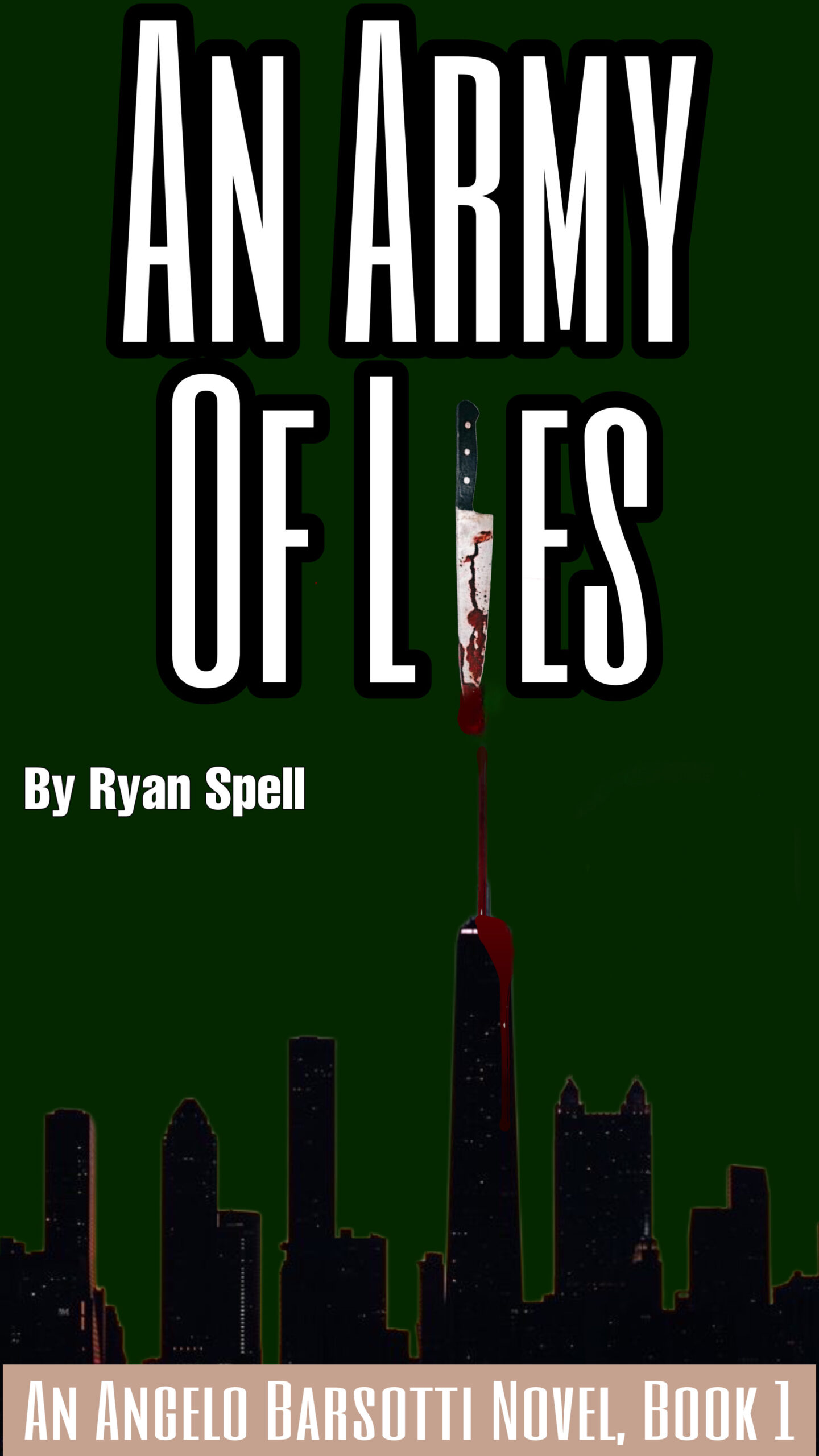
This is one of those cover concepts that looks good in your head, but… as you can see especially in the thumbnail, the knife standing in for the “i” doesn’t pull its own weight. It might work if you enlarged it so that the blade alone takes up the full space that the “i” would, but then you’d have to jigger things so that the handle is both visible and not blocking text behind it.
As it is, the blood drip doesn’t work like that (blood doesn’t run that way), and the cityscape isn’t as ominous as you want.
Plus: I always think it’s best to keep the book title and series title near each other, and the byline separate.
Other comments?
Boring background, timid byline, ineffective knife. Here’s my ten minute redo using the same ideas differently.
https://i.imgur.com/s9GSvPC.png
A lot of that rework is reawlly good, but it does imply a military thriller or mystery or action-adventurer, whilst this seems to be a non-military mystery. I know he said that a military platoon is involved, somehow, but…these definitely look like two covers for very different books.
I took a stab at it.
Oooooohhhhhhhhh, well-played indeed. It’s hazardous at the pointy end of the spear, eh?
The dark green isn’t offering enough contrast; I think this would work better in a greyscale–cityscape silhouette against a light grey sky, with dark grey clouds. Maybe vignette effect in the corners.
The tall thin font of the title is hard on the eyes, maybe a shorter, wider one that fills up more space to the left and right (and lower from the top) would work better. If you want to keep the knife as an I, you would def. have to get the blood right, otherwise it looks silly (and yes, you do want it to have the same weight as the other letters.)
I would ditch the banner strip at the bottom for a solid black base to the city, and put the author name there, making it bigger, and as Nathan suggested, put the series name up under the title. That would give your cover more cohesion and make it look more like a commercial cover.
Before I get into the art, I wanted to mention that this cover appears to have a very “tall” aspect ratio, a ratio of 1:1.8, rather than the 1:1.5 that many (most) print books have (6×9″) or the 1:1.6 aspect ratio for Kindle eBook titles.
I mention this because that ratio is not helping, around the title placement–if the cover were a 1:1.5 or a 1:1.6, you’d have a bit more room. Was this sized for a specific print book? Because 1:1.8 really is rather narrow relative to most book cover sizes and shapes (aspect ratios).
This might have worked had there been any contrast between the background and all of the other visual elements.