An Army of Lies

The author says:

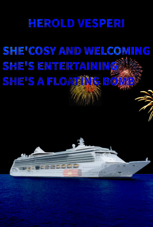
Two years ago, Angelo Barsotti lost his wife. As a Private Investigator, he still can’t get over the fact that he cannot solve the case. Angelo moonlights at McGinty’s as a bartender, which is a known cop bar and a great source of information. Angelo and his best friend and associate Lewis Pollard have just taken on a murder case. While working on this investigation, new clues about Angelo’s wife emerge from an unlikely place. A huge technology firm, a military platoon, and a swarm of lies make this one of the toughest cases that Angelo and Lewis have ever had. Will they catch the killer? Will they figure out Angelo’s wife’s murder? Follow along for the twists and turns in An Army of Lies.

Nathan says:

This is one of those cover concepts that looks good in your head, but… as you can see especially in the thumbnail, the knife standing in for the “i” doesn’t pull its own weight. It might work if you enlarged it so that the blade alone takes up the full space that the “i” would, but then you’d have to jigger things so that the handle is both visible and not blocking text behind it.

As it is, the blood drip doesn’t work like that (blood doesn’t run that way), and the cityscape isn’t as ominous as you want.

Plus: I always think it’s best to keep the book title and series title near each other, and the byline separate.

Other comments?

An Insult Troubling the Elements

The author says:

An Insult Troubling The Elements is a fantasy set in contemporary New Mexico and is targeted to young adults and older.

Xaila commands the powers and abilities as an Enchantress of Turquoise Sky. Responsible for directing the Elemental Forces over the Land of Enchantment, Xaila discovers her work is being interfered with by sinister influences. She encounters an unpredictable Interdimensional obstacle, cryptic signals from an unknown source, and a teenage runaway on the edge of desperation. These challenges threaten the very fabric of the Land of Enchantment. Xaila must find the answers in an exploration of her own past and deep into the history of her ancestral culture. In spite of Xaila’s great skill and prowess, the Enchantress soon realizes the solutions are not entirely under her control.

Nathan says:

Sorry, I think this one just needs to be re-thought from the ground up. The current cover concept gives no idea of what the book is about; there’s neither magic nor New Mexico in evidence, which are the two main selling points. Back to the drawing board (or rather, before the drawing board, back to the brainstorming session).

The COSI Home

The author says:

A practical how-to-get-control-of-your-life book for people with minimal resources (whether time, money, or energy). Written and illustrated by a neurodiverse teacher/traveller/graphic artist. Fully illustrated with mid-century-modern style ‘ink-and-watercolour’ graphics on nearly every page, with high and low options, personal anecdotes, and a detailed workbook included to make solutions fully personal…or at least that’s the plan, because I’m about forty percent through the actual writing at this point. 🙂

I’m the author AND the illustrator, and the central house image on the cover is representative of the inner illustrations, all scratchy pen and fifties-hued washes. Think vintage cookbook or repair manual of the time! Fonts were chosen for that mid-century mod look as well. Is this going to catch the eye of my target audience and suggest practicality mixed with creativity, empathy, and a bit of humour, or do I need to take another run at it altogether?

Nathan says:

I think it’s a great cover concept… but I’m not sure that it’s the cover for this book.  I just don’t see the target audience for “a practical how-to-get-control-of-your-life book” recognizing that they’ll find it behind googie fonts and mid-century modernist architecture — if anything, the first impression of this cover is “nostalgia.”

Without looking at similar covers in the genre, my gut impression is that your cover should give a first impression of “accomplishment in progress” — I can think of several visual metaphors regarding construction, gardening, cooking, etc., although you’d want to keep from making your book look like a gardening how-to or cookbook.

Other comments?

The Flowers of Ishfalen

The author says:

Clean Epic Fantasy/ Christian fantasy. Two gods, two lands, two very different races. But now they have a common enemy, armed with music… An infestation of strange ants is spreading from the north of the continent of Reyth, blocking the magic that underpins and protects two warring lands. That blight is not the only threat. Strangers have arrived, singing songs to entertain and teach. But their music hides an agenda and a secret power. Enemies who fought against each other in the war five years ago must now work together to search for a defence against this double invasion.

Target audience probably also reads David Eddings and Anne McCaffrey. It’s set on another world. The full blurb is on the image.

Nathan says:

You’re trying to avoid the obvious but expensive issue: Most epic fantasy — certainly the books of the two authors you mention — features full custom figurative art on the covers. It’s hard to convincingly say, “My book is like those!” when your book doesn’t look like those.

(On top of that, the font used for the spine and back cover is utterly wrong, but I’m assuming that’s just a placeholder. Right?)

My advice would be to browse ArtStation.com and similar portfolio sites to find a suitable piece of art already created. (By “suitable,” remember that it doesn’t have to have the right hair color for the protagonists and the correct heraldry on the shields — it needs to say, as you said before, that a reader of Eddings and McCaffrey would like this book.)  You’d be surprised at how cheaply an artist will license you the use of his artwork if they’ve already made it for a different project or for personal enjoyment.

Good luck!

Carthage Atlantica [resubmit]

The author says:

This is my second cover design for my novella “Carthage Atlantica”, an alternate-history tale about ancient Carthaginians from North Africa discovering the Americas in 200 BC. This time, I did a composition that made it look as if the war elephant was heading in the viewer’s direction, in response to your criticism of the previous cover design.

[original submission and comments here]

Nathan says:

Yes, you’ve taken some comments to heart, but it seems like you don’t know why those comments were made.  I’m again going to be extremely unfair by using those same Frank Frazetta comparisons:

Look at the strong use of contrasts to draw your eye to the important central figures. Backgrounds, when they exist, are atmospherized for much less contrast. There are no straight vertical lines; vertical lines are static. Instead, everything is focused around dynamic diagonals.  And the illustrations that were meant for book covers have areas in which the title can be inserted for maximum visibility.

Now compare that to yours. The trees and foliage are rendered with as much detail and contrast as the elephant; the “misting” effect only helps to flatten the perspective, making the central figures no more important to the eye than the background. You’ve even taken a step backwards as far as the type is concerned; while the title and byline in the original cover were too small and inobtrusive, they were at least readable against the background. In the new version, both are scrunched into spaces where they compete with — and lose to — the busy image (in the case of the byline, losing the battle entirely).

Here’s an exercise:

  • Find a bunch of dynamic, adventurous old covers by Frank Frazetta, Boris Vallejo, etc. (The covers, not just the artwork. We don’t want to ignore the type placement here.)
  • Do fifteen-second thumbnail sketches of each: Block in the title and byline, and indicate where the lights and darks are, where the lines and curves are. Heck, pull them into your graphics program and look at them in black and white to see where the impact is.
  • Then start your cover from similar thumbnails. Block in big, readable areas for your title and byline, and where you want the viewer’s eye to concentrate.
  • THEN start sketching out your artwork.

Other suggestions?