The author says:
A Civil War sharpshooter is tasked with helping hunt down an enormous mountain lion picking off immigrant workers building the transcontinental railroad in the foothills of the Sierra Nevadas in 1868. He finds himself caught in the middle of a battle between the immovable presence of nature and the unstoppable force of modernization. Hunter becomes the hunted as he toils with the idea of picking a side in this eternal conflict. Historical fiction novella addressing the themes of the cost of modernization and how those least responsible are often left to face the consequences of progress.
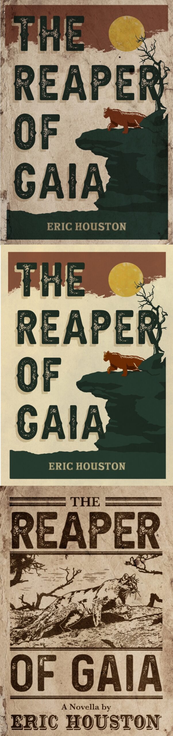
I’ve been toying with three cover ideas inspired by vintage travel posters and 19th century news headlines/posters.
Nathan says:
Of the three, I like the bones of the third one best; lighten the background, then use a halftone of the reddish hue for the mountain lion in the first two to make the lion pop in this one.
I question the wisdom of using “Gaia” in the title of a historical novel, though. While I know that it’s the name of an ancient Greek goddess, to a current readership it immediately brings up post-1970s environmentalism, and thus seems like an anachronism.
Thoughts?
The third one is the best.
Number two is good, too, with a nice 30’s poster effect. I would just get rid of the tree.
At first I thought this was a book about some kind of demon, a horror novel. The image of the creature is so unrealistic as to be amatuerish, as if done in crayon. Why is the cover deliberately ‘aged’ as if it’s been kicked around the floor at B&N? I don’t like that.
I like three best, also. It looks the most like an old news poster.
Thank you, everyone! Nathan, when you suggest making the lion in the 3rd design red, did you envision the lion filled red (like the one in the other two) or outlined red (how it is now but red instead of black)? Thanks again!
I was envisioning filling it with a halftone, so it wouldn’t be as dark as the other two examples currently are. Halftones are the dot pattern used in printing, like this:
But an outline could also work, too. Do both and see which looks better, especially in thumbnail.
So, “The Ghost and the Darkness,” with only one cat, eh? Can you instead of this, play off of that poster? The first two, to my eyes–I’m sorry–appear like old license plates for cars and I cannot tell if that’s intentional.
I’m not sure that any of the three is saying “historical fiction novella” in Genre X, either. Sure, I get that it’s meant to convey “another century than this one,” but a) which is not clear and b) the genre is still not clear.
I would reconsider this to some extent.
Hitch
Hey Hitch! Are you referring to a movie poster? And the first two were not meant to convey old license plates, so thank you for the observation.
Hi, Eric:
Yes, for the movie with a very similar premise–The Ghost and the Darkenss. This one? https://www.imdb.com/title/tt0116409/?ref_=nv_sr_srsg_0 with Michael Douglas and Val Kilmer?
Hitch
Crap, Ghost and the Darkness, not Darkenss. sigh.
I’m late to the party, but here’s my two cents. I like the third version, and I agree with Nathan in that the mountain lion should pop more (maybe just by making it that dark red color). I also like the red sky and yellow sun from #1; maybe incorporating that into version 3 and adding the color to the lion will tie it together.
You just need to say A NOVELLA. Drop the by. This will also allow you to move it elsewhere if you need the room if you add the sky and sun.