The author says:
“Locksmith’s Journeys” is the sequel to the YA science fiction novel “Locksmith’s Closet.” Lachlan Smith and his immediate circle of family and friends continue their search of the future through the time portal to learn the secret of what happened to the human race. Back in the present, they learn who made the portal and why.
[original submission and comments here]
Nathan says:
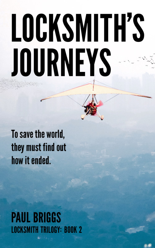
Well, at least the paraglider is bigger…
It still lacks any excitement, any danger, any indication of genre or audience. If I were to see this originally in thumbnail, I’d assume it was one of those “memoirs of my not-too-interesting life” volumes, because it all looks so peaceful.
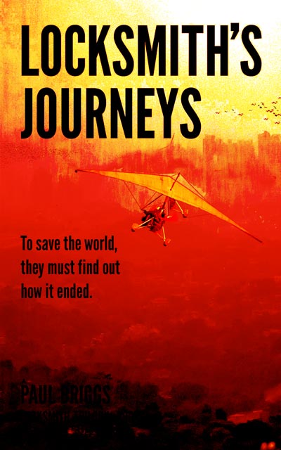
Here’s my five-minute do-over:
In addition to the obvious color change to a more “dangerous” hue, I also tilted the paraglider, because everything on this cover was so square that the contrast is appealing, and diagonals give an impression of instability and dynamism.
But I still don’t think it’s a good cover, and I don’t think this can become a good cover. You’ve stepped away from the human figures on your first cover, which are definitely a better way to market to your audience than a distant paraglider. You need to do that whole “Old Spice” thing: Look at successful YA books covers, then at yours, then at other covers, then back to yours…
Anyone think I’m wrong?


While the red scheme tweak is an improvement, I see this cover design as a total miss. There is nothing “sci-fi” about it and it looks like a hang gliding adventure, possibly nonfiction. The title is excellent and a real hook. You need an illustrated cover that matches the title and photographs aren’t going to cut it unless they’re manipulated to look like art. I can think of any number of ideas, but you can too I think.
The most important thing you should strive for is to imitate success. Look at the covers of books of the same genre. There’s no better way to learn what sells.
In short, start with homework on Amazon or another bookstore then try again from scratch. If you don’t feel up to it artistically, pay someone else. The cover is a critical part of any successful book these days. Its importance cannot be overstated. It is well worth paying to have to right one. It will determine whether your book gets taken off the shelf.
I’d love to see your new attempt. Good luck.
I do like the bigger glider, and that you’ve got some more scenery than just the Washington Monument on your first cover. A closer look at the cover gives away the cut-and-paste lines around your glider, however, along with the over-sharpened flocks of birds; and the (ruined?) city in the background is so misted over with smog and visual noise that I can barely see it even with the cover at full size. Your concept has improved remarkably from the first cover, but your execution is still killing it.
Post-apocalyptic city ruins, I might remind you, are a big crowd-pleaser with fans of futuristic and time-travel novels. While that glider remains an acceptable addition to the cover (if you can conceal your cutting and pasting better), you really do need to have the city ruins be much more visible. Your synopsis suggests this is a story the characters investigating a possible future arising from some calamity yet to come; your prospective readers are going to want to see signs of that calamity.
Judging by the lack of any obvious Washington D.C. landmarks this time, having the ruined city be identified specifically as our nation’s capital is unnecessary; probably just as well for everyone concerned, since fans of the Fallout series would probably dismiss any pictures of that city in ruins as just a rip-off of their own games’ eye-popping imagery, no matter how original the actual artistry you might acquire. If you’re not too choosy about which city we should be seeing in ruins, you can find loads and loads of stock images and original art depicting city ruins available to use for a fairly minimal expense. Looking “city ruins” up on an image search engine, I easily came up with this image, for instance.
If you want something truly original, I’ll bet you can find a fair number of starving artists on Deviant Art who’d be willing to whip up a picture of a ruined city for you. Somebody there drew this one, for instance. Swap out the helicopter in the distance and swap in your hang-glider in the foreground, and you’d have a pretty decent cover for this book. Feel free to add those flocks of birds too, though you should (of course) run a softening filter on them if you do the job yourself.
In short: hang glider good, ruined city better. Now try to make all your post-apocalyptic imagery clearer for your readers’ sake and your own, as well as ours.
100% down with RK’s suggestions. Alternately, since there might not actually be a ruined city in your book, show us that portal! Bright and shiny are huge pluses for YA novels. So give us a nice swirly magicky portal smack in the center, and the glider — big and prominent — headed for it. If you can de-genericize the glider with cool paint, futuristic/post-apocalyptic gadgetry, or prominent, identifiable cool-looking crewmembers, so much the better.
I agree that unless one is already familiar with the book it is impossible to tell anything about the novel from the cover alone.
The subtitle helps, but that is the second thing anyone is going to see…if they look past the cover art in the first place. And even at that, the subtitle gives such a disparate impression (it talks about the end of the world while the cover image is a peaceful shot of a hang glider in a blue sky) that the result is only confusing.
Nathan’s remake is a vast improvement…but still has the weakness of the hang glider image. You need to get across the fact that this is a science fiction novel, which the cover fails to do. If time portals are an important part of the story, then suggest something like that on the cover…have the glider zooming into some sort of vortex, perhaps.
Great idea!
Hells, yeah. You could probably just kill off the entire city thing and have the hanglider going into a big swirly magicky time-tunnel thing. Or, take the desolate ruins, show them at the OTHER end of the big swirly, and make this side all nice and shiny, and voila! With very little artistic talent required, you’re there. (if it were me, I’d put the ruins-at-night at the other end of the tunnel, and the daylight on this side, BUT, if the ruins need to be very visible, reverse it. The TardisGlider leaves normal night, into the Ruins in broad daylight, through the TTT (Time Tunnel Toilet).
So, +1 for the guys above.
When can we expect volume 3 of the of the Locksmith trilogy? (Will live long enough to see it’s completion since I’m now nearing 83 years?