The author says:
Abigail Johnston died of scarlet fever on a remote farm in Maine in 1872. On the day of her death at 19, her grieving parents posed with her lifeless body for a memento mori, a picture of the dead taken by an itinerant photographer. The picture trapped her soul in Gehenna, a place of torment ruled by Queen Lilith, Adam’s disobedient first wife. A century later, David Austin, finds her photo in an antique store in rural Maine and becomes obsessed with discovering her identity. He finds her forgotten grave in a forest after an improbably lucky search. While he is holding her photo in the cool spring twilight, a woman steps out of the shadows and extends her hand to him. “Sir, I need your help.” It is Abigail. She has crossed over to the land of the living to ask David to find and destroy Moloch’s chalice, the supreme power talisman of the shadowy demon Aamon to prevent his consort Queen Lilith and her children, the Lilim, from annihilating humankind and occupying Earth. Abigail’s touch creates a psychic bond between them which grows ever stronger. David, fighting to overcome self-doubts, searches the world from Jerusalem to Idaho, following a gossamer trail of clues while being pursued by the Black Sun assassins. He is aided by a secret brotherhood founded by Moses dedicated to the destruction of the Lilim. In a classic hero’s journey, David realize his hidden courage, and risks everything to succeed.
Nathan says:
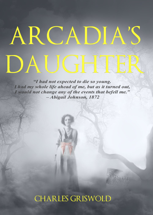
Aside from the gravestone, the historical photo of the girl is well composited into the foggy background. My real complaints are:
1. Ditch the character quote. It’s a lot of words that doesn’t actually tell us anything about the story.
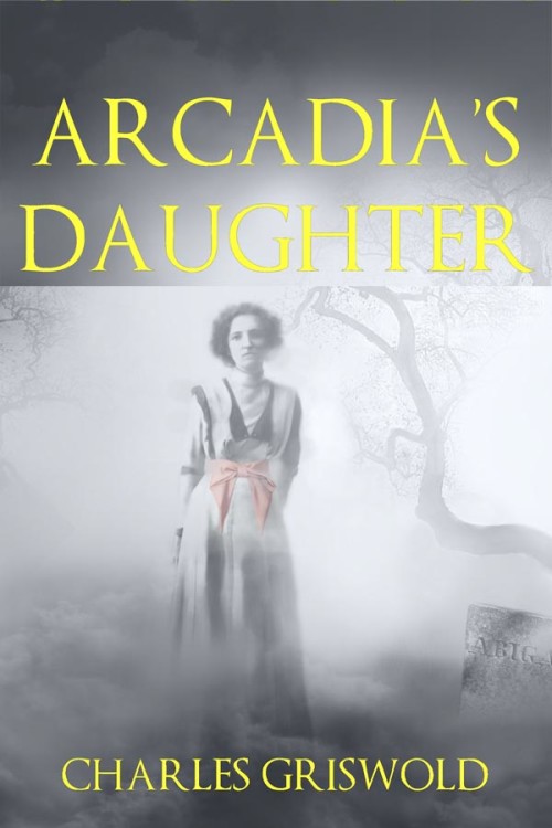
2. Waaay too much empty space. There are lots of covers that have small focal figures on them, yes, but they either have a detailed or meaningful background or surrounding that conveys useful information, or isolate the character so starkly that the white space around them carries weight. Yours does neither. You could trim it down to this size…
…and lose absolutely nothing. This also lets your name be larger because, hey, you wrote a book — there’s no reason to by shy about it.
Also, a slight drop shadow or dark halo would make the yellow title stand out against the pale background.
(I know it’s not germane to the discussion of your cover, but your “elevator pitch” needs plenty of work. It takes forever to get to what the actual meat of the story is.)
Other comments? (Only about the cover — I don’t want the entire thread to be dominated by a discussion of the description.)


Eh, your “elevator pitch” is too long as the man says, but at least I was able to get some feel for what the story’s like. To be honest, your summary sounds a little like what would happen if one of those Eastern writers of cheap Kung Fu movie scripts were to write a script for a Western ghost story that takes all the same liberties with Western culture and religion that Kung Fu movies typically take with Eastern culture and religion. It’s kind of a throw-in-everything-and-the-kitchen-sink supernatural story: canon, apocrypha, and some stuff you just plain made up to make the story more interesting all blended together in a vaguely Judeo-Christian setting.
I can almost envision the movie trailer for this now, and that’s where I’m seeing both what you’ve done right and done wrong with this cover. The fog rolling up from the grave, the ghost girl from 1872 emerging from her prison to ask for the itinerant photographer’s help… it’s all good and atmospheric, but our unlikely hero hasn’t stepped into the frame yet. Obviously, the girl’s very important to this story, but she’s only the main supporting character; where’s our protagonist?
In a nutshell, what your cover really needs is for the protagonist to step into that frame. This story takes two to tango, but you’ve only got the one on the cover. Abigail’s not looking too bad in her current pose, but she needs to be over closer to that gravestone on the right (which is barely noticeable in this shot) and David needs to be entering the frame from the left to come talk to her.
You also do need to zoom in on her (and him) a bit as Nathan says. We appreciate the ghostly atmosphere, but everyone already knows what fog looks like and we can see that it’s there no matter how close you might zoom in. For a bonus, it wouldn’t hurt to have the photographic MacGuffin prominently displayed in your protagonist’s hand as he enters the frame, and possibly centered between them; just as a lot of the story hinges on it, so too might it deserve a lot of your cover’s focus.
Concerning the lettering, you’ve got a pretty nice slightly curly-serifed font there already, but it probably wouldn’t hurt if you found something even a little curlier to blend in with the curly wisps of fog behind her. Of course, both your title and byline should be bigger, as Nathan says; don’t be shy. As he also says, give them an outline or halo or drop shadow or something to help increase the contrast with the background; any shade of yellow fades far too easily in the misty gray of the background.
Finally, having a tagline quote is strictly optional when you can establish the hero, the heroine, and the MacGuffin all in one shot; you may just want to eliminate it altogether as Nathan suggests. Whether you decide to have a tagline or not, your current one is (like your description) too long. If you want to have one at all, it needs to be something short, snappy, and a bit ominous. (At this moment, I’m imagining Abigail in a cinematic trailer solemnly instructing David: “Complete your quest; destroy the chalice. Release me from this infernal abattoir!“)
You’ve got the mood of your cover art right and you’re well on your way to having the right kind of cover; all you need to do now is finish the job.
Watch the kerning in your text, especially the “DAU” on the second line of the title. I like what Nathan did with zooming in on Abigail, an I also like RK’s idea of including the photograph somewhere. Otherwise, it’s an eerie cover and I think you’re on the right track.
Hmm. I think if you replace the quote on the cover with a short and simple subtitle you could leave the rest as is. I don’t care for the tombstone actually and it’s not necessary, IMO. I’d remove it. Otherwise, the illustration is good and does the job well. I also found the second word in the title harder to read because it’s starting to fade into the background. Nathan’s suggestion is worth a try. Or change the title color altogether.
It’s very plain. Too plain for me. Not quite simple enough to be minimalist, but not terribly eye-catching either. The colored bow would work a lot better if it were brighter; right now it’s too dull to work well as the single colored element in the black and white image. And I really don’t like the saturated yellow Trajan font; it looks very default.
The gray is a bit stark. Perhaps if this was coloured to resemble an old faded photo – yellowed a bit, or sepiatone, it would add to the feel. Maybe even hand coloured, like how people used to do to on black and white photos to attempt to colourize them. Having just her skin being black and white would add to the creepy factor.
As it stands now that bow just looks very out of place to me being the only thing in colour. It is basically screaming at me that it is cut and pasted there.
I never even saw the bow! So that perfectly illustrates the colour there is not necessary. I do like Waffles suggestion of changing the color in general from gray to sepia. And while we’re at it, use something other than yellow for the text.
The cover—especially with Nathan’s suggested changes (although I would center the figure to go along with the centered typography)—is good but it suggests a gothic romance rather than the story you describe.
I like Nathan’s cropped version of the cover, but the composition makes it look like historical fiction instead of religious paranormal thriller. Maybe a change in font would help.
This is my revision of your elevator pitch
Abigail Johnston died of scarlet fever on a remote farm in Maine in 1872. A century later, David Austin, finds her photo in an antique store in rural Maine and becomes obsessed with discovering her identity. He finds her forgotten grave in a forest after an improbably lucky search. While he is holding her photo in the cool spring twilight, a woman steps out of the shadows and extends her hand to him. “Sir, I need your help.” It is Abigail. She has crossed over to the land of the living to ask David to find and destroy Moloch’s chalice, the supreme power talisman of the shadowy demon Aamon to prevent his consort Queen Lilith and her children, the Lilim, from annihilating humankind and occupying Earth. He is aided by a secret brotherhood founded by Moses dedicated to the destruction of the Lilim. In a classic hero’s journey, David realize his hidden courage, and risks everything to succeed.
Yep, I agree about the blurb if this is indeed what you are using on the book listening and not just for us here! Far too long and has the classic debut writer’s mistake of spilling all the interesting stuff in one go. Like a cover, a blurb/pitch just needs to pick out the fewest possible details to give a rough idea of the book and get people interested. This is how how I’d keep it, and even here I think it’s still too detail heavy:
“”Sir, I need your help.”
On the day of her death in 1872, Abigail Johnston’s grieving parents pose with her lifeless body for a memento mori – a photograph of the dead by which to remember them.
A century later David Austin finds her photo in an antique store in rural Maine and becomes obsessed with discovering her identity. But David find tracking down Abigail’s name and resting place are only the start of his quest when the impossible happens – a dead woman asks for his help.
Now David must find and destroy Moloch’s chalice, the supreme power talisman of the shadowy demon Aamon, to prevent his consort Queen Lilith and her children from annihilating humankind and occupying Earth.
Fighting to overcome self-doubt, David’s quest takes him from halfway round the world, following a gossamer trail of clues while being pursued by the Black Sun assassins. He is aided by a secret brotherhood, but pursued every step of the way by assassins. David must realize his own hidden courage and risk everything to succeed.”
As for the cover, it’s close to a serviceable ghost story book cover. But is that really the right direction to go in for this cover? It sounds like the book is a mix of a few different genres, but what stands out as the dominating part of the plot is David’s quest (which in my head is a Dan Brown or National Treasure globetrotting treasure hunt kind of thing, is that right?). He sounds like the main character with the arc and the agency and while main characters don’t always have to go on the front, I think him and his input is being lost entirely from your book’s look at present.
So I think you need to signal the fantasy/action/quest bit.
The ghostly/photographic element is a big part of the book clearly and it’s a nice unique visual. I think there might be a place for something like the imagery you’ve used. But use it within a cover that’s predominantly about showing that this is a Biblical, low fantasy/paranormal book.
Think about how these posters set the tone for an actiony, paranormal story set around apocalyptic themes: http://www.impawards.com/1999/posters/end_of_days_ver2_xlg.jpg https://upload.wikimedia.org/wikipedia/en/2/28/Night_Watch_%282004_film%29_theatrical_poster.jpg
How this cover (Which is not a masterpiece but pretty effective) uses a few elements to tell us what kind of tone to expect: https://s-media-cache-ak0.pinimg.com/736x/4f/91/88/4f91883f8e7f67f1fd083ad9990e56b8.jpg