The author says:
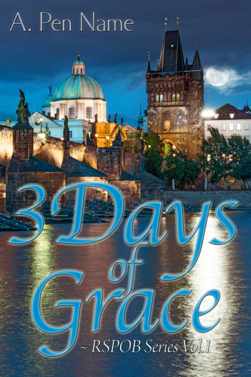
Shortly after moving to Prague, Grace is attacked by a werewolf and has now 3 days to decide if she wants to go through with the transformation or not. The intended audience is more or less young adult with a sense of humor. I would especially appreciate feedback about the typography.
Nathan says:
[looks at description]
[looks at cover]
[looks at description]
Are you sure this is the cover to that book?
I mean, I know I’m not the target audience for a YA werewolf novel, but I’m pretty sure that a werewolf novel should give some indication of it being a werewolf novel… or at least not look like it’s something completely other than a werewolf novel.
All we’ve got is an Old World cityscape. That’s not indicative of genre, readership, or anything else that would allow a potential reader to identify him/herself as the target audience.
And the typography, as especially requested, is awfully gentle. Even if this isn’t a slam-bang werewolf action novel, it still seems gentler than is warranted. Between the flowing script and the words “3 Days” and “Grace” in the title, I would assume that it’s a Christian drama at first glance.
(And “RSPOB Series?” That’s an entirely uninformative series name — once again, it’s not telling the reader anything about the novel. And given that this is the first entry in the series, it’s not like you can count on name recognition to bring in the returning readers.)
I think this is definitely a case of a bad initial concept… or maybe even no initial concept. You need to sit down and think, “What would catch the eye and the mind of my target reader? How would I use that half-second of attention before they move on to the book sitting next to mine to tell them that, yes, this IS a book that will interest them?”
Good luck.
Any other comments?


I completely agree with Nathan on everything he has pointed out. As it stands, this cover looks like a romance novel and there is nothing to indicate it’s YA. The font again represents romance not werewolves. Werewolves represent strength and nothing about this cover says its strong. The cover says its a romance taking place in a city. But that’s just my opinion.
Seconded. Additionally, you mention “sense of humor.” If this is a fun urban fantasy, that’s another thing you need to indicate on the cover that isn’t being communicated here.
Curiously, YA werewolf books don’t seem to have a lot of wolves on the covers, tending more towards hot chicks on dark backgrounds.
Yeah, I also agree with Nathan. I’m not the target demographic but between the font and the cover image, I would’ve thought that you’d written a romance novel that takes place (judging by the architecture) in Europe.
And the series line–RSPOB–no. No one’s going to know what that’s an acronym for. If it’s too big to fit on the cover, re-think it, or ditch it altogether. You can always come back to it when volume three is a success.
Congratulations: your cover contains everything your prospective readers are potentially going to love about this story’s… setting; and nothing else. Like the other critics, I rather assumed the pretty scenery on the cover in the thumbnail meant this was going to be some kind of milieu story, which nowadays usually means it’s either some kind of detective story or romance or both. Imagine my disappointment–which you can be sure many other shoppers initially drawn to your book cover will share–at discovering it was not from either of these genres.
Normally, I would suggest using this scenery from Prague as more of a background and putting your main character(s) in the foreground, but there’s really no room for any foreground here unless your character(s) could be standing in the middle of the river somehow. For that matter, you might be overestimating the importance of establishing the setting for your story; the only reason I know this is specifically a stock image of Prague is because you mentioned it in your synopsis and my running your cover through TinEye confirmed the location. Meanwhile, neither the picture nor your title nor anything else offers the slightest hint that this book contains a funny story about werewolves. (Showing a full moon in the night sky doesn’t count; lots of trashy romances having nothing to do with werewolves have shown a couple necking to the full moon on their cover.)
Really, I think you need to reconsider your entire approach, maybe go with something less literal-minded and more obviously wolf-related. It would probably help if we had a better idea what kind of humor you want your story to have, as this might suggest some unique element to help you (and us) distinguish your book from the far-too-numerous werewolf “romances” and erotica novels published by all of the Stephenie Meyer wannabes out there. If the humor is actually based on the story’s being set in Prague, for instance, all you might need would be to show someone wearing distinctive local clothing who’s halfway through his transformation into a werewolf: “Hey Dad, come take a picture of me with this weird hairy guy in authentic traditional Czech Republic clothing!” (Czech werewolf: “Hey, Little Red Riding Hood, who asked for your opinion of my looks?”)
Yes, your font definitely needs to be something less romantic and more edgy (both literally and figuratively). As mentioned, your book’s cover actually will attract some attention–but from romance novel readers, not the people in your target audience who might actually consider buying your book. You want a jagged font that suggests flesh-ripping teeth and claws and maybe some bloodshed, not the pleasant swirly font you’ve got right now that looks like ribbons flapping in the breeze.
Also, am I right in assuming that your “A. Pen Name” byline is just a placeholder for your actual byline (when you get around to deciding what name to use)? Is that as-yet-meaningless-to-us “RSPOB” sub-title likewise just there to show where your real sub-title will go on your final draft? I can appreciate whatever your reasons may be for withholding such information from us, but placeholder or not, you definitely need something more meaningful than “RSPOB Series” for your sub-title.
In short, you’ve got a nice cover for a generic romance here, but now let’s see a cover for your book’s humorous werewolf genre.
No. Just no.
I have to ditto everyone right down the line.
This is simply not an appropriate cover for the book you have described.
Frankly, the typography is the least of the problems here. The problem is that the cover absolutely in no way conveys any sense of what sort of book this is or what it might be about. In fact, as others have mentioned, it suggests a completely different book than what it really is.
I think the cover needs to be rethought entirely from scratch.
Not much to add, but for the record, my first impression was that it was a religious travel guide.
On another note, I strongly suggest you write out “Three” instead of using the numeral.
The cover itself looks fine, and although I’m normally suspicious of fancy 3D text effects, in this case it works. It does, however, seem like litfic or contemporary romance. The only thing that seems vaugely werewolf-ish is the moon.
Unsurprisingly, for the city of Kafka, there are a lot more dramatic and dark photos of Prague around, eg. https://pixabay.com/en/prague-bridge-czech-republic-569352/ – you could look for vintage black and white ones too. This one is too nice for werewolves.