The author says:
It is a printed workbook for web authors and writers who want to know where to go and try the best productivity apps – includes 150 sites, or video’s, infographics (social media image sizes for example) with space to write their own comments, or add their own apps they use – always carry it with you.
Nathan says:
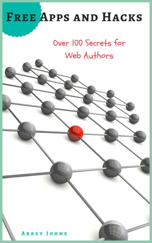
I think you can guess everything I’m going to say by looking at the thumbnail. The title is hard to read, the subtitle is impossible to read, and the byline might as well be invisible.
This is the second nonfiction title with abstract imagery on the cover that we’ve look at in the last little while (here’s the first), and while there’s nothing wrong with abstract imagery per se, especially for a book for which there really isn’t an image or class of images that gets the point across, that also means that the text has to do the heavy lifting here — it’s got to inform the reader of genre and appeal, as well as give specific information on the contents of the book. That means it MUST BE READABLE.
I mean, yes, it’s a neat image, but you really don’t have to be careful about covering up “important” details with text, do you? Make the title large enough that it takes up two lines: “Free Apps / and Hacks.” Enlarge the subtitle so that it extends practically from edge to edge. And for heaven’s sake, don’t hide your byline in itty-bitty type. You wrote the book — let people know it!
We could squabble about specific font choices — I’m not sure the kindergarten-penmanship font works for the subtitle — but even that is secondary to simple readability.
Other opinions?


Ditto.
IMO, putting the “free” inside that seal-looking image gives the impression that it is your book that is free. I would drop that and as Nathan suggested, make the text much larger. There is no imagery here that cannot be covered by text. In this case I feel the image should be a background for you text, not the focus of the cover.
Here’s a quick rough draft that I did of the cover just to give an idea –
Sorry, here is the link – http://i64.tinypic.com/2na1f11.jpg
Hi Tia
That’s really brilliant of you to do that – back to the drawing board for me then!!
I’m with Nathan and Rob and Tia on this one: your picture’s fine, but all your text is downright wimpy. The fonts on Tia’s draft look way better than what you’ve got now, but almost anything would; even some boring old office fonts like Arial Black and Times New Roman, if you made them BIGGER! LOUDER! BOLDER! in the same manner. Go big, or go home!
Thanks everyone. Really appreciate the feedback.
Yup. Ditto. That second grade hand writing font is only appealing if you are trying to sell something to second graders. Or Mums who buy things for second graders.
Tia’s rendition is certainly an improvement, but… (and I know that was a down and dirty one off, so no offense intended) the primary red w/black outline tend to look a little DIY. If you go there, and really you probably should, try to choose a slightly more sophisticated colour. Say, Maroon, for instance, without the outline.
Hope that’s helpful.
Kindly,
Tamian
Cover Designer