The Promised One

The author says:

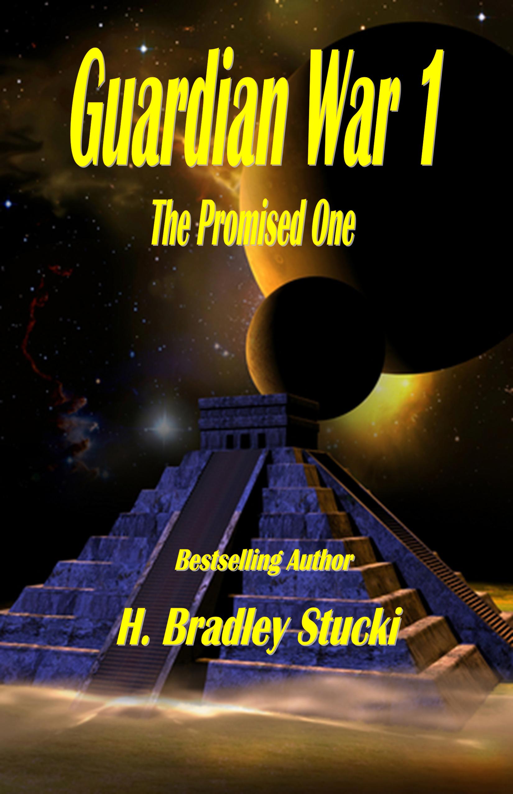
Javin Cox has a special ancestry which makes him the ‘One’ (or maybe One of Two) who can save all the races in the galaxy from being snuffed out. The problem is he knows nothing about it. And the Guardians who are supposed to watch over things can’t tell him anything because they’ve got troubles of their own.

Nathan says:

I know this is not what you want to hear, but there are more problems than successes here.

  1. Pyramids and planetoids don’t tell me anything about the setting.  Does this take place on Earth?  Other planets?  Vessels out in space?  Is it the present or the future?  Is is a sfi-fi-flavored coming-of-age story, military SF, mystical science-fantasy?  Dunno.
  2. Why is all of the type in italics?  It doesn’t accomplish anything.  The typeface is also very nonspecific; given that the image isn’t pulling its weight, the font needs to do more.
  3. Why is the series title so much larger than the book’s title?
  4. “Bestselling Author” — the fact that you don’t give a specific venue sets off bullshit detectors.  NY Times bestseller? USA Today?  Amazon overall?  Amazon itty-bitty category?  Given that the cover definitely isn’t what you would see on a “real” bestseller (NY Times or USA Today).  A laudatory quote or a tagline can do a lot more good than a vague “bestselling” claim.

Other comments?

The Rabbit Thief

The author says:

Set in 1840s New Hampshire, the novel is the story of Lucy Blunt, a maid convicted of the murder of the mistress of the house she had served. With weeks left until she will hang, she convinces a newspaper reporter to listen as she untangles the lies and secrets of her short life. Women’s historical fiction. Would appeal to readers of Sarah Waters and Emma Donoghue.

Nathan says:

It’s a very good layout. I only see two deficiencies:

  1. Sorry, but the resolution of the image you’ve got here is simply not high enough. Unless you just sent us a quick mock-up and the “real” version is much better, you’re going to have to find a higher-resolution image (or find an original historical photograph and scan it yourself at high resolution).
  2. As much as we poke fun at its random use, I this this is definitely one of the times when the subtitle “A Novel” would be appropriate.  Not only does it peg the book as fiction rather than nonfiction (there being no other clues on the cover), it also has the connotation of being a non-genre novel, and thus — rightly or wrongly — of greater literary merit.

Other comments?

Son of Ruin

The author says:

There are beings who walk unseen through the world, demons with evil in their dark, twisted souls. The young demon Succubus, summoned to the prison world of rock and fire, is learning to curse, using the dark lore of his kind. Talented and reckless, he desires to enter the world of humans. Meanwhile two brothers, Jonathan and Solomon, live in suburban Chicago with their parents. Solomon’s clear blue eyes see things others don’t and he helps his older brother navigate childhood. The talented demon and the two brothers are on a collision course, one that could alter the order of things.

Nathan says:

This cover has several problems; some are apparent at thumbnail size, and some at full size.

From the thumbnail:  We have a perfect storm here — the artwork makes the text unreadable, and the text makes the art incomprehensible.  There is literally nothing here that a casual browser, encountering the thumbnail on Amazon, can identify or find attractive in the three seconds or less that they’ll give this thumbnail before glancing to the one on the left or right.

From the full size: The title font is still almost unreadable.  At least I can make out the artwork now, but that’s a mixed blessing, because the artwork is simply not of professional grade.  One glance at the top demon’s misaligned face screams “amateur.”  To add to that, the stone background behind the (I assume) series title only serves to make that text harder to read (and to remind viewers of the design aesthetic on display at Geocities).  Top that off with a total of four fonts, and damn.

And on top of that (yes, I’m piling on, I know), the cover makes it look like the book’s about two demons fighting.  That doesn’t match well with the description you gave.

The advice I’ll give your is common advice around here:  Look up those books that you would expect to be popular among readers who would enjoy your book, and see how those readers expect to be marketed to.

Other comments?

Gladness Goes to the City

The author says:

Marguerite Martyn was a noted journalist and artist in 1910s U.S.A. Besides her serious reporting (always accompanied by her drawings), she occasionally wrote lighter fiction, which appeared on the newspaper’s feature page. The book is based on one of those fictional pieces. It’s about a girl named Gladness. This will be one of a series based on Martyn’s reporting and including her sketches.

Nathan says:

Hm. Hm, hm, hm.  Your description gives us very little to go on, really, unless your target audience really, really likes early 20th-century female journalists. With that said, I think we can offer some constructive advice from a pure design standpoint.

  1. You’ve divided the cover in an odd spot — almost-but-not-quite center.  And as you can see especially in the thumbnail, the real estate in the lower half seems terribly under-utilized compared to the top half, which is nearly unintelligible due to the detail and lack of color.  I think you should let the illustration take up about 3/5ths of the cover.
  2. Extend an unobtrusive border around the top half — the off-white background of the illustration conveys the idea of “old paper,” but it clashes with the white-white that will be surrounding it on most ebook vendor sites.
  3. Lose the third font for your byline. Just reuse the title font again.

Other comments?

Fight: Become The Best Of You One Step At A Time

The author says:

This book is about challenging people to be their best, to beat the odds against them. It is about the need to better and how to become a better version of yourself. Its about not accepting the status quo. Its about fighting back and taking life by force.Its about reaching for the stars.

Nathan says:

If what you’ve given us is the mock-up you plan to give to your designer, that’s all well and good. If this is actually what you plan to present as your book cover, I think you had better step back and work with an actual designer.

Even when taking into account the foreshortened perspective of the book that isn’t reflected in the graphics (again: this is a mock-up, right?), the mismatched type aligned at random, the BRIGHT PINK cross the cover model (who seems to be wearing a shrug made entirely of Photoshopped dots), the completely unnecessary “VS” before the byline… all of it seems to be either a joke, or a dashed-off brainstorming idea which has not benefited from reconsideration.

Sorry if that seems cruel, but it’s the truth.

(Also: *It’s)