The author says:
Set in 1840s New Hampshire, the novel is the story of Lucy Blunt, a maid convicted of the murder of the mistress of the house she had served. With weeks left until she will hang, she convinces a newspaper reporter to listen as she untangles the lies and secrets of her short life. Women’s historical fiction. Would appeal to readers of Sarah Waters and Emma Donoghue.
Nathan says:
It’s a very good layout. I only see two deficiencies:
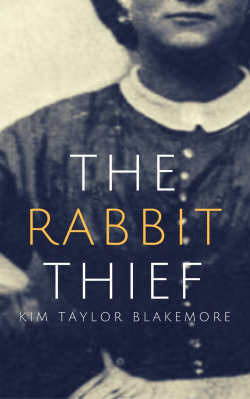
- Sorry, but the resolution of the image you’ve got here is simply not high enough. Unless you just sent us a quick mock-up and the “real” version is much better, you’re going to have to find a higher-resolution image (or find an original historical photograph and scan it yourself at high resolution).
- As much as we poke fun at its random use, I this this is definitely one of the times when the subtitle “A Novel” would be appropriate. Not only does it peg the book as fiction rather than nonfiction (there being no other clues on the cover), it also has the connotation of being a non-genre novel, and thus — rightly or wrongly — of greater literary merit.
Other comments?


Incredibly solid. The only point I can add is possibly doing your byline in the yellow colored text to make it pop more. You could even combine this with Nathan’s second suggestion by making it “A Novel by Kim Taylor Blakemore”.
I can’t add a single work to what Nathan said.
Excellent cover!
Well, here’s something I don’t see all the time around here: you’ve actually made your cover look too real! Before I read the description, my expectation was that this would be an actual ripped-from-the-headlines crime story about something that someone did in real life. That’s the trouble with live-action gray-scale photographs on a cover: they look like they come from a security camera or an old newspaper or the like; which fairly shouts “This actually happened!”
Coincidentally, another cover submitted here a month ago seems to me like it would better suit the concept of your story: something that didn’t actually happen to actual people in actual situations described in your story, but could well have happened to somebody in those specific situations. Here, a stark black-and-white line drawing that looks like it could have been from an antebellum New England newspaper would instantly clue your target audience to what they’re getting. That way, you can also avoid getting bad reviews from readers saying “Not bad for a made-up story, sport, but you tricked us with that cover!”
As Nathan also notes, the image works in thumbnail, but is too low-resolution for the advertising-poster-sized 4407 X 7032 cover you’ve sent us. My recommendation? Get an ultra-high-resolution version of the photograph you’ve got now (there’s nothing wrong with it other than the grainy pixelation), and have your cover designer rotoscope it into a line-drawing Ralph-Bakshi-style. (His American Pop (1981) did this pretty effectively.)
In short, (I can hardly believe I’m saying this) it’s not too bad the way it is, but make your cover a little less realistic please!
If this were nonfiction, it would be spot-on. Higher res photo and you’re good.
For fiction, though, it’s too spare. Historical fiction tends to have an eye-catching central figure or landscape, usually an antiqued modern photo or painting rather than an actual historical image. I think you want something like that here: A maid holding a knife looking dramatically over her shoulder or something like that. Or just a still life of some period objects with a knife and a noose. (The Hangman in the Mirror, for instance, is also about a maid convicted of a crime and facing execution.)
As is, even if you do put “a novel” on the front, I think your audience might look past it, thinking it’s a history book.
Thank you all, this is very helpful and much appreciated!
I may be a little late to provide feedback but really wanted to say that I love it and think it really suits your chosen genre, although I would definitely use a higher resolution image. I disagree that it looks like a true crime book.
One other thing which isn’t important and up to you entirely – the author name is not readable at thumbnail size, but may work if you make it bold.
That’s it – it really does look relevant and professional.