The author says:
Impulsive young test driver of the world’s first interdimensional motorcycle, enlists the help of a terrified news-crew-intern to expose a murderous army colonel who is trying to steal the technology. Night of adventure/end of the world
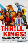
My other cover. I’m having trouble picking between the two.
Nathan says:
If this were a graphic novel, I would definitely say go with the second one. However, with a prose book that will be first seen at thumbnail size on Amazon and other sites, I think the first one has more “instant impact.”
Anyone disagree?


First one is definitely the eye-popper, and for a few reasons:
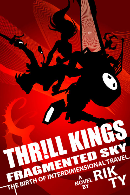
It’s a lot less busy. I like the silhouette look to it. It lends the novel a more sci-fi feel.
It allows you to have the “off the cover” effects in your subtitle without the distraction of the subtitle saying “LOOK! I’m doing something clever font-wise!” (Good choice not having the N in “intergalactic” trail off, by the way.)
I agree.
Am I alone in thinking there are too many words on the cover?
Thrill Kings is the series title.
Fragmented Sky is the book title.
The Birth of Interdimensional Travel is what? The sub-title?
“A Novel by Rik Ty” is the byline.
It just seems like a bit much to me.
Otherwise, I’d say that you have two very sharp covers. I can see why you had a dilemma trying to choose between them.
First one. Definitely. It’s very dynamic and eye-catching. There’s nothing wrong with the second one, per se (well, except the girl’s off-center wasp waist)–the art is definitely professional grade–it just doesn’t really speak to me. The characters are super cool-looking, but they’re not doing anything.
There are a fair number of tweaks I’d make to the first cover, although none of them change the fact that it’s really good already:
-The figures are pretty much impossible to decipher at thumbnail. I thought the girl’s hair was a horse’s tail and the motorcycle’s wheel was a face. To make things clearer, try one or more of: Separate the figures more, make the front figure a human (or more obviously human), show both wheels of the motorcycle.
-The one change you definitely need to make to the figures is the girl’s impossibly skinny C-curve waist. People don’t bend that way. Ouch!
-Is that Impact? While this is obviously a completely appropriate place for that font, I’d change it to something similar but not identical, since memes have pretty much stolen Impact.
-I’d lose the exclamation point. It feels like you’re trying too hard to make it thrilling when it’s plenty thrilling already.
-I concur that there are one too many lines of text here. I wouldn’t be sure what part of that I needed to type in order to look your book up.
-Normally I’d say to lose the “a novel by,” but since you have an unusual-looking name, I think you’re correct to include it here.
I like the effect of the first one, but it is really almost impossible to tell what the black silhouette represents…at least not at a glance, and a cover should not be a visual puzzle. You might be able to take care of some of this by making the left hand figure a little more obviously a figure.
On the other hand, the cover is imbued with so much action and the design is so striking that it may not matter too much.
The art on the second is fine but, in spite of all the unusual characters, lacks any real punch nor any sense of what your book is apparently about.
The problem with both covers lies more in the typography than the art. And that problem is overkill. This is worst in the second cover. You simply have far too much going on. There is no need to play around with “The Birth of Interdimensional Travel” in order to hammer home what the phrase means. There is nothing gained by adding a decorative texture to “Kings” and using an exclamation mark in place of the “I” in “Thrill” is, again, simply too much.
I agree with DED that it is difficult to tell what the title of the book is.
And, as others have pointed out, you really don’t need to add “a novel by,” but your name is unusual and it probably doesn’t hurt to let people know that it is that of the author.
While I can’t much disagree with any of the points my colleagues here are making, I rather do like the second cover better. The first one should be all right for a paperback as long as you clear the word clutter a bit (“A Novel By” is unnecessary and one subtitle at the very most should be sufficient). Hang on to that second cover for the graphic novel if you ever decide to adapt this book into one, however; if the story’s got as much action in it as both of your covers suggest, you probably should.
I’m not well-educated enough about design to nitpick the finer points, but just speaking as an adult female reader of sf who loves violence, intensity, and high style, the first cover ROCKS and would definitely make me pick the book up and read the back cover/first few pages…the second cover, while well-done for what it is, looks comparatively goofy and juvenile, and wouldn’t. I’d say that the first cover would attract a more mature audience that’s looking for a more intense reading experience, while the second would attract a younger audience that’s looking for a lighter, more fun-focused and/or video-game-like story. Which one is better would depend on the book itself.
Thank you everybody. You’ve given me some real things to consider (the waist, most of all)
Signed, Just some guy, not the author, not at all, keep posting. . .
This was a blast
– thank you
If you want to use that painting, it would be perfect for branded swag, eg, a signed bookplate you send as a preorder bonus.
The first one is the best in my opinion. The second is likely to appeal to a young audience but I don’t think that’s what you’re aiming at.
Suggestions:
1. The silhouette action is a bit jumbled. Perhaps a little more clarification to show what’s going on.
2. The title & author name don’t look right. They seem a bit pushed into the corner. I’d probably remove the diagonal orientation because I don’t think it’s doing you any favours. The title is quite a mouthful and a lot to get into your head in a short space of time. Is ‘Fragmented Sky’ essential?
Good cover