The author says:
‘The Worst Man on Mars’ is a British Sci-Fi Comedy that’s a cross between ‘The Martian’ and ‘Red Dwarf’. It’s aimed at the same audience who enjoyed ‘Hitchhiker’s Guide to the Galaxy’. A blunt Yorkshireman and reality TV show winner has seized control of the first manned mission to Mars. He finds that the base – built by an advance party of incompetent robots – isn’t ready. Worse still, the planet isn’t as empty as first thought.
Nathan says:
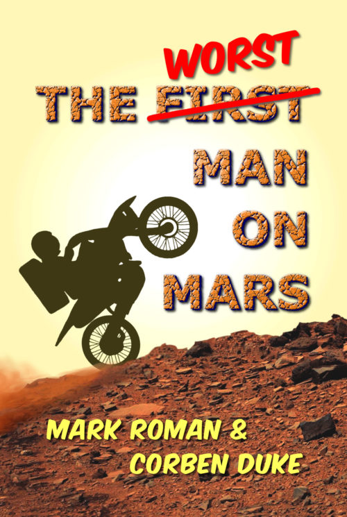
One of the rules of thumb often bandied around here is, “Would a person who knows no English understand the cover?” In this case, I’d have to say that they wouldn’t; while the orange color scheme works if if you know that the book is set on Mars, it could just as easily be a motocross novel set in Southern Utah. I think that the humor of the description really doesn’t come through, either.
Here’s what I would do:
- Replace the main title font with something either “noble” (Trajan, etc.) or computerized.
- Use actual handwritten letters for “worst.”
- Add something that looks like a Mars base in the horizon space behind the motorcycle.
- Add a gradient to the sky, so that it darkens to purple at the top, possibly with some stars showing.
(An aside: Is there enough oxygen in the Martian atmosphere that an internal combustion engine would work? Just asking.)
Other comments?


Thanks, Nathan. Very useful comments. I’m going to have another go at it to make it more Sci-Fi along the lines you mentioned.
Liking the sound of the motorcross novel set in Utah!
A useful model for this book’s concept would be the cover for the ‘Redneck Eldritch’ collection that Nathan was involved with. Take some cosmic horror tropes (or in your case science fiction tropes) then juxtapose them with some big mudding truck in the foreground and you’ve got a cover that works, on genre and humorous.
A simple possibility, use the famous face shot in the helmet from the movie “the Martian” but do something low-class and demeaning like have the model wearing an embarrassing trucker hat inside his helmet with a Trump-esque slogan on it (I don’t know the British equivalent). It’s classist, which is awful in its own way, but it would probably work really well.
A more complex cover that could be really fun would be a full cover picture of a Mars base, but a very broken and ramshackle one. Picture the sci-fi analogue of a run-down Ozarks shack just falling apart at every seam with the main character standing in front of it, looking at it and scratching his head with his ass metaphorically hanging out. Granted this is custom art territory, and you’d want to have the full cover design thought out and vetted in full size and thumbnail before hiring a commission, but it could be really fun.
Having drawn art for the helmet idea instead of a live model might help some with the classist bit. I’m unsure.
Thanks, Kristopher. Your ideas are great fun … particularly the last one!
This is your call, but “word crossed out and another word written in” titles tend to be hard to parse. Be prepared for people to call it “The First Worst Man On Mars.” Otherwise, I’m mostly on board with what Nathan says. Kristopher’s idea is also really funny.
Oxygen? Not on Mars in real life. It’s obviously an electric motorcycle! Nice to see the rider has an appropriate space helmet and air tanks to stay alive… 🙂
Nate’s suggestion for the sky is good, too.
The TeslaCycle. 🙂
Also, I concur with Nathan’s and Kristopher’s comments–and I really, really don’t love the fonts. I get the whole HHGTG–I’m a HHGTG fan, myself. So: I’m your target audience. Your buying demographic, and as-is, this cover wouldn’t attract me. Wouldn’t necessarily repel me, but…it’s just good enough for what you’ve described.
If, when you come back, with new art, you still need “Fonting,” I’d be happy to jump in and help then. It’s a bit hard for me to make suggestions now, because I can’t yet see the cover in my head, sorry.
Reminds me not a little of this classic
Anyway, as usual, silhouettes are usually a mistake—especially when there is no reason for them. Why, you have to ask yourself, is everything on the cover rendered realistically…except for the bike and rider? I don’t think there is a good answer.
I have to agree with the others’ comments about the fact that it is not immediately obvious that the cover is supposed to be Mars. You need to work a little harder at that. The potential purchaser needs to think “Mars” even before reading the title.
The typefaces are ill-chosen, but I would fix the cover art first.
PS
To answer your question, Nate: No.
I guess I must have mistyped that link: http://people.uncw.edu/smithms/Ace%20singles/sD-series/D-233.jpg
That is a very good cover for a Mars story. Humor that up and make both art and font less dated and it would be solid.
Also, just “Worst on Mars” wouldn’t be an awful alternate title for this book. It’s what it would get shortened to in conversation anyway.
Thanks for all your comments. I’m on it! Beavering away on a new cover.
Ron – I’ve not come across that cover before and now I can’t get it out of head. Thanks, mate!
Hitch – Thanks for the font offer. I’m not sure I’m allowed to return for a second crack at winning over the Covercritics … that feels greedy.
You’re welcome! 😉
Just post your updated cover (or link to it) here in the comments and most of the commenters will provide feedback. I’ve seen it done several times before. Good luck!
You can resubmit. People do that all the time.
I resubmitted my first cover. Sometimes it gets done here in the comments, when it’s a matter of tweaks, and sometimes it is through the normal channel when changes are substantial. No reason to feel greedy, we need fodder for this forum to teach us anything.
Hi,
It’s me again. Hope I’m not outstaying my welcome. I’ve moved away from the motorbike idea. Nathan’s comment that he thought it was a motorcross novel set in Southern Utah worried me. Not a motorbike in sight on this cover.
Any better?
Ah, I see the image didn’t insert. I’ll use the ‘Submitting a Cover” form.