The Worst Man on Mars [resubmit]

The author says:

This is a resubmission for ‘The Worst Man on Mars’

[original submission and comments]

Nathan says:

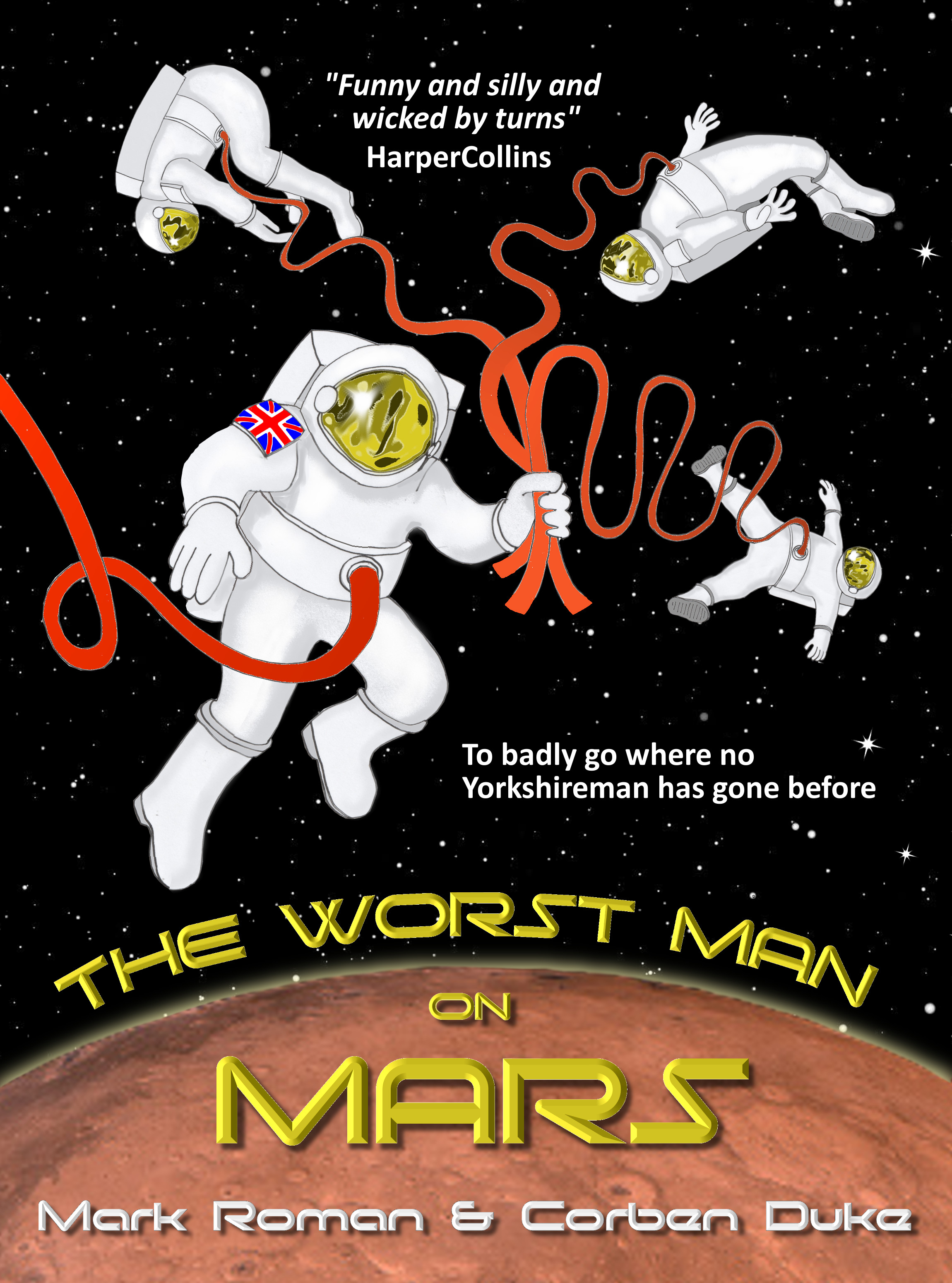
I like the concept of this one a lot more — there’s both humor and action in the image.

Here’s what I’d do to tweak it:

  • Reduce the size of the main astronaut a little, and the background astronauts more.
  • Move the Mars horizon further up.
  • Find a taller font (or a taller version of the font) for the title, so that the title is more discernible in the thumbnail. Ditto for the byline, which is unreadable at thumbnail and still not easily read at full size. (That’s one of the reasons for moving the horizon up — you’ll have more room for bigger letters.)
  • Reduce the beveling on the text, and instead work on contrast with the background.
  • Find better places for the pullquote and subtitle; as it is, they look like they were crammed in there as an afterthought.

Other suggestions?

???

The author says:

It has been 50 years since humans were introduced to the fantastic beings that shared their galaxy. Technology has been thrust to futuristic depths, producing an elaborate space station that orbits Earth where Tara lives with her mother and sister. But it is not quite the melting pot of cultures that idealists had hoped for. A tragedy on Earth pushes Tara and her family to abandon everything they know to escape being tied into the conspiracy. But who labeled them as traitors in the first place? As they run deeper into uncharted space, the mystery grows as thick as the tangles of trouble they find themselves in.

Nathan says:

Honestly, I can’t that title. I’m not being hyperbolic for emphasis; I literally have no idea what it says. THIS IS A PROBLEM, especially because your synopsis doesn’t give me any clues. Readers simply won’t buy your book if they can’t read your title.

Given that you only sent a small version of the cover, I can’t tell if the texture on the face is an interesting effect or the consequence of scanning a too-small image from printed material.  However, I can tell you that the story you describe — intrigue aboard a space station and beyond — isn’t really indicated by the cover.  If it weren’t for the angular (unreadable) title font, I would assume that this is fantasy or nhew-agey paranormal fiction.

My advice to you:

COMMUNICATE with your cover. Make it readable, and make it reflect the story, so that the people who would like your novel will realize from the cover that this book is for them.

Death Divers

The author says:

A small group of death Divers (hazmat equipped salvagers) pit wits against a group of armed mercenaries to retrieve an artifact from an irradiated and abandoned part of future Earth.

Nathan says:

Oh, goodie! I am totally the target audience for a book like this, so I can speak with even more authority than normal.

  1. The tan overlay makes everything murky.  I appreciate that you’re trying to limit the color palette, but there should still be enough highlights and lowlights to make it stand out.  (You’ve got the lowlights handled.)
  2. But the image itself isn’t very evocative; in fact, without the tan, it wouldn’t seem post-apocalyptic at all — none of the buildings seem ruined at first glance.
  3. I don’t propound “Always have people on the cover” as a hard-and-fast rule, but in this case, where your story isn’t just “someone wanders around the wasteland” but a conflict between two groups of people, there should be some hint of conflict or violence on the cover.
  4. Even at full size, the byline blurs into the background; in thumbnail, it’s almost hidden.

I think you might want to start over with a different image. The good news is that there are plenty of photos and digital paintings of armed people against a post-apocalyptic setting out there, and I bet you wouldn’t have any trouble finding a photographer or artist willing to let you use their work on an ebook cover for twenty or thirty bucks.

Other comments?

Hell of a Deal

The author says:

Paul is a dealer in demonic contracts, a middle-man selling safe deals, deluded that he is a master of the dark arts. A seriously hot uber-witch tries to kill him as the start of a hostile management restructuring from the demons who need to replenish their human livestock. Paul is caught in the battle between the demons, an obscure Church sect (led by the uber-witch’s crazed and violent sister), and the other demon traders in town who think he’s playing for the wrong side. It’s not a good time, but Paul also wants a date with the psycho witch. Paul is just trying to survive – he’s already died once and come back, but you only get one do-over like that. As his friends are drawn into the fight there is no way out, and once the demons complete their planned acquisition, his sacrifice is needed to get everyone home again.

Genre: Urban Fantasy with a touch of dark humour

Target: Adult – a lighter tone for fans of Mike Carey’s Felix Castor series, or Richard Cadrey’s Sandman Slim, with a hint of Pratchett and Gaiman’s “Good Omens”

Nathan says:

I can see what you were going for here, but too many little problems add up for a big problem.

  1. The title is too small (there’s nothing in the background that shouldn’t be covered up), and the gradient through it makes it harder to read in thumbnail.  It also clashes with the background.
  2. The filter effect for the main photo muddies the contrast instead of heightening it. It looks like you rebooted your computer in safe mode.
  3. The glowing Greek letters on the wall end up being the only part of the image aside from the title and byline that draw the eye — but the photo is arranged so that there’s a human figure dead center.  The result is that nothing is dominant in the image; it becomes focus-less.
  4. The human figure… It’s not clear, but it’s not a mysterious silhouette; it’s just indistinct.  The pose doesn’t convey dynamism, or strength, or humor; it’s boring.
  5. The edges between the midground (with the strongly filtered effect) and the background (rendered in an entirely different visual style) are distinct and artificial.
  6. The fonts you chose are all different sans serif fonts — not close enough to be unified in their effect, not far enough to contrast effectively.  They seem like fonts that just happened, instead of fonts that were deliberately chosen.

Take a look at your cover in thumbnail, and compare it to the thumbnails for covers from Mike Carey and Jim Butcher: stark and bold typography, strong contrasts, narrow color schemes.  This is how readers of books like yours understand that the book is for them. Go and do likewise.

Other comments?

Joe Coffin: Season One

The author says:

Setting: Birmingham UK, the present.

Genre: Horror/Crime

Target Audience: Fans of Stephen King and TV show Dexter

On the day that Joe Coffin, hitman for Birmingham gang The Slaughterhouse Mob, is released from jail he has nothing but murder on his mind. While inside his wife and young son were killed, and now he is out for bloody revenge. The problem is, Coffin’s enemies are circling, and his wife might not be quite as dead as she should be. Joe Coffin is a vampire horror story and a gritty gangster thriller, written TV style in episodes and seasons. If you liked Breaking Bad and Dexter, and if you prefer your vampires bloody and brutal, then you will love Joe Coffin. With a fast paced, multi character storyline, smart dialogue and great characters, the Joe Coffin books are written to be binge consumed, just like those TV shows you love.

Nathan says:

Know what the first thing that leapt out at my was? You’ve got an unattributed Amazon review front and center on your cover. GET RID OF IT. Pullquotes are only valuable if they carry authority with the reader, and “some random reviewer on Amazon” does not have authority.  While we’re at it, if you can’t put an actual name to the second pullquote, at least attribute it to the website instead of just the site name; that way, readers feel that they could actually check on the review if they wanted.

Second: Aside from the fact that two nameless people liked it, I can tell very little about the book from the cover. Yes, I get that it’s violent, but aside from that, nothing. Now, it’s not necessary to convey setting or storyline on the cover, but there’s got to be something that draws the interest of the potential reader — something to catch the eye.  Especially when your book is going to be first seen by most potential readers at thumbnail size, there needs to be something that registers on their consciousness as a thing of interest.  As it is, the only things that register instantly at thumbnail size are “Coffin” and “Season One” (even “Joe” takes a second to register, as it’s smaller and against a deeper red of the blotch).

I’m not talking about cutting and pasting an extraneous object into the layout.  What could be a part of the bloody background? A shoeprint? Pocketknife? Cigarette butt? Broken crucifix?  Something that relates to your story, sure, but also — and more importantly — something that the right brain (the non-verbal side) can focus on.

So: Lost the first pullquote (and maybe even the second one), increases the size and contrast of “Joe,” give a little bit of space so that “Joe Coffin” and “Season One” can be read as discrete phrases, and use the space between the byline and title to add a feature of visual interest.

Other suggestions?