The author says:
Reprinting, with my comment and explanation, of a series of fanciful drawings and narratives by a leading newspaper artist of the 1910s.
[original submission and comments here]
Nathan says:
It looks like you made good use of the comments from last time around. Good job!
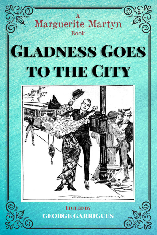
I don’t think the typeface for “A Marguerite Martyn Book” works; everything else on the cover, while pediod-specific, is fresh and clean as if it just rolled off a sparkly printing press. Adding a distressed font to that mix is jarring. (I’m also of two minds about the maroon-tone font color. At the very least, add an outline or drop shadow to separate it slightly from the aquamarine background.
I think you could also stand to enlarge your byline — not enough that it seems crowded, but enough so that it doesn’t seem to be the most unimportant part of the cover.
Other comments?


It’s nice, I like the blue and teal colors, as well as the border and the image in general. One thing I’ll point out, though it could just be me, is that it took me a while to see the woman. Like, I see her legs, and then her upper body gets lost in a bunch of detail, and that’s looking at it at full-res. Even after looking at it for a minute I don’t know what she’s doing and I have a hard time understanding how her clothes work.
As I said, might not be worth fixing – the image still depicts the setting well, it just kind of bugged me.
George:
What about something like Victorian Parlor, for the byline? Or Black Velvet? That’s got some nice weight and feel to it, and the kerning isn’t awful. An excellent serif, that conveys that turn-of-the-century feel is Ronaldson–very tasty. I’d definitely do away with the grunge–it really doesn’t fit.
I agree with Nathan, that you need a shadow, or outline/drop shadow, to pop the mauve/lilac colored-text off the page a bit.
Nice job on this one, George. 🙂
(full disclosure, George is a client of ours.)
The cover design is nice enough, but I think it lacks some essential information…or, rather, needs to present the information in a way that is more clear.
“A Marguerite Martyn Book” sounds like the credit of a publisher or imprint, or perhaps the title of a series, which is exactly what I thought until I looked the name up. I think that anyone for whom the name of the artist is not already familiar might have the same problem. I think it would be better to be more explicit. For instance, “The Art of Marguerite Martyn” would be much clearer and more to the point.
Yes, I thought that too about explaining the book to people – as in The Art of etc
Overall nice. I agree about the distressed typewriter font being wrong. And all the typography except the title has contrast problems that will affect the readability; since your byline font has very thin horizontal strokes, it’s hard to see them in white on a cyan background, and the maroon on cyan has low value contrast. Larger typography and some drop shadows would help.
My only other thought was I remember being really confused last time trying to figure out what, exactly, this book was. Your blurb this time is WAY more clear, so that’s good! Might it be possible to get something like that actually on the cover?
Very nicely done; the only remaining trouble I’m seeing is that the font and color scheme make legibility something less than optimal. Also, is shades of teal really an “old-timey” scheme in keeping with the book’s theme? I would have thought something with sepia tones more fitting (not to mention black and maroon tends to show up better against them).
If that typewriter font is what Ms. Martin and her employer were using at the time, it’s all well and good to use it here as well. Just be sure to print it large enough and with enough contrast to be visible in thumbnail. For the credits byline, “Story and Art by Margeurite Martin” should suffice.
For best results, I’d recommend doing this same design with about four or five different color schemes, and then taking an informal survey of about ten people as to which color scheme they like best. Sepia tones would probably suit me, but then I’m hardly a representative sample of your target audience. If you get a consensus, then you have anecdotal evidence as to which cover will sell best and should go with that; if you get roughly even splits or mixed opinions, then you should just go with whichever cover you like best.