The author says:
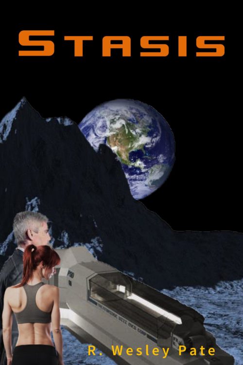
This is a sci-fi novel targeted for adults. The cover presented here is a layout concept. The story begins 50 years in the future as the protagonist and her husband travel to an exclusive resort on the Moon. A bioterrorist attack leaves most of the guests and staff infected with only days to live. The heroine goes into stasis to try and survive long enough until a cure can be found. She’s in and out of stasis for the next 200 years until the day arrives when she can take matters into her her hands.
What I see here is you’re trying to represent all of the story elements on the cover. Earth from the moon — check! Statis chamber — check! Heroine and her husband — check!
However, do so means that your cover doesn’t have one central element on which to focus the eye. Look at the thumbnail: The only thing clearly visible is the Earth, which is both generic and undramatic.
Find an image which will appeal to the readers who would appreciate the book. Maybe a skeleton, half-buried in moondust, with the earth behind it?
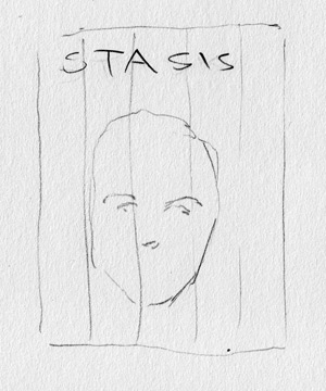
My first visual idea when I read your description, before I even say your cover, was this:
That’s the protagonist’s face front and center, and each of the vertical stripes is a section of a different color (present, though not as intense, on her face) with a different background, giving the visual message of one person in different times or places.
I’d have to play with it to see if it would work, but it does have the following things going for it:
- A focal point to the image.
- Structure.
- Color.
You want your cover to have the appeal of a movie poster, as opposed to the “Well, it’s in space” impression of your mockup.
Any other comments?


I did the very same thing with my first cover. I threw in every element from the book I could think of. I look at it now and cringe.
One of the best ways to learn is to look at covers in your genre of books that are successful. Preferably books that have been published by a big house.
About all I can say for the cover’s designer is: you’ve come to the right place. Had you published your book with this cover, it would have landed itself on our companion site lousybookcovers.com soon enough, where it would have gotten random imagery and cut and paste tags at the very least. As others have already noted, you’ve made the classic amateur’s mistake of trying to put every part of the story you think to be important on the cover, and its coherence has suffered accordingly.
From your synopsis, it seems the only plot point that really matters so far as what you should put on your cover is the final one: the lady protagonist spends two centuries in and out of stasis. Nothing else is important: not the husband (presumably dead either because he perished in the attack or he died from old age while waiting for his wife to be cured), not the setting for the attack (which merely establishes that this is the future), and not what disease the terrorists gave her (a mere MacGuffin for us). No, all that matters is that this is the story of a gal in Stasis, as your title reminds us; as such, that gal in stasis is pretty much all you need to show on your cover.
Coincidentally, with Star Wars: The Last Jedi being rolled out just last week, I’ve been seeing a lot of the very kind of image your cover needs on it in the trailers for that movie. Specifically, what you need is a picture of your protagonist in her stasis pod. Like Finn in his bacta suit (as portrayed by John Boyega), the obviously advanced technology enclosing your protagonist should suffice to clue your target audience to this being a book about the fairly distant future. A straight-up portrait of her asleep behind the glass (or plexiglass or transparent aluminum or whatever stasis pods fifty years in the future are using) is all you need.
Cryosleep and other methods of putting people in suspended animation being a common staple of science fiction involving space-faring civilizations that don’t have any means of faster-than-light travel, you won’t need to include anything else whatsoever on your cover to let your prospective readers know this is set in a space-faring future. So long as your protagonist’s face is sufficiently pretty, you also won’t need to show any husband; readers will easily surmise that anyone as good-looking as she is could hardly be unattached at her age. So long as she’s got her eyes closed, you also won’t need anything to indicate how much time passes in this story; even the most casual science fiction readers tend to be aware that the whole purpose of suspending people in such stasis pods is to keep them alive while they wait for important events further in the future than their lifespan is likely to endure (such as the arrival of their star ship in a distant star system or the development of an as-yet uninvented cure for whatever ails them as in this story).
As such, while you can include more details on the cover than just a gal in a stasis pod if you want, you don’t have to and I generally don’t recommend doing so. While our esteemed host’s suggestion of multiple backgrounds in vertical stripes would be a good idea if this were fantasy instead of science fiction (since fantasy’s version of suspended animation isn’t so instantly recognizable on a cover as science fiction’s), it would only clutter your cover needlessly if you were to impose it over the shot of your protagonist in a stasis pod and earn you a layers upon layers tag on lousybookcovers.com. If your urge to be all symbolic and sub-textual and all that great stuff absolutely compels you to add anything else (such as a shot of a starry sky with Earth in the middle of it hanging over her pod), you should show it only as a vague reflection in the pod’s window.
Your story’s premise is simple and immediately accessible enough to be summarized in just the one sentence at the end of your synopsis. Your cover should likewise be just as simple and immediately accessible to your target audience. Don’t let it get so bogged down with superfluous details as it is right now.
The cover only makes sense if you already know something about the book…which is putting the cart before the horse.
I think you may have fallen into the “kitchen sink school” of cover design: the urge to include every element you think is important. So you have your two characters, you have the moon and you have what I presume is a stasis chamber of some kind. But none of those things are really significant without already having some knowledge of the book. For instance, there is absolutely no way to know what that pod is—it might even be a spaceship at first glance—without knowing the story.
Even given all of that, the cover tells the potential reader nothing at all about the book, its themes or story.
However, all that being said, perhaps the worst problem might be the execution of the cover itself. It is just too patently a cut-and-paste job, with each element apparently having been taken from a different, unrelated source. Light comes from a different direction for every element and nothing casts shadows. Nor, for that matter, does anything seem to make much sense. Is the pod sitting on the surface of the moon? Are those two people wandering around on the moon unprotected?
I think you need to rethink the cover from scratch. Pick one, strong visual element that would best get across to a potential reader what your book is about and make everything else subordinate to that. Others have already suggested that you focus on the idea that your heroine finds herself leaping from one time period to another as she goes in and out of stasis. I agree with them that this would be a great starting point.
I look at the current cover and my first thought is, “How long would a woman last in her underwear, without a spacesuit, on the moon?” My second thought is, “Does the moon even have any mountains that high and jagged?” It has the unintentional copy-pasted illogic of too many unprofessional covers. It would work a lot better if the ghost man were deleted and the woman and the stasis pod were inside a moon base with the Earth visible through a viewport.
However, I really like Nathan’s suggestion, and think it would look awesome if well-done!
Actually, my first thought was “why is that guy in a suit on the moon?” I, too, really like Nathan’s suggestion and I think it would work very well.
(n.b.: if it’s good enough for Interstellar…)
One other comment–the poor kerning on the uppercase “S” in Stasis is bugging me. Please fix that, if you would. I don’t object to the font (trust me, my fellow CC’s are shocked at that, because I usually do), but the S needs to be a bit more snug with the t.
P.S.: make sure that the girl’s face is stunning, asleep there in the pod. Think the compelling beauty of the legend of Sleeping Beauty. Beauty always works.
In fairness to the author, they did say that this cover is a CONCEPT, so the cut-and-paste issues should be overlooked.
But the scene just makes no logical sense. Two people are just hanging out on the surface of the moon with no spacesuits? And she’s in underwear while he’s in a suit? And there’s a stasis pod just lying on the ground in the middle of nowhere?
If you want to depict a scene, it doesn’t have to appear exactly as it does in the book, but it does have to make sense; at a minimum, the stasis pod should be indoors in a space station-looking room and the people’s outfits should match and look like something you might wear into stasis.
Indeed, the author did say it was a “concept”—but even as a concept it does not work for all of the other reasons I listed…and those you also mentioned: both the layout/design and the basic idea itself do not work. Even if all of the elements that were cut and pasted from other sources were to be replaced by an artist, the cover would fail on many levels, not the least of which is that it really conveys no sense at all of the story the author describes.
First of all, thanks to everyone who provided comments. It’s really been eye-opening. This is my first novel…and obviously, my first cover…and I knew there would be bugs to work out. I will definitely take your comments to heart moving forward.
This is a cut-n-paste job, as you all noted, which is due as much to my limited, self-publish budget as anything else. Not sure a professional artist is realistic at this point, but we’ll see. Again, thanks to you all for your thoughts.