Because cover copy sometimes becomes a concern and an object of commentary here, some advice about good cover copy from a writer who sells like a sonofabitch:
Selling a story by NOT telling a story
Because cover copy sometimes becomes a concern and an object of commentary here, some advice about good cover copy from a writer who sells like a sonofabitch:
Selling a story by NOT telling a story
The author says:
Explains what cryptocurrencies are, how they fit in our economic system, how to trade them and the risks/rewards involved. This book serves as a introduction to the world of cryptocurrencies and technical trading. Potential readers should get the idea that they could become make money with cryptocurrencies, although there are risks involved.

[original submission and comments here]
Nathan says:
A step forward and a step back here. The good:
The bad:
Recommendations:
Other comments?
The author says:
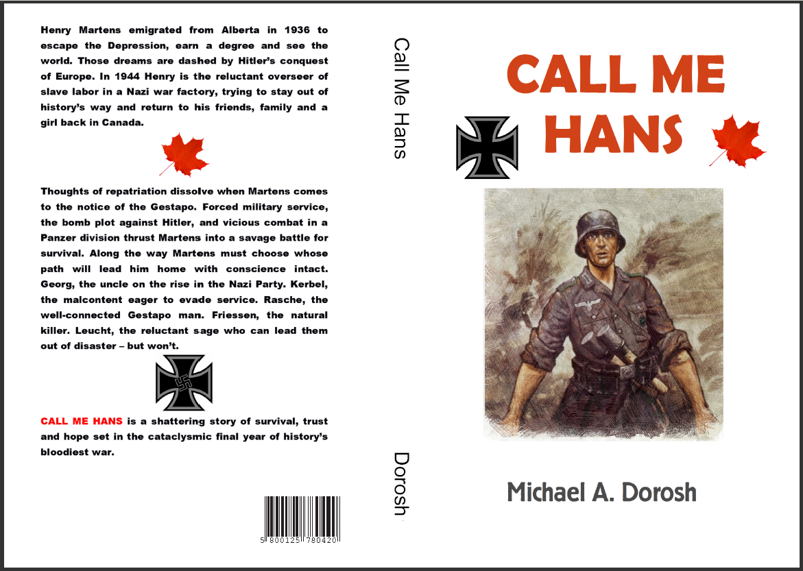
The book is a character-driven historical/literary fiction piece about a Canadian living in Germany during the Second World War. The book follows the main character, Henry Martens, from May 1944. Working for his uncle, a Nazi Party leader and factory owner, Martens has successfully evaded military service until events in his factory bring him to the notice of the Gestapo. From there he’s sent to military training with the German Army, and eventual assignment to a combat unit on the Russian Front. Martens juggles his desire to return home (with conscience intact) with the necessity of toeing the line with his German superiors in order to survive. But the more dedicated a German soldier he becomes, the more he does to survive the war, the more unlikely it will be that he can ever return to family and friends in Canada.
Nathan says:
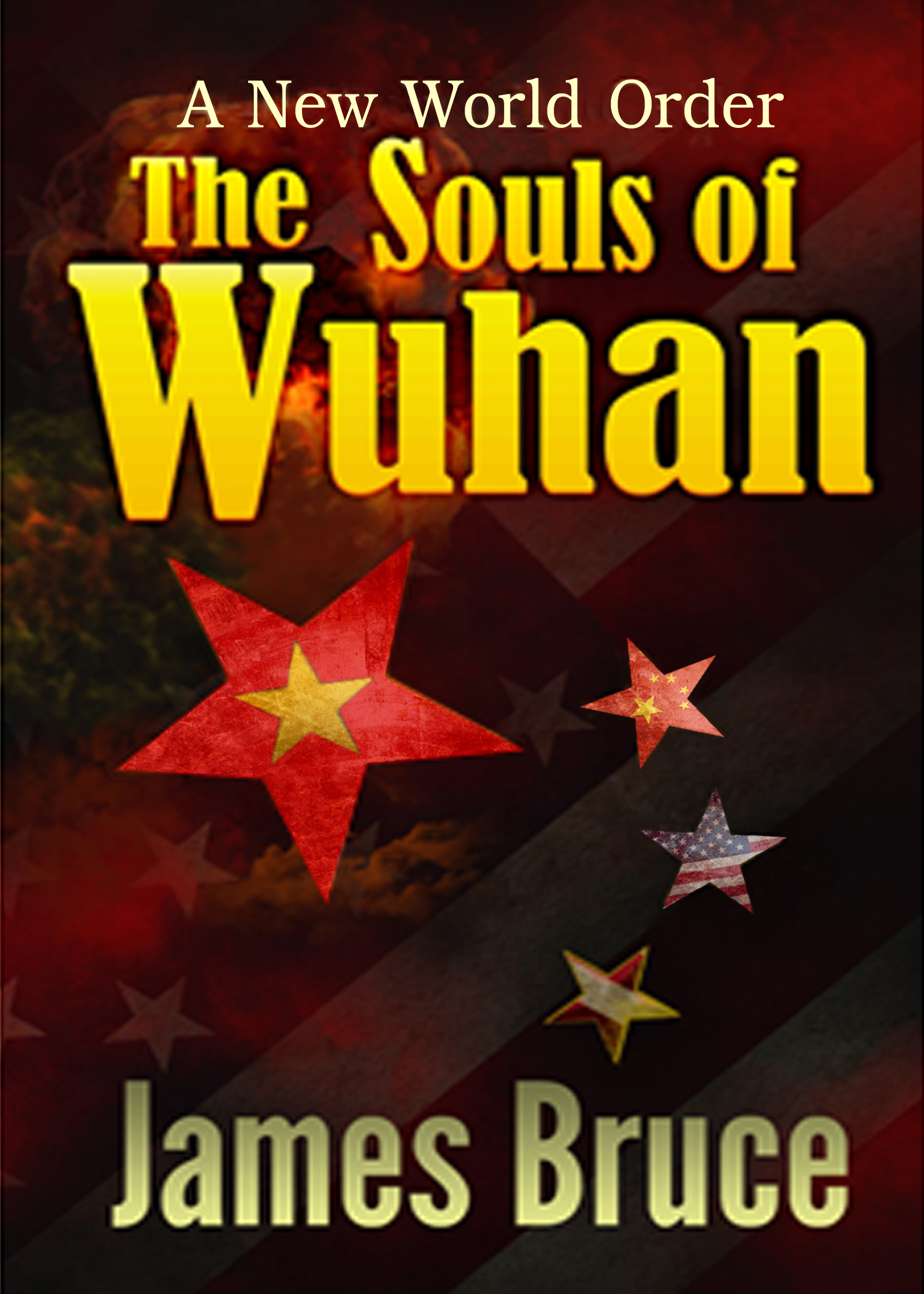
This cover design looks like a throwback to early ’70s publishing for young readers by Scholastic and the like. As such, I don’t think it’s hitting your target readers, unless you’re aiming at juveniles with a book that is as much to teach them about history as to tell them a story.
I think you need to go back and look at the other books in your genre, and be clear what your genre is. A wartime drama is a DRAMA (set in wartime). A wartime suspense thriller is a SUSPENSE THRILLER (set in wartime). Use the cover to convey the type of story first, and the setting second.
Other comments?
The author says:
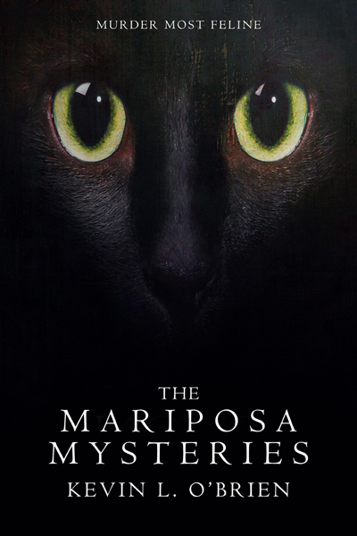
A collection of stories set in Victorian England that combine Sherlock Holmes style mysteries with the Cthulhu Mythos. January Ian “Jaim” Mariposa is a paranormal investigator whose partner/companion is a small black cat named Bubastis. That’s Bubastis on the cover. Target audience is cat lovers, mystery lovers, Lovecraft fans.
Nathan says:
The snark in me say that the cover is only missing two things:
It should be easy to find (or commission for a reasonable fee) something monstrous and Victorian; DeviantArt is awash in images like that.
Lovecraft fans in particular are always on the lookout for a good read, but you’ve got to include something on the cover to let them know that this book is for them — and if it isn’t in the title, it’s gotta be in the image.
Other comments?