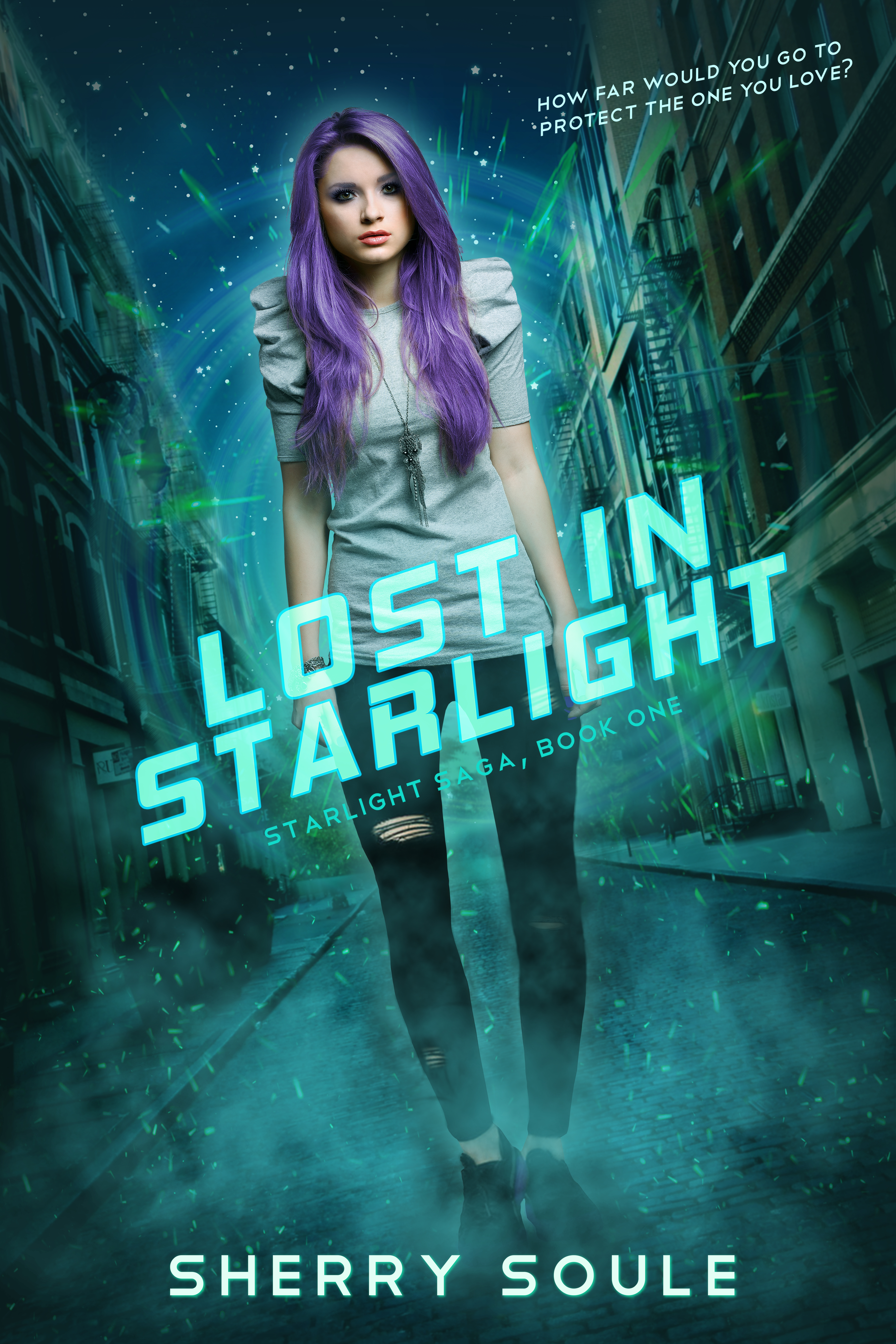
The author says:
Genre: YA Sci-Fi
Nathan says:
Well, you’ve definitely hit the bull’s eye on genre identification. This has “teen spec fic” written all over it. I’ve only got two design notes:
- Apparently this bugs me a lot more than most people (because if it bugged other people, it would be nearly so common): I hate italics which, because of the angle of the baseline, still tilt left. If your goal were to make ME happy specifically, the title type would align either with the horizontal building fronts or with the vertical edge of the cover itself, and the latter’s probably a better choice. (The fact that the tagline is also at a different angle just exacerbates the problem.)
- The series title could stand to be lighter and more readable — at the very least, I’d make it the same color as the title interior, rather than the title outline.
Other comments?
This is good! Even your cut and paste lines look good, which is not something I say very often.
Aside from squaring up all those different diagonal angles, my only objection is her very square shoulders, which make her pose look stiff.
Yeah, I noticed the thing with the shoulders, too and it bugged me–but I’m not sure it would bug the casual looker/browser.
Other than that…it’s pretty damned good.
Talk about a brief description! Well, this is apparently a “Sci-fi alien Romance” if I’m reading the title of the cover’s JPG correctly, yes? From the purple hair and swirls and specks surrounding the gal, I’m thinking this might be something like the romantic comedy anime series Onegai Teacher, in which a half-human extraterrestrial gets into a lot of hot water with the authorities on both her world and ours when she gets romantically involved with one of the students at the high school where she gets a job as a teacher.
I only have two recommendations for improvement:
1. If you have the resources for it, and the angling of italicized captions bothers you as much as our host, you could try diagonally tilting the images and captions on your cover the exact same angle to the right that you’ve got them tilted to the left right now. The picture would still have all the same dynamics it has now while the italics would tilt unambiguously to the right.
2. While you did a good overall job on the cutting and pasting, your colorization of the gal’s hair also discolored a detectible portion of her forehead up near her scalp. Try being a little more meticulous with your selection tools while manipulating images, and see if you can’t patch that discoloration with selections from the original un-manipulated image of the gal, all right?
Great job that could be tweaked just a bit further to be truly excellent, and more importantly, more eye catching and appealing to the right browsers!
You’ve picked a good image and tilting the whole design was a smart design choice. It gives it just enough of a quirky off-kilter vibe to take a fairly generic image and make it signal science fiction.
The palette is lovely. Though it’s hard to know from the very brief description, if this is a book with a primarily female readership, and a warm, quirky and relatively light tone, and some romance, this imagery gives off that vibe.
I don’t mind her shoulders looking a bit strange. I feel it’s the touch of oddness that draws the eye and vibes ‘alien’.
But I think the swirly sparkly business around her hinting at the SF nature of the story needs to be bumped right up. Brightening it certainly, and maybe also giving a different tint to the science magic elements that would stand out a bit against the green? Picking up the purple note from her hair, or using a complementary piping colour like pink.
Not only are these events the only firm hint of genre on the cover (the most important info for your browsers to recognise quickly) but they are also the detail that keeps the negative space around the girl from being dull and making the overall effect lifeless. Pep ‘em up a bit!
I probably wouldn’t have noticed the italics thing but once pointed out I agree with Nathan.
Talking of the title I think it’s the one bit that could be doing a lot more work to sell your book. You’ve picked an SF-y font which is good and it has a nice glowy treatment. But I think a bit more time playing with options could yield much better results. You’ve specifically got quite a Star Trek TNG font right now. Is that really the exact right vibe to appeal to your teen girl market?
A font with a bit more height would be good to utilise the space it’s in more, and be all the more readable at thumbnail. I’d maybe try out a purple treatment of the title too. The girl’s hair is a welcome break to the turquoise palette, maybe it could stand to be picked up in the text (another thing that would make it pop/read clearly at thumbnail).
Or the series title could be the purple bit. I do think you need to make a little more of that series info. It’s almost apologetically small as is.
The most important thing whatever other advice you go with, is to tidy up those angles. Currently the girl’s angle is a little off from the street and the pull-quote is way off from the title. They should all agree with each other.
As I say, very strong design. But on a cover every element needs to be working as hard as it possibly can to call out to the right reader as she scrolls past due a few seconds, and there’s just a few ways in which your elements could be working that bit harder.
My biggest suggestion would be to have the angle of title, subtitle, and tag the same. In the current work, they are skewed and it makes the eye gravitate to them in a bad way.
Fix – make them 90 degrees to the stance of the model and that would make it pop a lot more.
Maybe it’s just me, but the girl doesn’t seem to be at quite the same angle as the street/background. She looks even more off than she actually is, though; I think it’s the way her legs are angled that make it seem worse. I definitely agree with Kata and Douglas about matching the text angles.
Yep, fix the angles. The spines of the letters should be vertical and the image should match their overall tilt.
Make the Series more visible.
I also agree about the hair coloration. It would be better to err on the side of the hair since other areas which were missed simply look like highlights.
Pretty much second what everyone else has said. The things that stand out most for me are the shoulders and the discontinuity of the type: handle it all in the same way, so far as the slant and use of italics is concerned…including the author name.