The author says:
The book is a literary fiction piece set in the Second World War. The protaganist, Henry Martens, is living in Germany when the war begins, tries to avoid service, but in 1944 is forced into the German Army by an increasingly desperate fascist regime. As noted in the original submission “Martens juggles his desire to return home (with conscience intact) with the necessity of toeing the line with his German superiors in order to survive. But the more dedicated a German soldier he becomes, the more he does to survive the war, the more unlikely it will be that he can ever return to family and friends in Canada.”
I appreciated the commentary on the first submission and hope this will get me a little closer to the mark.
[original submission and comments here]
Nathan says:
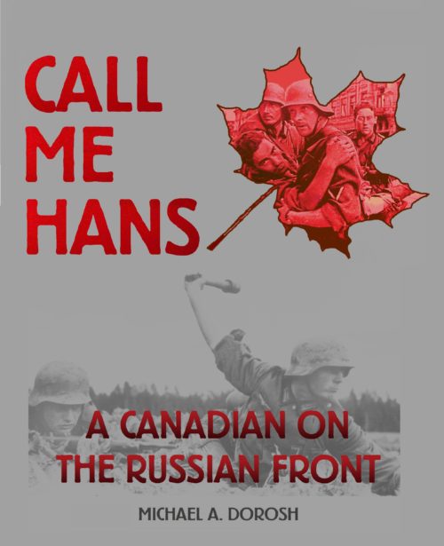
I appreciate that it looks less like an educational piece this time out. However, something about it says “memoir” to me, more than fiction (probably the reliance on period photos). There are also some design missteps in here — the gray-on-gray of the lower photo mutes it to murkiness, and the fact that that murky photo is also behind type also obscures it almost to the point of uselessness.
I think that full-color art is definitely the way to go, rather than monochrome period photos.
Other comments?


Maybe something more like this. (trying to stay true to your vision but add just that bit of color it needs)
https://imgur.com/a/0wE5Mxo
the picture is free from Wiki commons. Its a real recruitment poster.
Not too bad…but it goes in at least one too many different directions, visually. One is the use of the image over the maple leaf, which in itself is not a bad idea. The other is the use of the image of the soldier throwing the grenade, which is also not a bad idea. The problem is that they are two different ideas on the same cover.
Some other issues include:
The overall murkiness of the cover. The dark grey simply swamps everything since the reds are too close in value to the background color.
Making the type two-toned adds nothing but instead detracts from the readability.
The background photo simply vanishes against the dark grey background, especially since the contrast in photo itself has been decreased, making it greyer overall.
The photo is largely wasted since the subtitle has been planted on top of it. It is also wasted by being much too small: its side and bottom edges should bleed off the cover.
The juxtaposition of the leaf and the gesture of the soldier makes it appear at first glance that the soldier is either throwing or holding the leaf.
You should pick one or the other of the two images. One possibility, however, would enable you to retain both. But you would need to make them work together instead of independently. One thing you could do toward accomplishing that would be to, first of all, make both images much larger than they are now. I would then superimpose the photo of the soldier over the leaf, so that the leaf is in part behind the photo (this assumes you would be able to delete the sky behind the soldiers). This would integrate the two images into a single graphic that would be much more effective than two unrelated images.
But whatever you do, kill that grey background.
Savoy’s suggestion is a really excellent one!
I would only recommend changing the text on the sign to read the same as your current subtitle.
An option to use the photos he has would be to make them black and white and bigger. Place rhem on a white bacground with a cool effect like explosion in black with a huge title in red over it.
Exactly!
I think the original was closer. The photo in the maple leaf is really not doing it for me, and the other photo is so faint and murky it might as well not be there. There’s still a lot of empty space, and the gray is an unappealing color.
I do like the subtitle/tagline. But it shouldn’t be so much larger than the author name, and it should be clearer which one it is. If it’s a subtitle, it should be directly under the title with maybe a horizontal line in between. If it’s a tagline, it should be smaller.
I stand by my original comments: You want a single war-related image that fills the whole cover. That’s it.
I’m with katz on this one: this cover seems like a step backward from the original. In addition to being awfully murky, the background image appears to have been stretched horizontally or squashed vertically (depending on one’s perspective). Red on gray also isn’t a very emotionally appealing color scheme; it just seems rather drab and lifeless.
There’s also a matter of focus, which this revision of the cover lacks. Your original cover had one man at the center of everything, a somewhat bewildered look on his face, and that was a good thing; why not go with that, and just fill the whole cover with that image? If you still insist on getting that Canadian maple leaf in there somehow, my suggestion would be to doctor the picture of that trooper to slap the maple leaf on over his German eagle patch.
It’s very dull, it looks like the type of cover at an old library that I’d pass over. I think you should brainstorm a bunch of different ideas for your story; I’d focus on an individual person for the cover if it’s a mans story during the war not about the war itself. I like the premise and I think you deserve an equally impressive cover for it. I had this one idea of a man in German uniform with a Maple Leaf pin over his heart to show the duality and wear his loyalties lie.
https://i.imgur.com/OskcCfm.png
I tried making a mock-up version of the idea; I’m not an experienced Photoshop user, so It’s a rough draft. It came out looking more appropriate for a thriller based novel but it’s just one iteration of the idea. Invest in a good artist to construct the cover, it’ll pay for itself.
This is definitely a big step in the right direction!
It occurred to me that we all may have lost track of the fact that this is a novel. I know I did. I think that the use of any kind of documentary images combined with the book’s ambiguous subtitle fails to suggest fiction in any way.
Ron: That’s a good point. Honestly, I am not sure I ever “got” that it was a novel–it doesn’t come across that way. I was viewing all these submissions as non-fic, so…IMHO, this needs a complete revamp. Nobody is going to think that this is fiction, as it is.