The author says:
Fantasy meets Science Fiction in this action packed Superhero novel. His life would forever change in ‘The Powers Cataclysmic.’
Over twenty thousand years into the future, humankind, Earth, and the entire universe witnessed a catastrophic event that forced most existence across all universes to evolve into the highest dimensions and beyond. After this shift, all sapient beings could fly and have cataclysmic, super cosmic powers, godlike existence, and use even their hair, garments, and energy as extensions of their bodies. Unfortunately, there were those who lusted to dominate over all others as beyond omnipotence was not enough for them.
Over thirty thousand years after that event, Thrastara Navarras turned twenty-two years old. Months passed, and he still had yet to taste the beginning of his adult level powers, and hopes his friends and his mentor Arveias can help him to unleash his powers despite his trust issues and history of personal trauma. He also hoped Kalavria would notice him and that she would at least tolerate his existence. His fate would forever change when a stranger named Arrak killed two of his friends. While thirsting for revenge he is confronted by Exorcists, including Dr. Johnas Moorekase and Dr. Sephras Kainesen. Johnas warns Thrastara he is infested by demons may be a candidate to be Lord Neraios’s next vessel as the Antichristos. The Lord of Brilliance and Darkness could use someone like Thrastara or one of his long lost siblings to gain even more powers. Family secrets will be revealed along the way. Will Thrastara be able to set aside his deep hatred for the maligned Exorcists, or will he succumb to his hunter Arrak, or ultimately his own inner demons? Within the infinite sized dimensions and beyond, from Earth to Mars and beyond, many questions will be answered in ‘The Powers Cataclysmic,’ which is the first book in the Katastrophica series, a series unafraid to mock itself.
Content: Contains the concept of higher dimensions in a more fantasy oriented sense, extraterrestrials, angels, demons, the supernatural, superheroes, content people may find objectionable, religious references and concepts, over the top superpowers, language, references to and instances of smoking, drugs, alcohol, and some sexual contact.
Genre: Fantasy Sub genres: Superhero Fantasy Fiction (Prose), Science Fantasy, Science Fiction, Speculative Fiction
Target Demographic: General Fantasy/Adult (same group that reads series like ‘The Wheel of Time’ and ‘The Chronicles of Amber.’) and Superhero Fiction of all kinds (comics, novels, etc), fans of action anime. Secondary: New Adult, YA I’m aware that science fiction deals with the future, not fantasy. However, superhero fiction is somewhere in the middle, like science fantasy, which is what I’d like to convey.
[original submission and comments here]
Nathan says:
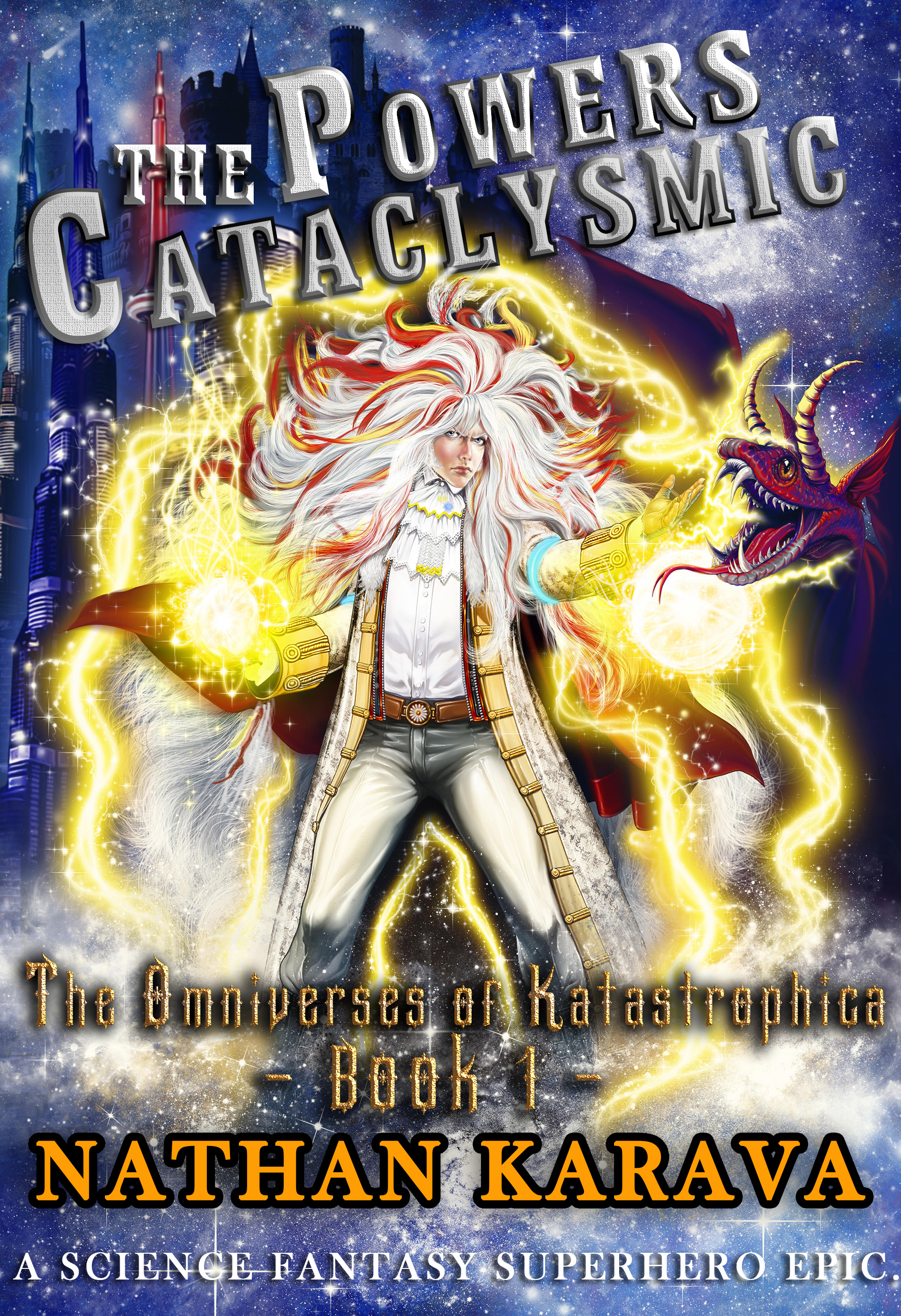
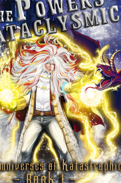
AAAGH! Too much!
Seriously. Angled fonts, beveled fonts, drop-shadowed fonts… The artwork is ornate enough. Adding bling to the type just makes it harder to read.
And with all the added sound and fury in the art, the thumbnail just becomes “I think maybe there’s a figure in there…” Remember, since 95% of your potential readership will first encounter the book as a thumbnail at Amazon or some other ebook site, your thumbnail has to set the first hook and get them to click through.
I would chop the artwork like so:
…and then use strong font treatments that clearly separate the text from the background and make it easily readable.
(Also: Your blurb is still TL;DR.)
Other comments?