The author says:
A short erotic thriller focused on an innocent girl being drawn into her boyfriend’s wealthy family and discovering their dark and twisted sexual relationships.
Nathan says:
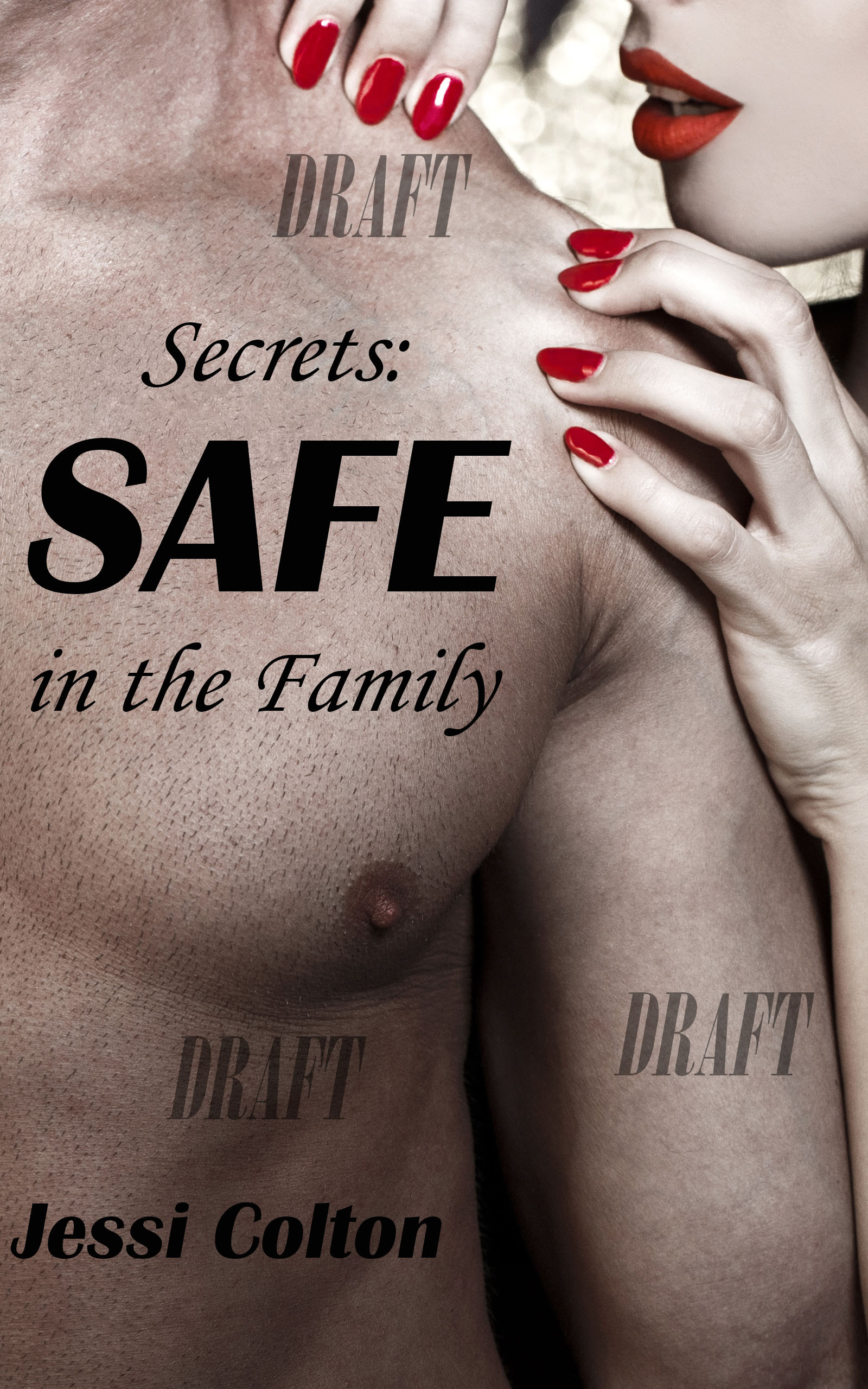
The biggest problem here is that you’ve chosen an image with the girl as the aggressor; that sounds like the complete opposite of what you want. Start with a different image, on in which the female figure is in sexy peril.
I agree with Nathan. The cover really doesn’t reflect the story you have described. There are problems as well with the typography, but since the image needs to be rethought from scratch there’s not too much point in making any comments about that right now.
I agree that the typography needs help, and the cover seems to be backward (to the storyline), but the bigger issue to me is the image itself.
Am I the only one turned off by seeing every pore or cuticle on the guy’s chest? It’s positively making me turn away. I would strongly urge you to find another image. To me, it looks like they wanted a clean-shaven male model and couldn’t afford one, so they got some guy that shaved two weeks ago. It’s extremely unattractive and offputting. It looks like chickenflesh with hair.
You’re not–the very first thing that jumps out at me is that it seems like a very hairy guy who had his chest shaved and now it’s growing back. Ouch, stubble!
YES, exactly. If you zoom in, that’s exactly what it is, stubble. Bleacckkkkk. I mean…yowch! And it’s just freaking distracting, visually, even ignoring everything else…it’s all I could see, when I opened the page. I couldn’t pull my eyes away from it. NOT what you want for a cover, unless the whole damn book is about his chest stubble, which hopefully, it’s not.
I am really sorry you guys pointed that out. I have been feeling itchy now for the past hour.
Like the others here, about all I can say is your image is right for the genre, but not so much for the individual story. Aside from the stubble (and the “draft” watermarks, which I hope are only there because you haven’t actually purchased the image yet), it looks for all the world like the gal is about to grow a pair of fangs at any moment and sink them into that beefcake guy’s neck. Whether your summary tells the story straight or there’s some twist reversal you neglected to mention in which predator and prey switch places halfway through the story, your cover is no place for either misdirection or spoilers for this kind of story: you want to intrigue your prospective readers, not confuse them or spoil them.
Of course, if (as your summary implies) this is about the gal finding out about a whole family of predatory perverts, the cover also ought to have more than just the guy and gal; as in, maybe the guy and his dubious relations all sitting together on a couch (preferably with him in the middle), and the gal standing or sitting and looking at them with her back to us. For best results, assuming she really is the prey and they are the predators for this entire story, try to angle them so that she looks small and vulnerable and they all look comparatively large and menacing with looks on their faces that say “Girl, you look good enough to eat!”
I, too, was thinking this looks like a vampire novel.