The author says:
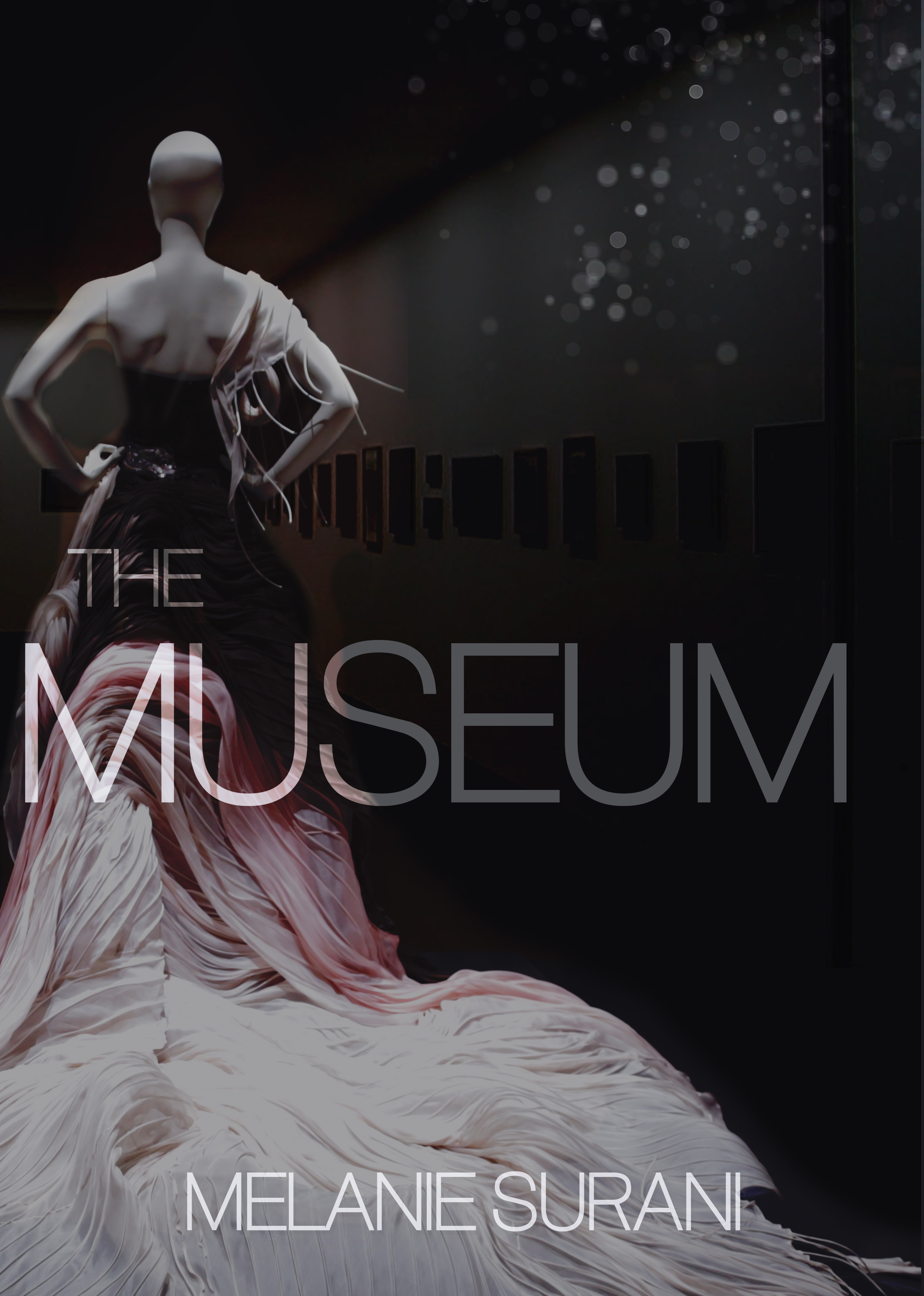
All Sophia wants is to leave work and see her favourite artist in concert. She meets him: Josh. He’s friendly and dreamy and they click. But before Sophia and Josh know what’s happening, their champagne is drugged and they wake up in a fashion museum. At least, it used to be. The museum is dark and unattended. The two of them are dressed in strange costumes, as are the mannequins and dress forms. Exhibits display creepy designs, unnatural taxidermy, random boxes and step ladders, putrid food in the employee lounge… No one’s coming back. They meet the other people in the museum. No one knows how they got there, and with no outside doors or windows, no one knows how to get home. The phones are cut, but surveillance is running. Tempers flare as food runs out. If they don’t kill each other, the museum will.
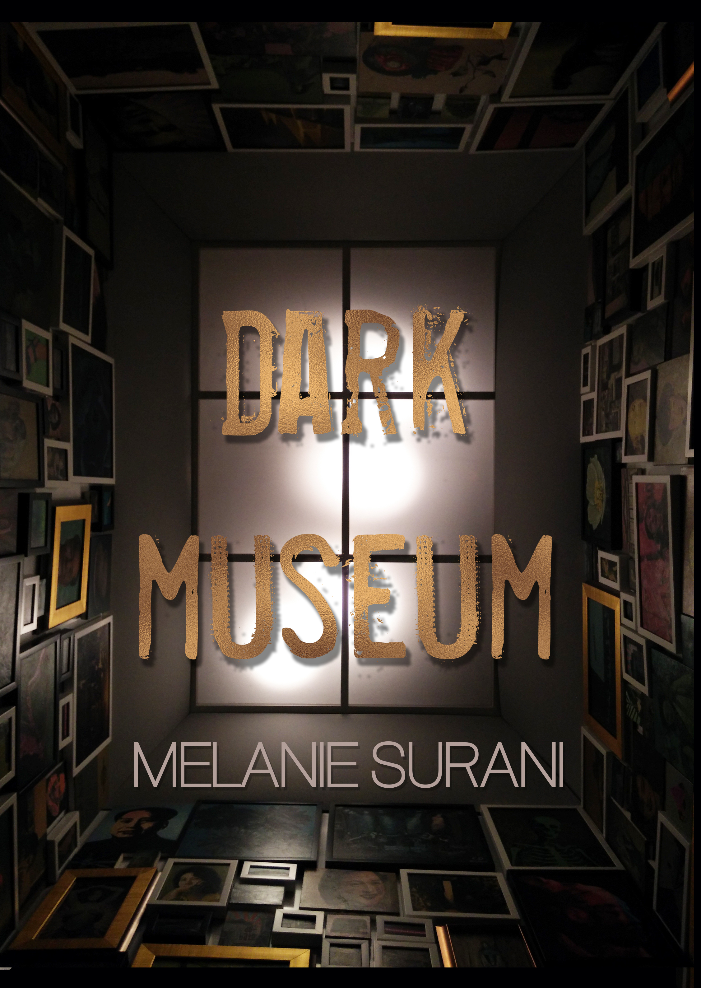
________ Suspense, mystery, 20 minutes into the future (2nd attempt at this cover — used to be called The Museum)
[original submission and comments here]
Nathan says:
I honestly think you’re getting farther away. The text is hard to read, and the museum isn’t comprehensible as such without a good long look. And “warm gray” really doesn’t read as “suspense.”
Here’s what I think you need to do:
- Identify a half-dozen novels that you would expect to be in the same shopping cart as yours.
- Examine the covers for those novels. Look for commonalities. As yourself, “How does the reader of these novels know that these novels are meant for him/her?” Is is bold type? High contrast? Backlit silhouettes? A color scheme dominated by one strong color?
- Use the visual cues you just gleaned to come up with your cover concept.
Other comments?