The author says:
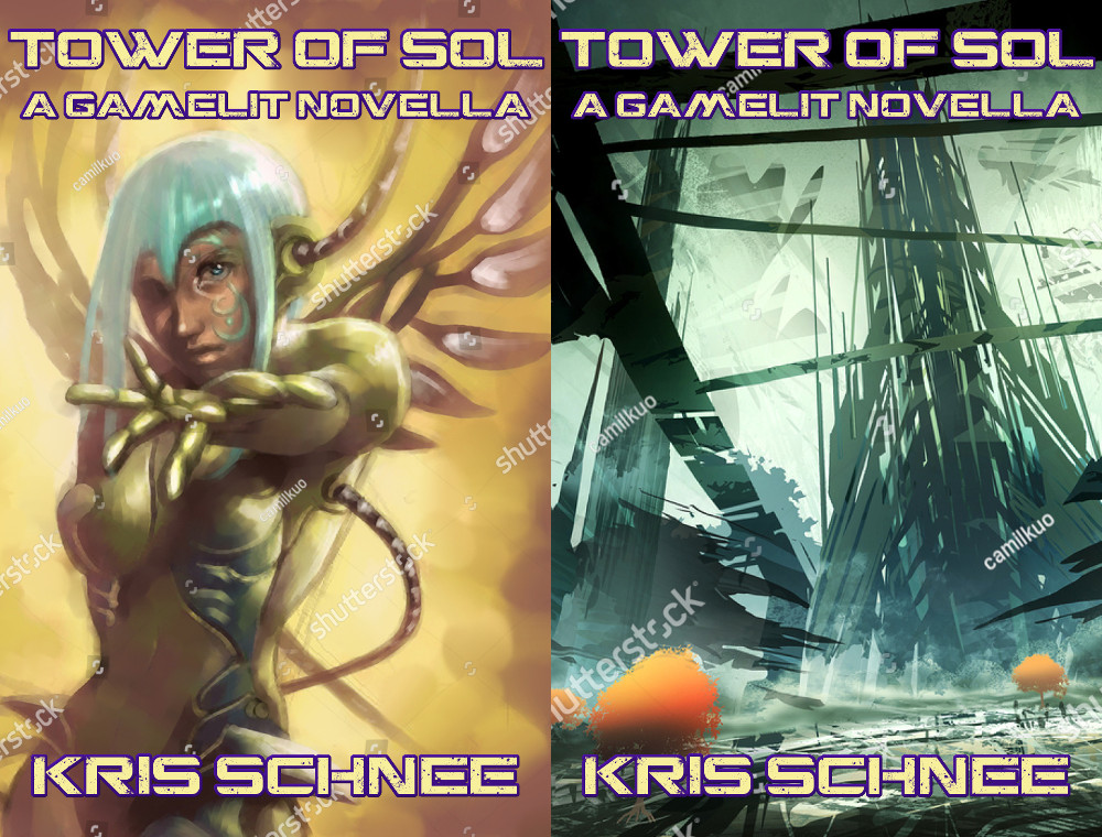
(Prototype with two possible versions; has Shutterstock watermarks.) This is a 32K word story in the “LitRPG” or “GameLit” genre in which characters are playing some sort of roleplaying game with specific rules. Similar authors: Michael Chatfield, M. H. Johnson, Travis Bagwell. In this one, there’s a post-apocalyptic (21st century) village. Its people learn about a tower built by a game-obsessed AI who challenges them to go there and fight their way to the top, past robots.
Nathan says:
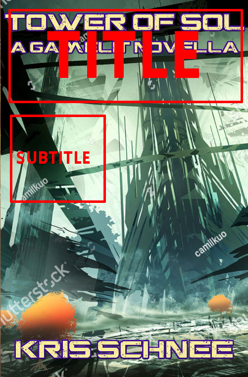
If you’re going for a post-apoc vibe, the second cover is DEFINITELY the way to go. Not only is the figure drawing on the first cover a little off (perspective is hard), the initial impression is one of fantasy, not sci-fi — you have to look longer to realize that there’s actually some tech in the faery-like body armor.
Concentrating on the second cover: I’d see what can be done about making the title bigger; having title and byline the same size is visually confusing, and unless your name is “Stephen King” etc., it’s the title that should probably be larger.
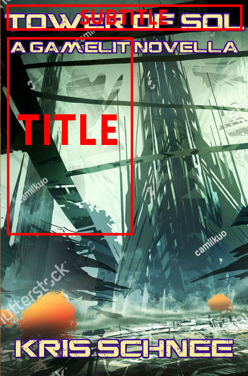
The two layouts I’d play with are one with the title at the top (on two lines), and the subtitle left-justified to the left:
 …or maybe subtitle at the very top, and title to the left in that open space, left-justified:
 Other comments?
While the second cover does seem to best represent your book, in either case what you don’t want to do is let the cover art dictate the cover design. Unfortunately, two things often happen. One is falling in love so much with an illustration (and/or paying so much for it) that you don’t want to cover up any of it with type. Another problem is that all too often artists making illustrations available though DeviantArt and other sources don’t always necessarily have “book cover” in mind, with the result that there is no provision made for space for a title or other text.
Regardless of how good the artwork on a cover is, it’s of prime importance to make certain that the title is prominent and readable.
To this end, Nathan’s suggestions regarding the placement of your title and other text in the second example are excellent.
I like Nathan’s suggestions. However, an alternative would be to make the main title 3-4 times taller (not bigger) than it is now. I don’t mind the subtitle underneath, but the main title has to dominate it if you’re going to keep it there.
They’re both rather good covers, but unlike our esteemed host, I wouldn’t dismiss that first cover with the faerie cyborg on it without having a little more information first. RPGs, like many other forms of fiction the Japanese have introduced to us, are known for being heavy on both fantasy and science fiction. That gal who looks like a fantastic creature in the thumbnail but more like a soldier in futuristic battle armor in close-up wouldn’t be at all out of place in, for instance, a “magi-tech” RPG like Chrono Trigger or Chrono Cross or the apocalyptic science fiction anime SaiKano (in which the cyborg super-weapon girl Chise looked a lot like that when in battle mode).
That said, the second cover is also very reminiscent of the “Tower of Destruction” from Chrono Cross, and the supervillain’s tower lair from the science-fiction anime Scryed that he built entirely from his twisted imagination combined with his ostensibly scientific (but awfully psychedelic-looking) otherworldly “alter” powers. That’s why it’s difficult to know the specific genre(s) just from being told this is a LitRPG: RPGs can be everything from the hardest of “hard” science fiction to the most fantastic kind of fantasy and everything in between. That you state the story takes place in (evidently) a computer simulation featuring a post-apocalyptic 21st century village and a tower defended by robots only tilts the probable genre slightly further toward science fiction: Chrono Trigger and Chrono Cross had all of these science fiction elements, and yet were also filled with fantasy beings like faeries and mermaids and magic-wielding warriors and haunted swords with mystical spirits indwelling them.
Obviously, if your story’s events are taking place in a world known to be a computer simulation (as with Tad Williams’ Otherland book series), this book has to have at least some science fiction in it. However, if the computer simulation also contains a fair number of fantasy characters and settings (dragons, elves, faeries, goblins, mermaids, vampires, etc. in castles and dungeons filled with magical weapons and equipment) for the players’ amusement, then maybe you should hint at this by showing a combination of fantasy and science fiction on your cover. I also wouldn’t entirely rule out the possibility of combining the two covers: I can easily imagine that faerie cyborg or someone like her standing in the middle of that tech-tower landscape or something like it, especially if she’s actually the RPG world’s character avatar for one of the players.
Basically, in any story set in a simulated world where the technology is advanced enough to allow for any kind of story to be simulated, we need to know not only the book’s genre (obviously science fiction), but also the genre of the story-within-the-story. If a story in one of Paramount’s authorized Star Trek books takes place entirely (or almost entirely) in a holodeck or holosuite simulation, the cover artists still need to know what genre that simulation’s story is before drawing an image (or montage thereof) for the cover. If your player characters fighting their way past robots to reach the top of the tower are going to be fighting to rescue an elven princess cyborg from the dragon cyborg holding her captive once they get there, your prospective readers would probably like to know something in advance about all this fusion between fantasy and science fiction tropes taking place in your story.
Thank you CC and all commenters, for your advice! It looks like nearly everyone favors the “tower” image over the “angel/robot” image.
I had not considered these alternate placements of the text; will play around with those. My main concern has been “is this title going to be at all readable at the 115×180 thumbnail size?”
Re: RK’s comment, in this case the story is in the real world with what is basically a live-action roleplaying environment. I’m a bit bothered that the tower isn’t quite accurate to the plot (it doesn’t look like this), but it’s reasonably close.
Well, this may be a first: I’m the one saying “your cover image doesn’t tell us enough about the story” when no one else brought it up.
I know it says “A Gamelit Novella” right on the cover, but LitRPG is such a tiny subgenre that I really want to signal that with the cover image through a traditional technique like “image dissolving into pixels.”
More broadly, I understand the limitations of budget, but both these images just scream “predrawn art I bought off a stock image site” (and not just because of the watermarks). So looking at them, my brain doesn’t go “If I read this book, there will be a cool blue-haired cyborg chick,” it goes “The author of this book thought the cyborg chick picture was cool, but the contents of the book will be totally unrelated.”
I’m not expecting you to conjure a perfect custom image out of thin air, but it helps if the stock painting has more dynamism. These images look generic and decorative because nothing is happening in them. I think you can probably find an image with more movement that also checks more of the boxes in your description (post-apoc, fighting robots, etc).
Gwen is right. And if you do find an alternate image that comes closer to your what your book is about, be careful to make sure that it’s one that will work with having typography added. A fairly good rule of thumb is to not have anything vital in the upper third of the art. See these cover paintings by Steve Hickman for examples of what I mean:
http://www.stephenhickman.com/Gryphon.jpg
http://www.stephenhickman.com/kindred.jpg