The author says:
The book is a sci-fi technothriller set 10-15 years in the future. It involves AI, robots, a tech theft, and a home invasion. Think Ex Machina meets Rear Window meets trolley problems. I want it to appeal to scifi readers who like Michael Crichton-style technothrillers / Hard sci-fi / Asimov’s robot novels. The cover is not a mockup, but I want to get other opinions before I publish the book. Specifically: 1)Does it convey the genre expectations? 2)Does it stand out? 3)Does it make you want to click on it and find out more about the book?
Nathan says:
It definitely says “techno.” I’m not sure about the “thriller” part.
When I look at the “technothrillers” category, here’s what I see (click to see it large):
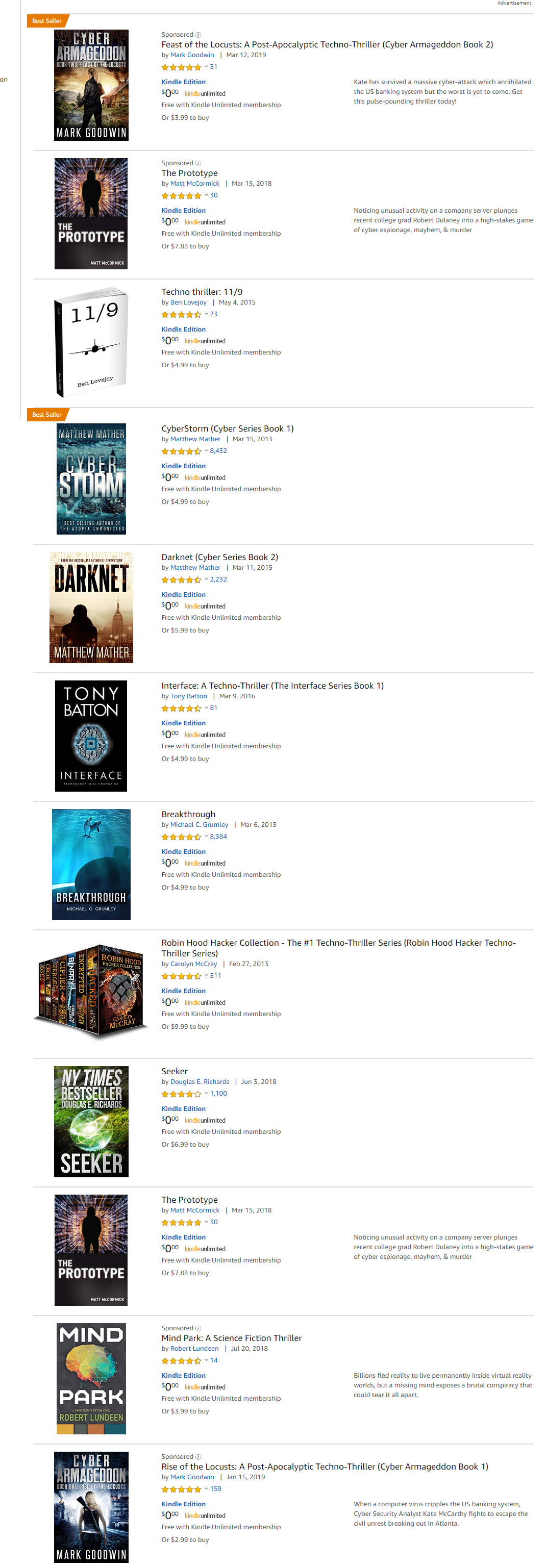 Here are some commonalities I see:
- More often than not, a thin sans-serif font.
- A lot of silhouettes.
- High-contrast color schemes dominated by one color (a cold one, most likely).
I know you wanted the cover to “stand out,” but before it does that, it needs to draw the attention of your target audience, which means it needs to contain the instantly recognizable cues that that audience looks for to find books aimed at them. I think if you tweaked your existing cover with those visual cues in mind, you’d have a winner.
Other comments?
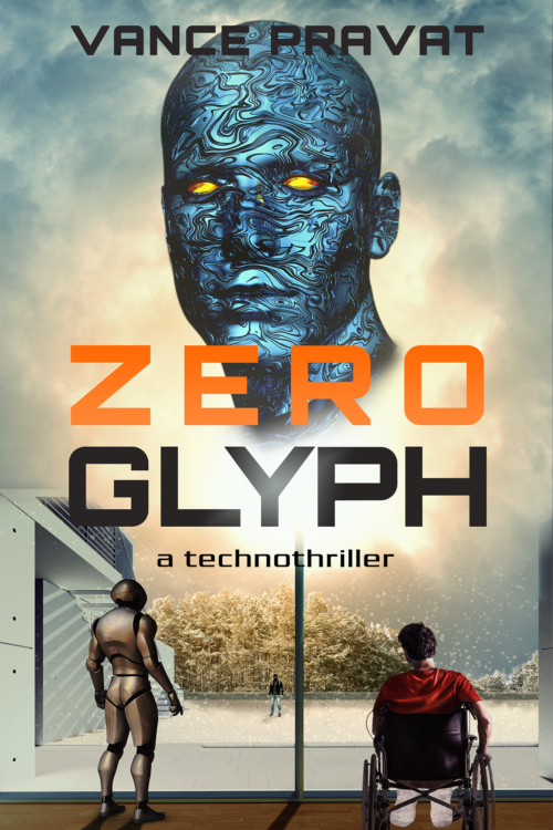
Not off to a bad start. The first thing that came to mind was that there may be too many visual elements and too many that are unrelated. That is, you have a robot (I presume), a figure in a wheel chair, a figure in the distance, the giant head, some trees and bits and pieces of a building. But there is nothing really tying all of these things together.
And some of these elements seem entirely unnecessary. The trees, for instance, add nothing to the cover, nor does the partial building/window frame—which fades off into sky for some reason.
Some things to perhaps consider working on…
Eliminate everything except the figures and the head. The building, window frame and trees are unnecessary. A flat surface is all you need, perhaps with some sort of pattern that would enhance the perspective, with lines leading toward the center horizon.
Increase the presence of the figures, especially the ones in the foreground. If they were raised further into the picture frame, their cast shadows would be visible on the ground, the converging lines of which would help lead the eye to the giant head. And if the figures were lit by the light source in the center of the picture instead of from random directions, this, too, would help tie them into the image.
Ron, thanks for the detailed analysis.
The bottom half represents a scene from the book; the robot and the man in the wheelchair are in a house, looking out at a masked robber in the ice-covered lawn beyond. I added the trees to break the monotony. Yeah, the light source is the sun outside, which means the backs of the two figures inside should be in shadow. That’s how I made them initially, but that just reduced the detail and colors of the two figures in the thumbnail image, which is what most people see. I’ll give it another shot.
Raising the figures into the frame is a good idea; the lengthened shadows should help tie the two figures together.
I am not entirely happy with the giant head either, but I don’t know what else to put in its place. The image of an eye, like in a lot of thriller covers? Or just eliminate it altogether and enlarge the title and author name? Suggestions?
I might add that the two foreground figures don’t seem to be reacting to the giant head. If it were apparent that both were looking directly at it, this would go a ways toward unifying the cover.
(At the moment, they seem to be looking at the tiny figure in the distance. If they are, then I would change that. It creates too many centers of interest.)
I agree with Ron. You need something to link the images together. Maybe try fading the sky to black under the floating head, losing the building and replacing it with the cloud and that fun specs texture you have in the corner and using it to highlight the other figures, which I’d probably make bigger but I think you need to play with the placement of all the elements, including author name because that looks a bit forced into the spot. It might look cool to make the head much bigger and partially off the side or angled like he’s looking down.
That head is a great graphic and with some repositioning is probably strong enough to carry the cover on his own.
I think one of the most consistent errors that I see authors make, in cover design, is the “scene from a book” scenario. We have a client right now, that has made the cover designer change a FAB design several times, for the teeniest of reasons–that a house used in the cover doesn’t have exactly the right type of steps leading up to it, or the right type of tree next to it, etc. As if the readers who buy the book will ever notice–they won’t. They really won’t care. Hell, 98% of them will never bother to even click back to see the cover, once the book is downloaded. (Ask Amazon if you don’t believe me–there’s a reason that the SRL [start reading location] doesn’t open at the cover or the title page or sooner.)
Honestly, you might be better off nuking the robot, the scene in the yard, and using the wheelchair-bound resident (presumably the home invasion victim, yes?) as the silhouette, which would also address the large white blobs, below the seat. Use him as the silhouette; come up with a far more interesting brightly-colored background for him, and then float Mr. Blue head in the sky, (maybe it fades to black, like the night sky, and Mr. Blue Head floats around up there?).
I might also suggest finding a less lackadaisical wheelchair occupant. Yours looks like he has his head cocked, like he’s watching cute little squirrels running around the yard, not a killer/intruder/whatever. Just a comment there. Silhouette a more-alert wheelchair user with some yellow-gold glow, then fade it to blue(ish) to black and Mr. Blue Head can dominate. That might fly.
I’m okay with the font. It conveys “techno” and it’s a san serif, albeit a bit blockish. That’s typical with sci-fi/techno thriller, so, I think that’s fine.
Offered FWIW.
‘As if the readers who buy the book will ever notice’ I would – that’s why, as a child, I decided to become an illustrator! 😀
Though, obviously if you’re using photos you can’t always get it perfect, which is fair enough.
I commiserate with you, Hitch. The biggest hurdle any author has in dealing with their own book cover is objectivity. It’s just too easy to fixate on details that seem of immense importance to you because you are already intimately familiar with the book. But the potential reader isn’t privy to all of those details. I’ve told this story many times but it’s worth repeating…
I was once shown a cover for a book that was described as a Tolkien-like high fantasy adventure. The cover image was of a rustic stone bridge crossing a babbling brook in a lovely rural setting. I couldn’t figure what that had to do with heroic fantasy. So I asked the author what in the world he was thinking. “Well,” he said, “the hero is an ogre and that’s the bridge he lives under.”
PS
Please! No silhouettes!
Ron:
Normally I’d concur, but, look at the books on that image from Nathan! That’s silhouette after silhouette after silhouette. Obviously, it’s an expected element. I mean, I’m all for encouraging good or great design, but then again, there’s bucking the trend too, and in book cover design, that’s not necessarily the best idea, no???
Ron:
There’s a difference between a flat silhouette pasted on to an unrelated image, and a figure silhouetted by the light source in the image.
You are absolutely right, Nathan. The cover for “Cyber Armageddon” is a good example of what you say. (Rather than being a silhouette, the figure might be said to be “silhouetted” against the background.)
Even that being said, I am not so sure that such a device automatically reads “technothriller.” When I do a search in Amazon for “spy thriller” I see the same device used.
My prejudice against true silhouettes—a figure in a solid color—is that I all too often see this being done in lieu of having to actually depict any detail in a figure.
My big objection to this cover: That blue head stock image has been used in a lot of blog articles.
The first thing I thought upon seeing this cover was “Haven’t we seen that looks-like-Doctor-Manhattan-with-liquid-metal-skin guy somewhere before?” Then I went back through some of the previous covers we’ve had on here and found that yes, yes we have. If it comes down to choosing between one element of the picture and the other, I recommend dumping the stock image of that guy’s big blue head in favor of the other images.
Basically, I think your decision does come down to that, and therefore you should dump the big blue head. While it’s not incredibly obvious what exactly is happening on the rest of the cover, the guy in the wheelchair and the robot viewing a guy in a snowstorm through the window of a scientific-looking building do make this cover look rather cinematic, which is generally a big benefit to hard sci-fi covers. I’d also recommend centering those three characters vertically (extending the wooden floor in the foreground out backward as much as you need to in order to fill the cover) and putting your titles up top and byline on the bottom; that way, you’ve got whatever action there is on this cover focused smack-dab in the middle where every casual browser can easily spot it on the thumbnail, and your captioning all in the “dead space” where there’s not much of anything happening that would keep anyone from reading the titles and byline.
Another point of concern: what exactly is the “action” on this cover? As our esteemed host says, we’re definitely seeing the “techno” here, but the “thriller” part is eluding us; by definition, a thriller tends to have lots of action. With that big blue head hanging in the middle some kind of big glowing corona in the sky, I was kinda thinking this was a science fiction version of Jesus Christ’s Second Coming as envisioned in religious literature: just, y’know, with a space alien or an android or some such emerging from the celestial cloudburst rather than our Messiah.
I guess something emerging from a big glowing corona thing could be the “action” on this cover, but it strikes me that the big glowing corona by itself before anything emerges from it might serve that same function just fine. Without that big blue head, it’s left to the prospective reader’s imagination what that glow might be and what (if anything) might be emerging from it. (Of course, one might just as easily believe it’s an “everyone staring at a huge explosion that’s about to kill them all” shot, but that’s not necessarily a bad thing for purposes of thrilling the viewer.) In any case, that’s one more reason to dump the big blue head.
In short, while I can’t figure out much about the plot of the story itself from any of your imagery (and you certainly didn’t say anything about it in your summary), you do have most of the right kind of elements to suggest the genre here, which is all you need to do. Trying to combine two completely different images into a cover montage, however, is not going to work; you need your cover to consist of one single fully integrated image. So again, one last time: dump the big blue head and focus on integrating everything else on the cover into one big well-centered picture.
RK, Thank you for your comment. My initial cover looked like this: https://drive.google.com/drive/folders/1m6hxNARCCxcglYGYYdjNSISDOZFL6kf2?usp=sharing
I felt it wasn’t looking sci-fi enough so I removed the human face, changed the background, and stuck the blue head on top. I got the blue head from pixabay, so I can imagine its been overused. I’ve searched lots on shutterstock and istock for a good android/cyborg face picture, but the free one seemed the best of the lot.
The head is just there to fill up the space of the top half of the cover; it is supposed to signify an advanced AI that is a central character. I didn’t realize people would interpret it as part of the scene below.
I’ve seen many two-part covers that have a scene at the bottom and a face at the top. Like this one: https://www.amazon.com/gp/product/B01N1ZJ41Y Or this https://www.amazon.com/Amid-Shadows-Michael-C-Grumley-ebook/dp/B00FFXHMEE Or this https://www.amazon.com/Mage-Slave-Enslaved-Chronicles-Book-ebook/dp/B01IRU7F9S
They seem to be doing well, so I don’t think a two-part cover by itself is a dealbreaker. I guess the elements in those covers are better integrated with each other, while the ones in mine still seem separate as Rob pointed out. I gotta work on that. I’ll get rid of the blue head and try having just the scene as the focus of the cover, as well as replacing the head with a better image, get rid of the glaring sun and perhaps do a double exposure effect.
As for the genre, I suppose its more of a hard sci fi than a technothriller. It doesn’t have much action. The first half involves a robbery at a corporation – lots of conversations, board meetings and such; the second half deals with a home invasion. Easy fix – I’ll just remove the technothriller tag from the cover.
Here’s the blurb for what its worth:
A MAN CONFINED TO A WHEELCHAIR. A ROGUE AI OUT IN THE WORLD. A PERFECT STORM. WHAT ELSE CAN GO WRONG?
Raphael, the world’s first superintelligent robot, has gone missing from its lab. If the security tapes are to be believed, it has simply vanished into thin air. A case of tech-theft or something far more sinister?
Its creator, Andy, has complete faith in the security protocols he built into his AI, but others are not convinced. Confined to his home, he is now in a race against time to set things right, while staying one step ahead of the skulduggery and infighting within a company that seeks nothing less than control of the new economy.
Take a deep dive into trolley problems and AI rights as you try to find out whether Raphael is a guileless automaton or a monster that will do anything to get what it wants.
I can tell you right now that most of my wheelchair-assisted friends would strongly object to “confined to a wheelchair,” since to them wheelchairs are assistive devices that allow them to do things, rather than confining them.
My bad. Someone else pointed it out too. I will reword that phrase.
Well, yes, I’ve seen covers successfully done with the portrait overlooking the scene that way; “TV Opera” covers I call them, since so very many of them tend to be extended universe fiction based on various popular television series including everything from Babylon 5 and the Star Trek franchise to stuff like Sliders and Buffy The Vampire Slayer. Of course, one reason these covers are successful is that when your book is based on a hit TV show, having any of the instantly recognizable characters from it prominently displayed on your cover ensures that prospective readers will instantly recognize the book is associated with one of their favorite franchises. Obviously, your book being original fiction, you don’t get the same advantages from doing things that way.
While it’s possible some different portrait hovering over the action might work for your novel (particularly if the portrait is a close-up shot of that guy standing out in the snowstorm), it strikes me from your plot description that the antagonist of this story is a bit vaguely defined: since nobody’s sure whether the stolen (or escaped?) AI in question is really behind all the conflict going on or not, it makes a certain amount of sense to leave that character’s appearance rather vague on the cover too. Moreover, even if the robot does turn out to be the evil mastermind behind everything, it sounds like they’re having more trouble with its mind than its body. To make an analogy to another popular series, what “the good guys” are facing is like Skynet from the Terminator movies and TV show; dangerous as the Terminator bots are, Skynet is the malevolent will assigning them their tasks and therefore the ultimate villain of the entire franchise. Whereas Terminators are easy to portray on book covers, Skynet is… a lot more difficult, especially since the fourth movie (Terminator: Salvation) established that Skynet has no fixed appearance, merely throwing up on a screen whichever face is likely to provoke the emotional response it desires from the person with whom it happens to be conversing.
More to the point, from your description of the conflicts in this story, it sounds like this story is a kind of thriller, but more in the cerebral sense than the physically violent sense: instead of car chases and shootouts, the conflict takes the form of heated arguments in boardrooms with maybe some burglary and corporate espionage thrown in for good measure. Just like the best horror movies don’t have to splatter lots of blood and guts across the screen to scare their audience, the best thrillers don’t require lots of screaming and explosions and property damage in general to thrill people. As such, nothing too obviously violent has to be taking place on your cover to make it appropriate for a thriller.
What it does need is something just a little sinister to keep the viewer off-balance: in horror and thriller stories alike, not showing things can be more unsettling than showing them. Implying something has gone terribly wrong without making clear what that something is can be incredibly effective. As such, while you might be able to find some image more appropriate to the cover than the current blue head, you should definitely consider the possibility that the most appropriate image of all is nothing immediately identifiable; your best bet might be to center the cover on that humanoid figure out in the snowstorm, and then leave him/her/it deliberately vague and shadowy so as to leave the viewer thinking “Who is that, and why is everyone looking at that person so intently?”
Bottom line: whether your story is a techno-thriller or just techno, you need not actually try to portray the rogue AI on your cover and it’s probably better if you don’t. Robert Heinlein’s The Moon Is A Harsh Mistress had a prominent rogue AI character in it, but you never see it on any of that book’s covers either, and that book sells just fine. Having your characters in the foreground all focusing on the vague and shadowy figure at the center of the background should suffice to get your readers’ attention and intrigue them enough to take a closer look and then maybe decide to buy it to get the inside story, which is really all you can ask of a cover design.